Flutter(Old Version)
Last updated:2026-03-03 14:18:06
Flutter(Old Version)
Last updated: 2026-03-03 14:18:06
TUIKit Overview
TUIKit is a UI component library based on Tencent Cloud Chat SDK. It provides capabilities such as conversation, chat, search, relationship chain, group, and audio/video calls. With TUIKit, you can quickly integrate an instant messaging app with complete UIs for all platforms, including iOS/Android/Web/Windows/macOS.
TUIKit streamlines the application development process based on the Tencent Cloud Chat SDK. It helps developers efficiently implement UI features and supports calling corresponding APIs of the Chat SDK to implement instant messaging-related logic and data processing, allowing developers to focus on their own business needs or custom extensions.
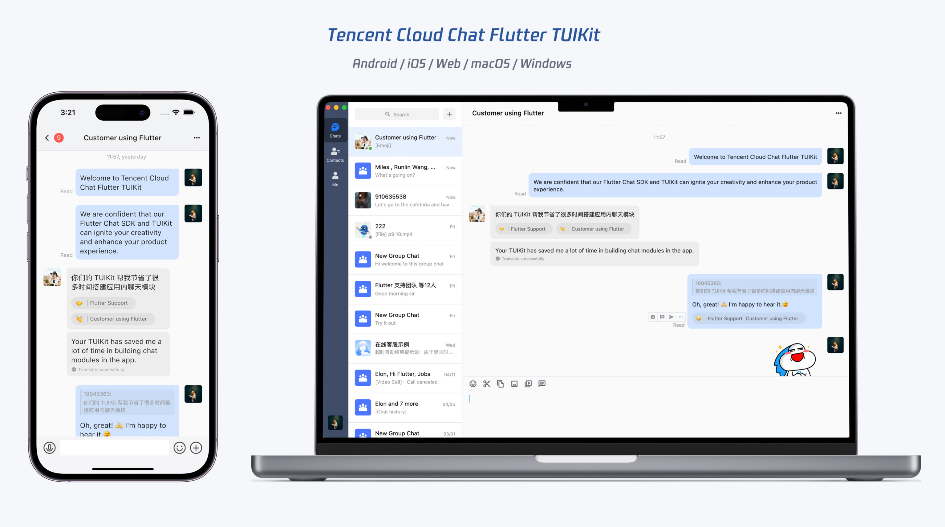
Overview
Currently, TUIKit for Flutter contains the following primary components:
Component | Description |
Conversation list component | |
Core chat component | |
Friend adding component and group joining component | |
Blocklist component and new contact request list component | |
Contacts component and group list component | |
User profile component and group profile component | |
Global search component and in-conversation search component |
Environment Requirements
Environment | Version |
Flutter | Flutter 3.0.0 or later and Dart 2.17.0. |
Android | Android Studio Dolphin | 2021.3.1 or later and Android Gradle plugin 4.1.0 or later. |
iOS | Xcode 12.0 or later. Ensure that your project has a valid developer signature. |
Supported Platforms
Platform | Supported or Not |
iOS | Supported |
Android | Supported |
Web | Supported from v0.1.5 |
macOS | Supported from v2.0.0 |
Windows | Supported from v2.0.0 |
Hybrid development (Adding the SDK for Flutter to your existing native app) | Supported from v1.0.0 |
Prerequisites
1. You have signed up for a Tencent Cloud account and completed identity verification.
2. You have created an application as instructed in Creating and Upgrading an Application and recorded the
SDKAppID.3. In the Chat console, select your application and click Auxiliary Tools > UserSig Generation & Verification on the left sidebar. Create two
UserID values and their UserSig values, and copy the UserID, Key, and UserSig for subsequent logins.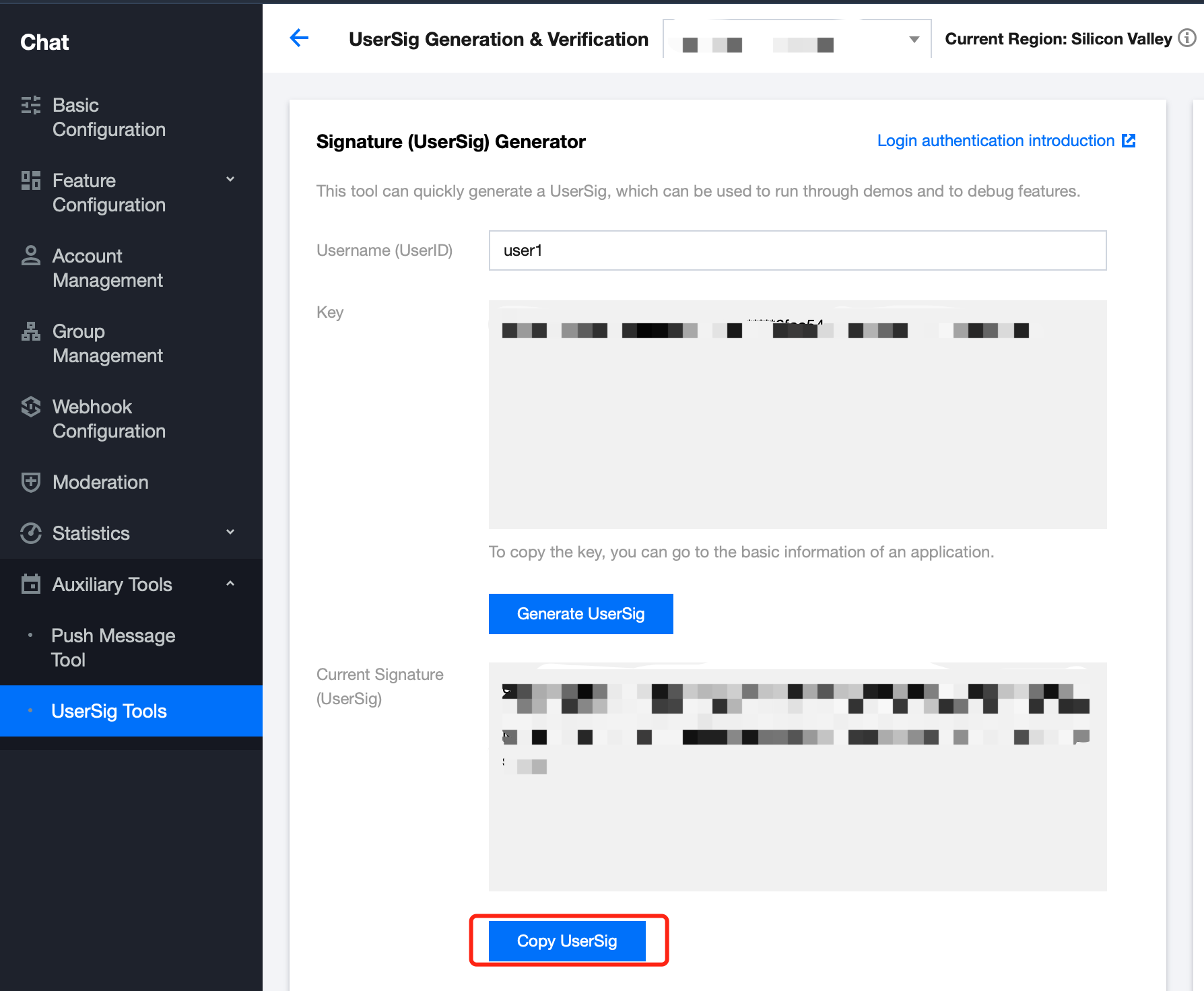
Integration Directions
The following describes how to use Flutter TUIKit to quickly build a simple Chat app.
Step 1. Create a Flutter app and configure permissions
Configuring permissions
The TUIKit requires permissions such as camera, album, mic, and network, so you need to manually declare them in the native file first.
Android
Open
android/app/src/main/AndroidManifest.xml and add the following permissions in <manifest></manifest>:<uses-permissionandroid:name="android.permission.INTERNET"/><uses-permissionandroid:name="android.permission.RECORD_AUDIO"/><uses-permissionandroid:name="android.permission.FOREGROUND_SERVICE"/><uses-permissionandroid:name="android.permission.ACCESS_NETWORK_STATE"/><uses-permissionandroid:name="android.permission.VIBRATE"/><uses-permissionandroid:name="android.permission.ACCESS_BACKGROUND_LOCATION"/><uses-permissionandroid:name="android.permission.WRITE_EXTERNAL_STORAGE"/><uses-permissionandroid:name="android.permission.READ_EXTERNAL_STORAGE"/><uses-permissionandroid:name="android.permission.CAMERA"/><uses-permissionandroid:name="android.permission.READ_MEDIA_IMAGES"/><uses-permissionandroid:name="android.permission.READ_MEDIA_VIDEO"/>
iOS
Open
ios/Podfile and add the following permission code at the end of the file:post_install do |installer|installer.pods_project.targets.each do |target|flutter_additional_ios_build_settings(target)target.build_configurations.each do |config|config.build_settings['EXCLUDED_ARCHS[sdk=iphonesimulator*]'] = 'arm64'config.build_settings['ENABLE_BITCODE'] = 'NO'config.build_settings["ONLY_ACTIVE_ARCH"] = "NO"endtarget.build_configurations.each do |config|config.build_settings['GCC_PREPROCESSOR_DEFINITIONS'] ||= ['$(inherited)','PERMISSION_MICROPHONE=1','PERMISSION_CAMERA=1','PERMISSION_PHOTOS=1',]endendend
Notes
If you want to use the push capability, you also need to add push permissions. For more information, see Vendor Message Push Plugin Integration Guide for Flutter.
Installing the Chat TUIKit
TUIKit contains the Chat SDK, so you only need to install
tencent_cloud_chat_uikit.The TUIKit is open source. You can integrate the online version, or fork it in GitHub before local integration. Before proceeding with the following steps, we recommend that you refer to the TUIKit overview or try out the demo to identify differences between the existing TUIKit default style and your desired style.
If the differences are not substantial, we recommend you import the online version and customize it as needed using the provided configuration parameters and builder.
flutter pub add tencent_cloud_chat_uikit
If the differences are substantial, we recommend you fork the TUIKit source code and modify the forked version directly before importing it into your project. To update TUIKit to the latest version, you can use the Git upstream to sync the new updates from our GitHub repository into your forked repository.
Step 2. Initializing Chat TUIKit and SDK
1. Initialize the Chat service upon application start.
2. Run
TIMUIKitCore.getInstance() first and then call the initialization function init(). Remember to pass in your sdkAppID.3. To help you get API errors and user prompts, we recommend you mount an
onTUIKitCallbackListener instance. For more information, see here./// main.dartimport 'package:tencent_cloud_chat_uikit/tencent_cloud_chat_uikit.dart';final CoreServicesImpl _coreInstance = TIMUIKitCore.getInstance();@overridevoid initState() {_coreInstance.init(sdkAppID: 0, // Replace 0 with the SDKAppID of your Chat application when integrating// language: LanguageEnum.en, // Configure the UI language; otherwise, the system language will be used.loglevel: LogLevelEnum.V2TIM_LOG_DEBUG,onTUIKitCallbackListener: (TIMCallback callbackValue){}, // [Configure a listener]. For details, see [here](https://www.tencentcloud.com/document/product/1047/50054#onTUIKitCallbackListener).listener: V2TimSDKListener());super.initState();}}
Notes
Do not perform subsequent steps before the initialization in this step is completed.
Logging in with a test account
1. Log in with a test account initially generated for login verification.
2. Call the
_coreInstance.login method to log in with the test account.import 'package:tencent_cloud_chat_uikit/tencent_cloud_chat_uikit.dart';final CoreServicesImpl _coreInstance = TIMUIKitCore.getInstance();_coreInstance.login(userID: userID, userSig: userSig);
Notes
This account is for development and testing only. Before the application is launched, the correct
UserSig distribution method is to use the server to generate UserSig and provide an application-oriented API. When UserSig is needed, your application can send a request to the business server for a dynamic UserSig. For more information, see Generating UserSig.Directions:
In the following 3-5 steps, we will guide you through the basic usage of the widely used components, which is same on the mobile and desktop clients. They both use the same set of codes and files.
In step 6, we will demonstrate how to integrate these components into an app and build overall layout for mobile and desktop clients. At the overall layout layer of the app, certain components may require separate adaptation.
Step 3. Implement the conversation list page
You can use the conversation list as the Chat app homepage, which contains all the one-to-one and group conversations.
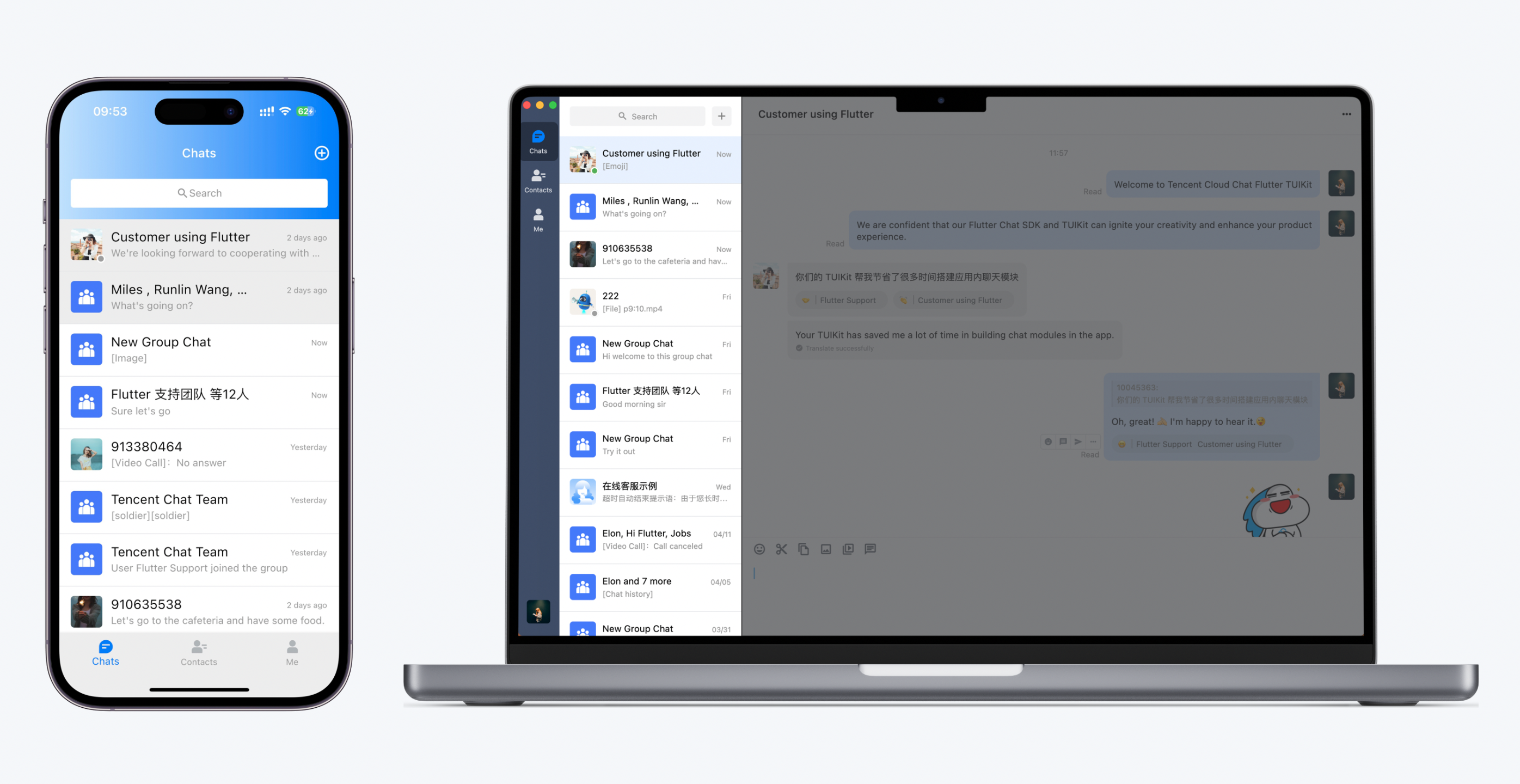
Create a
Conversation class and use the TIMUIKitConversation component in the body to render the conversation list.You only need to pass in an
onTapItem event processing function to redirect users to the specific chat page. The Chat class is as detailed in the next step.import 'package:flutter/material.dart';import 'package:tencent_cloud_chat_uikit/tencent_cloud_chat_uikit.dart';class Conversation extends StatelessWidget {const Conversation({Key? key}) : super(key: key);@overrideWidget build(BuildContext context) {return Scaffold(appBar: AppBar(title: const Text("Message",style: TextStyle(color: Colors.black),),),body: TIMUIKitConversation(onTapItem: (selectedConv) {Navigator.push(context,MaterialPageRoute(builder: (context) => Chat(selectedConversation: selectedConv,),));},),);}}
Step 4. Implement the chat page
This page consists of the message history and message sending modules.
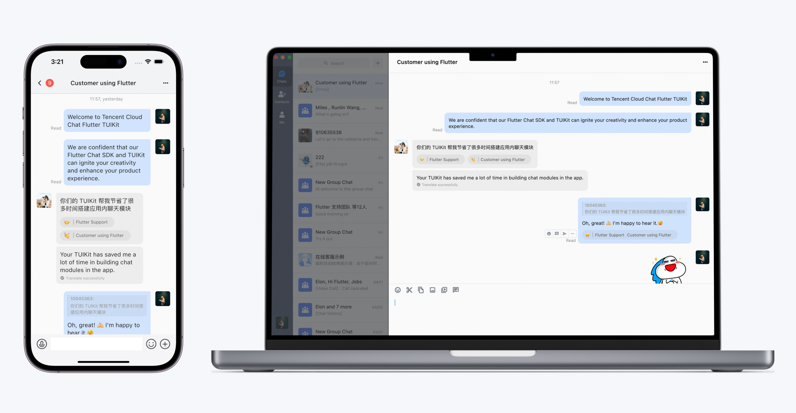
We recommend you pass in an
onTapAvatar event processing function to redirect users to the profile details page. The UserProfile class is as detailed in the next step.import 'package:flutter/material.dart';import 'package:tencent_cloud_chat_uikit/tencent_cloud_chat_uikit.dart';class Chat extends StatelessWidget {final V2TimConversation selectedConversation;const Chat({Key? key, required this.selectedConversation}) : super(key: key);String? _getConvID() {return selectedConversation.type == 1? selectedConversation.userID: selectedConversation.groupID;}@overrideWidget build(BuildContext context) {return TIMUIKitChat(conversation: selectedConversation,onTapAvatar: (_) {// To adapt to desktop clients, modify the code here by referring to the Demo code.Navigator.push(context,MaterialPageRoute(builder: (context) => UserProfile(userID: userID),));}, // Callback for the clicking of the message sender profile photo. This callback can be used with `TIMUIKitProfile`.);}
If your business scenario does not require entering the Chat Widget directly from the Conversation Widget,
V2TimConversation selectedConversation conversation object in the code above won’t be obtained automatically. In such cases, you can add a V2TimConversation object instance and pass in to the TIMUIKitChat component.TIMUIKitChat(conversation: V2TimConversation(conversationID: "c2c_10040818", // One-to-one chat: "c2c_${userID of the receiver}"; Group chat: "group_${groupID}"userID: "", // userID of the receiver. Required only for one-to-one chatgroupID: "", // groupID of the group. Required only for group chatshowName: "", // Title displayed on top AppBartype: 1, // 1 for one-to-one chat and 2 for group chat// The above configurations are simplified and necessary. You can configure more parameters here based on the notes for `V2TimConversation`.),// ... Other `TIMUIKitChat` configuration parameters);
Step 5. Implement the user profile page
By default, this page determines whether a user is a friend and generates the user profile page after only one
userID is passed in.Create a
UserProfile class and use the TIMUIKitProfile component in the body to render the user details and relationship chain page.Notes
If you want to customize this page, first consider using
profileWidgetBuilder to pass in the profile component to be customized and use profileWidgetsOrder to determine the vertical display order. If the requirements cannot be met, use builder instead.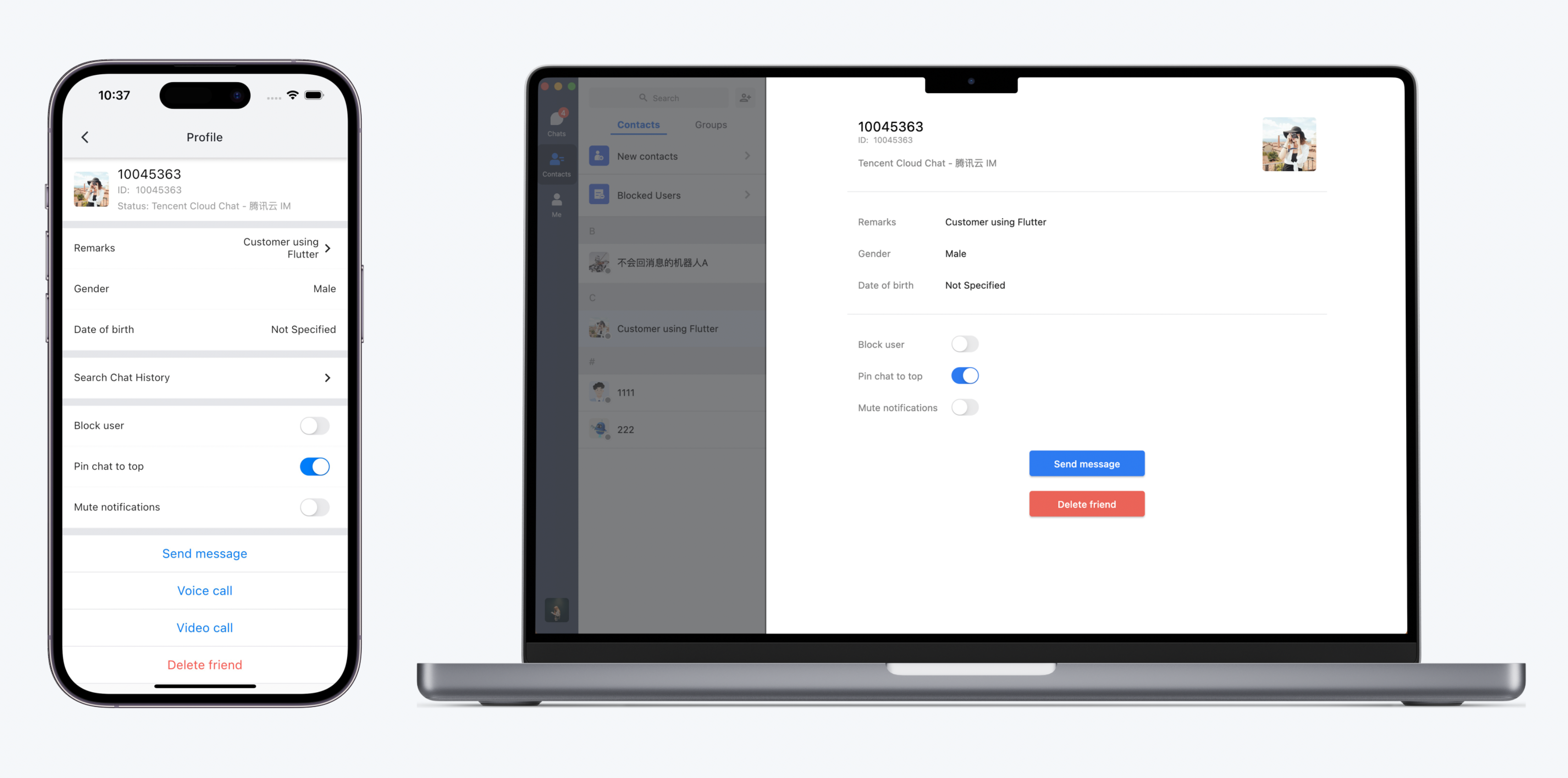
import 'package:flutter/material.dart';import 'package:tencent_cloud_chat_uikit/tencent_cloud_chat_uikit.dart';class UserProfile extends StatelessWidget {final String userID;const UserProfile({required this.userID, Key? key}) : super(key: key);@overrideWidget build(BuildContext context) {return Scaffold(appBar: AppBar(title: const Text("Message",style: TextStyle(color: Colors.black),),),body: TIMUIKitProfile(userID: widget.userID,),);}}
At this point, your app supports messaging, friend relationship management, user profile display, and conversation list display.
Step 6. Build the Overall Layout of an Application
Starting from TUIKit 2.0.0, we have adapted UI layouts for both Desktop and Mobile clients while keeping the component usages the same.
However, in terms of the application layout, you still need to adapt to the desktop and mobile clients separately. This includes component placement, redirection methods between components and overall layout of the page.
Platform recognition and component selection
This section explains how to use the platform recognition and component selection capabilities provided by TUIKit to ensure that the effects implemented by your business code are the same as those of TUIKit components.
The following are general features developed for desktop adaptation that have been implemented by TUIKit. You can directly use this feature in your own project.
Screen type adaptation
To ensure compatibility with both mobile and desktop clients, we recommend using this solution. It determines the display mode and business logic based on whether the screen is a desktop widescreen or a mobile portrait screen. This solution can also be used for Web client adaptation.
Run the following code to determine whether the app is running on a desktop client.
context is only required when the code is executed for the first time after the application is launched.import 'package:tencent_cloud_chat_uikit/ui/utils/screen_utils.dart';final isDesktopScreen = TUIKitScreenUtils.getFormFactor(context) == DeviceType.Desktop;
System platform recognition
In most cases, screen type adaptation is sufficient for desktop adaptation. However, system type is still required in specific scenarios, such as applying privacy permissions or obtaining storage paths for different systems.
We recommend that you do not frequently call system APIs to obtain current system types to comply with relevant privacy policies. Instead, you can use this system platform recognition feature to achieve this. This feature allows you to obtain the system type only once upon application launch and store the type parameter in a global variable for direct return in subsequent calls.
import 'package:tencent_cloud_chat_uikit/ui/utils/platform.dart';final bool isAndroid = PlatformUtils().isAndroid; // Determine whether it is an Android device.final bool isWeb = PlatformUtils().isWeb; // Determine whether it is a webpage.final bool isIOS = PlatformUtils().isIOS; // Determine whether it is an iOS device.final bool isWindows = PlatformUtils().isWindows; // Determine whether it is a Windows desktop.final bool isMacOS = PlatformUtils().isMacOS; // Determine whether it is a macOS desktop.final bool isMobile = PlatformUtils().isMobile; // Determine whether it is a mobile application, including both Android and iOS devices.final bool isDesktop = PlatformUtils().isDesktop; // Determine whether it is a desktop application, including both Windows and macOS devices.
Automatic widget selection based on platform
When adapting to desktop and mobile clients, minor changes might not be enough. Sometimes the adaptation requires displaying two different widgets dynamically. For example, a component needs to occupy the whole page to have corresponding
Scaffold and AppBar on mobile clients, while on desktop, just a Modal pop-up is needed. To address this, we’ve developed a general method TUIKitScreenUtils.getDeviceWidget(), which allows you to pass in mobile and desktop components and automatically return the corresponding components based on the platform type.Sample code for the method:
TUIKitScreenUtils.getDeviceWidget(desktopWidget: Container(), // Widget for desktop clientdefaultWidget: Container(), // Default widget, which is required. Use this when there is no corresponding platform widget passed in.mobileWidget: Container(), // Widget for mobile client);
Suppose we want to implement a component that occupies the entire page and has corresponding
Scaffold and AppBar on mobile clients, but not on desktop. You can remove some core components and use this method to add a Scaffold framework for mobile clients while desktop does not need this framework. Sample code:@overrideWidgetbuild(BuildContext context) {Widget widgetBody() {return const TIMUIKitBlackList(); // Replace this with the actual widget to be displayed}return TUIKitScreenUtils.getDeviceWidget(desktopWidget: widgetBody(), // Display component directly on desktop clientsdefaultWidget: Scaffold( // Use this defaultWidget and add a Scaffold for mobile clients unless special casesappBar: AppBar(),body: widgetBody(),));}
Overall layout design practice
Notes:
If your application needs to be deployed on both mobile and desktop clients using the same set of code, we recommend that you read the section for mobile clients first, and then the section for desktop. If you only need to deploy your app on a specific platform, you can read the corresponding section.
To achieve better display effects, primary components usually occupy the entire page on mobile clients.
To help you better customize the components to match your business needs, redirection among components is not configured internally. Except for
TIMUIKitChat, all the components do not contain Scaffold or AppBar.This means when you use the primary components, you need to decide whether and how to configure
Scaffold and AppBar based on your own business needs, listen for exposed click events and other redirection events, and process Navigator.push() redirection.For example, in step 3 above, we demonstrated how to listen for
onTapItem of the TIMUIKitConversation conversation list component to redirect end users to the specific chat page.TIMUIKitConversation(onTapItem: (selectedConv) {Navigator.push(context,MaterialPageRoute(builder: (context) => Chat(selectedConversation: selectedConv,),));});
You can also configure
Scaffold and AppBar for the primary component classes implemented by .dart files based on your business needs. Since the logic of the top AppBar of TIMUIKitChat is complicated (such as displaying Typing and unread message count), TIMUIKitChat contains Scaffold and AppBar, while other primary components do not.However, most secondary or deeper-level components that are navigated to from primary components contain
Scaffold and AppBar, for example, the group management page component. This is because their navigation logic is processed within the component and their module is relatively independent.Notes:
For such
AppBar in secondary or deeper-level components, you can modify UI themes to customize AppBar color and style by configuring parameters such as appbarBgColor, appbarTextColor, chatHeaderBgColor and chatHeaderTitleTextColor.
Overall layout
Notes:
The implementation of overall layout and architecture described in this section is only intended to provide a feasible approach and the Demo code. You can customize the development as per your needs.
The overall layout of the desktop client is quite different from that of the mobile client.
Unlike the mobile client, which uses
Navigator.push() to switch among different components and pages, the desktop client is not suitable for frequent navigation.You may have noticed that when you use instant messaging applications on desktop clients like Telegram, Discord and Messenger, all interactions are completed within the same window. The right-side core modules are accessed through switching among left-side tabs.
Common modules include:
Tab Icon on the Left | Module Content on the Right |
Chat | Conversation list + specific chat page + contact information + group information |
Contacts | (Contacts or group list) + (Contact details or group details) |
Me/My account | Settings or personal profile settings |
Profile photo | Personal profile settings |
We recommend that you create a file that is similar to the home_page.dart file in the demo to implement a two-column layout. You can maintain an
index to determine the current tab, place a LeftBar on the left to switch tabs, and place an IndexedStack expanded by Expand on the right to display core page content.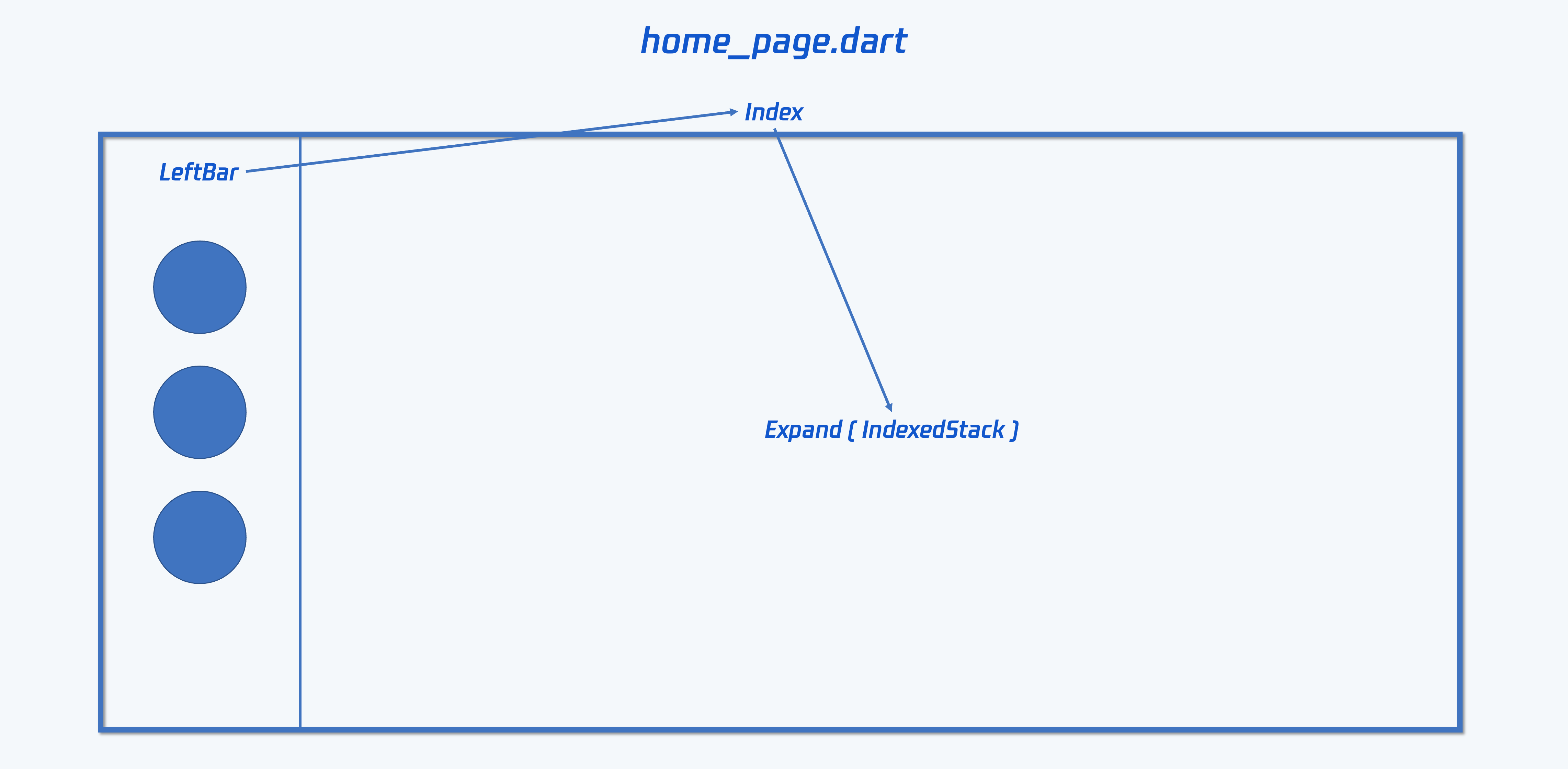
Based on the provided Demo source code, the following part describes how to implement layouts of right-side common pages for the
Expand(IndexedStack) section in the figure.1. Conversation list and chat page
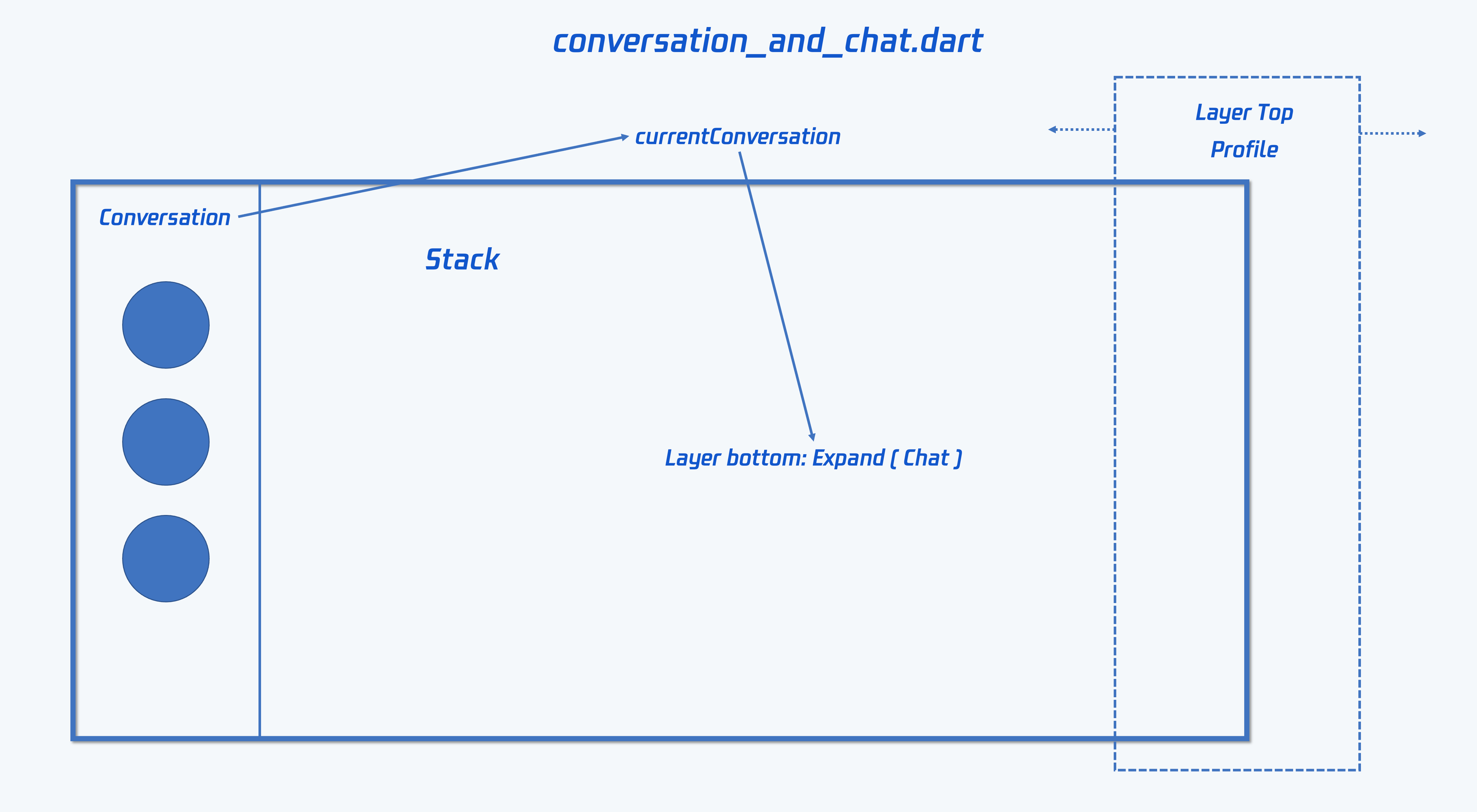
We recommend you refer to the Demo code and create a
dart file to place ConversationAndChat Widget class, which is used to support the business logic.The
ConversationAndChat Widget class can introduce the Chat, Conversation and UserProfile components created in above steps and keep the class code for the primary components basically unchanged.The class adopts a Row layout, places a
ConstrainedBox on the left to restrict the width of the Conversation component, and uses Expand to expand and place the Chat component. In addition, you can float a UserProfile or GroupProfile component on the far right using AnimatedPositioned animation with Stack for position changing. This allows your users to enter user profile or group profile page when clicked and return to the panel afterward.The
ConversationAndChat class needs to contain states to record the current V2TimConversation? currentConversation conversation.Add a public method
onConversationChanged for the Conversation Widget class created in step 3, as shown in this Demo code. This is used to redirect the conversation clicked by end users to the corresponding chat page.Listen on the onConversationChanged event, record the conversation currently switched to by the setState method, and pass in the Chat component to change the chat displayed on the right.
2. Contacts
The contacts page is able to display contact lists, joined group lists, new friend requests, blocklist, contact profiles and group profiles, search for contacts or groups, and go to both one-to-one and group chat pages.
Create a
dart file for the code of this part and create a ContactsAndProfile Widget class to support its business logic.The structure for this part is similar to that of the conversation list and chat page. Both of them use a Row layout and work with
ConstrainedBox and Expand. Place Contact, GroupList and other list components on the left-side ConstrainedBox and place UserProfile, GroupProfile and other profile components on the right-side Expand.The implementation method is similar to that of the conversation list and chat page. For more information, see Demo code.
One thing special for this part is that you need to implement the redirect-to-chat (both one-to-one and group chats) feature and allows your users to enter the chat page upon click. This does not belong to TUIKit. You can configure and adapt those based on your business needs. The following shows the demo effect and then describes the implementation methods:
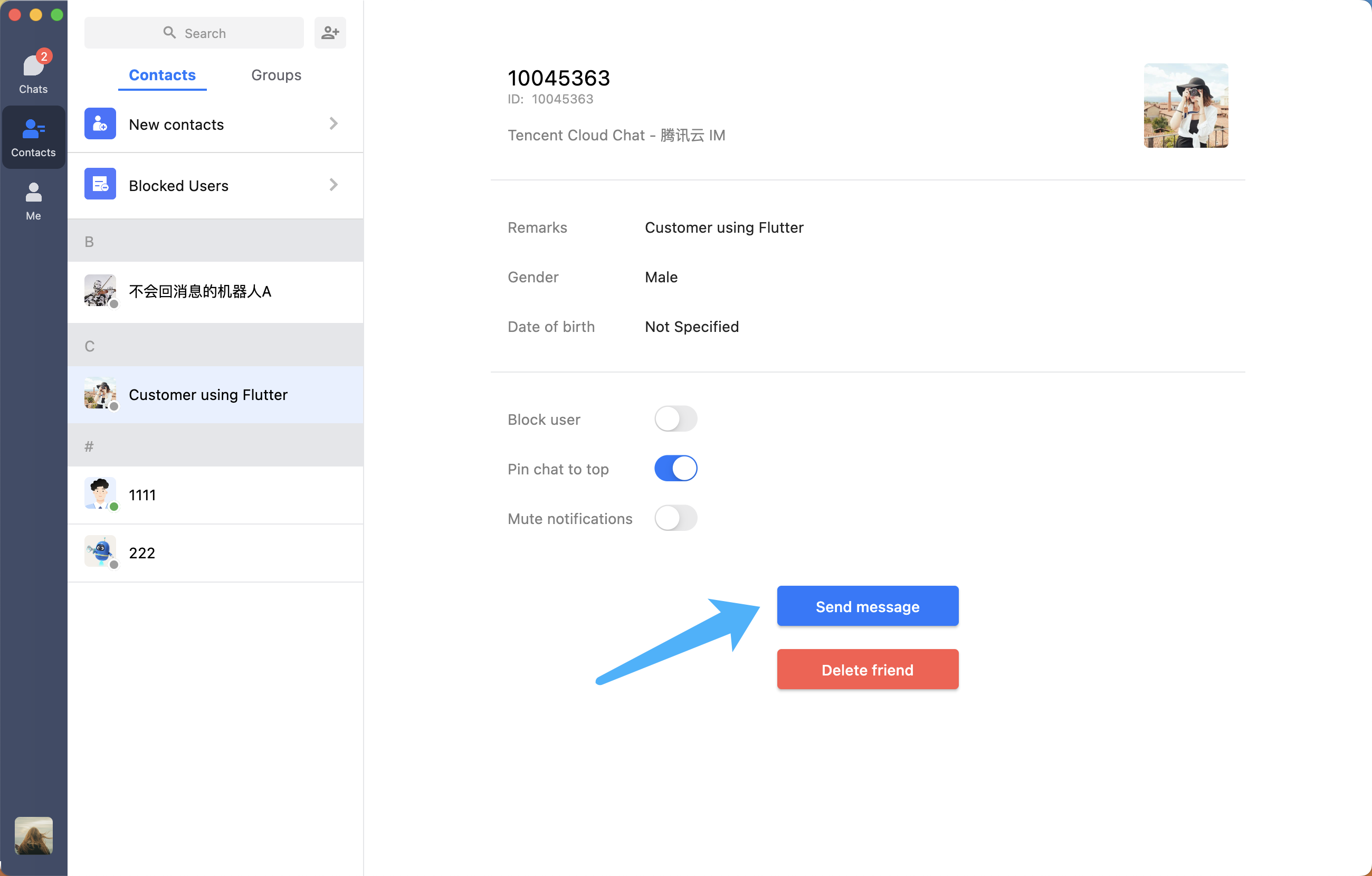
Taking one-to-one chat as an example, you can add a custom button and an
onClickSendMessage method to the UserProfile component created in above steps for implementation of triggering event when end users click this custom button. For more information on how to configure this, see Demo codeSimilarly, configure an
onNavigateToChat method for the ContactsAndProfile to forward the listened onClickSendMessage event. For demo code, see here.At this point, introduce the
ContactsAndProfile component in the home_page.dart, listen for the event, and forward this event to the ConversationAndChat Widget. For demo code, see here.In the ConversationAndChat component class, you can use
didUpdateWidget to dynamically update the passed-in V2TimConversation conversation to update the current chat page and the conversation list. For demo code, see here.You also need to add a
directToChat method to the previously created Chat Widget to allow other components or modules to specify current chat page. For demo code, see hereIn addition, you need to add a
directToChat method to the Conversation component class to update the style of a conversation specified by other components and modules. The background color of the selected conversation is blue by default, unselected is white and the pinned is gray. For demo code, see here.At this point, you have implemented the redirection from contacts to chat pages.
3. Other pages
The development methods for other pages are similar.
The key is to minimize modifications on cross-platform general classes for each primary component and add external page components for these primary components to achieve desktop adaptation.
Thus, you can use one set of code to maintain cross-platform modules through one-time development.
Featured capabilities on desktop
Due to the various features of desktop platforms, such as switching components without navigation, we provide some public and common components to implement these featured capabilities that you can use directly.
Component 1: Modal pop-ups. Use the provided ones or customize all pop-ups in TUIKit
In TUIKit, most modules implemented by new page components on mobile clients are implemented in the form of Modal pop-ups when adapting to desktop clients.
To ensure user experience consistency, all pop-ups in TUIKit use the same component. This pop-up component supports configuring title, send button, cancel button, width, height, position, etc. It also carries secondary components, supports modifying configuration items and displays right-click menu as well as other modules.
1. Use the provided modal pop-ups:
You can use the provided modal pop-up directly in your project to ensure pop-up style consistency throughout the project.
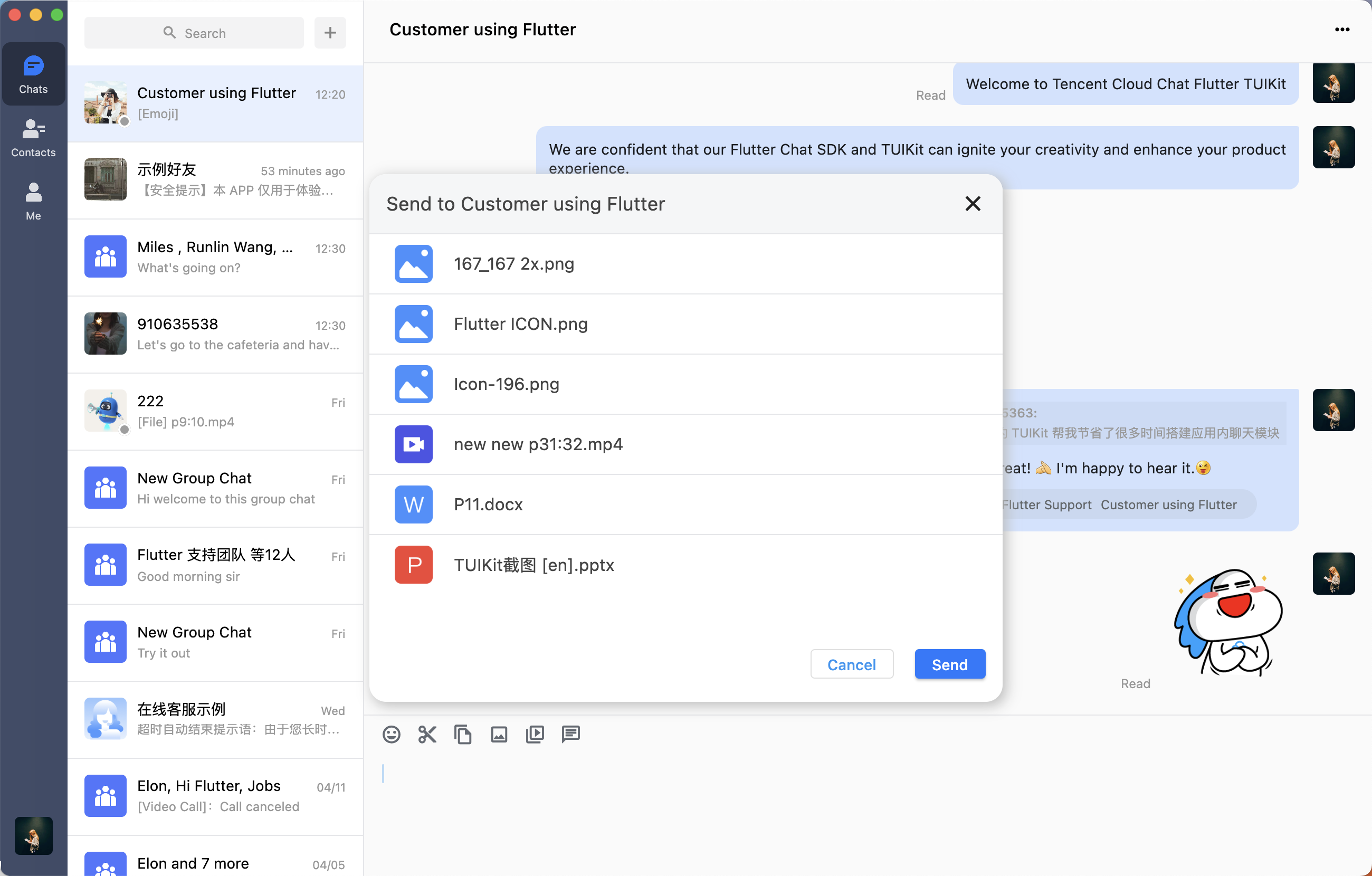
showPopupWindow. For more custom configurations, such as display position, see the notes of the method.import 'package:tencent_cloud_chat_uikit/ui/widgets/wide_popup.dart';TUIKitWidePopup.showPopupWindow(context: context,title: Modal name,operationKey: TUIKitWideModalOperationKey.custom,width: MediaQuery.of(context).size.width * 0.4, // Widthheight: MediaQuery.of(context).size.width * 0.5, //Heightchild: (onClose) => The specific internal component for display(groupID: groupID,controller: _chatController,onClosed: onClose,),);
2. Customize all or part of the Modal pop-ups in TUIKit:
You can listen on the
showDesktopModalFunc method of TIMUIKitConfig and build your own pop-ups based on provided parameters (such as, onclick event callbacks, current operation type operationKey or position).Every time TUIKit needs to display a pop-up, this callback will be triggered and the
operationKey field will indicate the scenario for current pop-up display. You can determine the pop-up type based on operationKey: return true to display a custom pop-up and return false to display a TUIKit default Modal pop-up.Component 2: Confirmation pop-up component
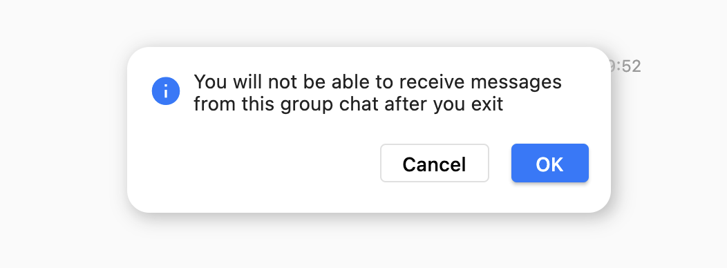
The confirmation pop-up components in TUIKit do not support customization. You can use the provided components as needed for a consistent user experience.
Similar to Modal pop-ups described above, call
TUIKitWidePopup.showSecondaryConfirmDialog() method to build the confirmation pop-ups. Parameters and configurations can be found in the notes.Component 3: Right-click menu
Unlike the long-press or swipe-to-show operation on mobile clients, desktop usually uses click or right-click to show menus for interaction.
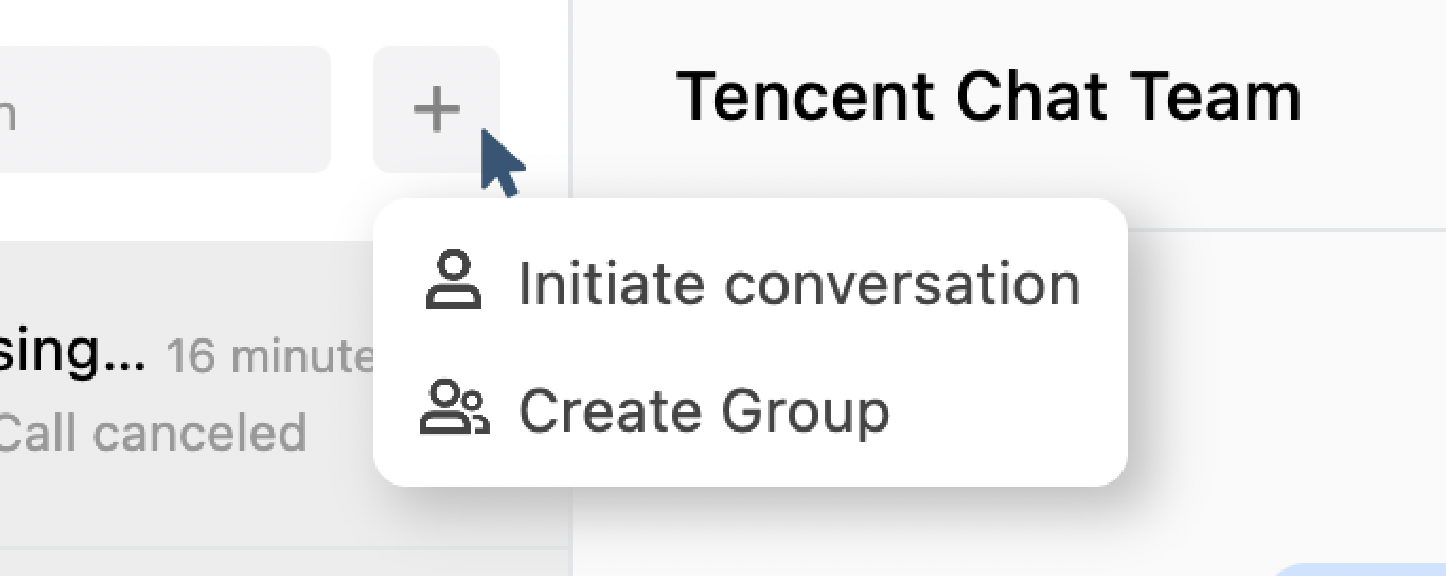
Use with component 1
TUIKitWidePopup.showPopupWindow():TUIKit provides the
TUIKitColumnMenu menu list component, where each menu item is a ColumnMenuItem component that can define the displayed label text, icon on the left and click event. closeFunc method is also provided to close the right-click menu at the end of the click event.The button for clicking is wrapped in
InkWell. Listen on onTapDown to obtain TapDownDetails event and click position of the mouse, and then pass in the position. You can also consider boundary based on the menu placement to avoid the menu going out of the bounds and determine the offset position by using the min method and MediaQuery.of(context).size parameter.The following shows the basic usage. You can find more usage in the notes of the method.
return InkWell(onTapDown: (details){TUIKitWidePopup.showPopupWindow(isDarkBackground: false,operationKey: TUIKitWideModalOperationKey.custom,borderRadius: const BorderRadius.all(Radius.circular(4)),context: context,// Calculate the offset value below based on actual situation and details.offset: Offset(details.globalPosition.dx + 10, details.globalPosition.dy - 200),child: (closeFunc) => TUIKitColumnMenu(data: [ColumnMenuItem(label: TIM_t("Personal center"), onClick: (){// Click event defined by youcloseFunc();}),ColumnMenuItem(label: TIM_t("Personal center"), onClick: (){// Click event defined by youcloseFunc();}),],));},child: Container(),);
Addition 1. More TUIKit capabilities
You can also use the following TUIKit components to quickly implement Chat features:
- TIMUIKitContact: The Contacts page.
- TIMUIKitGroupProfile: The group profile page, whose usage mode is basically the same as that of
TIMUIKitProfile.- TIMUIKitGroup: The group list page.
- TIMUIKitBlackList: The blocklist page.
- TIMUIKitNewContact: The contact (friend) request list. If you want to display a badge, you can use the
TIMUIKitUnreadCount badge component, which can mount listeners automatically.- Local search:
TIMUIKitSearch is a global search component, which supports the global search of contacts, groups, and chat records. You can also use TIMUIKitSearchMsgDetail to search for chat records in a specific conversation. You can choose whether to pass in conversation to choose between the two search modes.Addition 2. (Optional) Using a controller to control TUIKit
Notes
We recommend you use this feature in
tencent_cloud_chat_uikit 0.1.5 or later.After quick integration in the above steps, you can now build a set of available Chat modules. If you have any additional control requirements, you can use the corresponding controllers.
In scenarios such as the conversation list page, you can customize the swipe action menu with conversation items to provide features such as pinning a conversation to the top, deleting a conversation, and deleting historical messages, or sending messages to meet your additional message sending requirements, for example, sending a gift message on the gift UI developed by you.
Currently, the following controllers are provided:
Component | Controller | Feature |
Refreshes the historical message list/Updates a single message/Sends additional messages/Sets custom fields for messages, etc. | ||
Gets and refreshes the conversation list/Pins a conversation to the top/Sets a conversation draft/Clears all messages in a conversation/Deletes a conversation/Navigates to a specific conversation, etc. | ||
Deletes a contact/Pins the conversation with the current contact/Adds a user to the blocklist/Changes the way of being added as a friend/Updates the alias of a contact/Mutes notifications of messages of contacts/Adds a contact/Updates the user profile, etc. |
These controllers are used in the same way, and TIMUIKitChatController is taken as an example. For the complete code, see the demo.
1. Instantiate a TIMUIKitChatController object in a class that uses TIMUIKitChat.
final TIMUIKitChatController _chatController = TIMUIKitChatController();
2. Pass the object in to the
controller parameter of TIMUIKitChat.@overrideWidget build(BuildContext context) {return TIMUIKitChat(controller: _chatController,// ... Other parameters);}
3. In the class, you can use the controller to customize operations such as sending a geographical location message:
_sendLocationMessage(String desc, double longitude, double latitude) async {final locationMessageInfo = await sdkInstance.v2TIMMessageManager.createLocationMessage(desc: desc,longitude: longitude,latitude: latitude);final messageInfo = locationMessageInfo.data!.messageInfo;_chatController.sendMessage(receiverID: _getConvID(),groupID:_getConvID(),convType: _getConvType(),messageInfo: messageInfo);}
Addition 3. (Optional) Using more plugins to gain a rich TUIKit user experience
In addition to the SDK and TUIKit basic features, we provide four optional plugins to help you enrich Chat capabilities:
Message push plugin: It provides vendor offline push capabilities, online push capabilities, and the push of your other business messages to help you increase the message deliverability.
Audio/Video call plugin: It supports one-to-one/group audio/video calls.
Custom emoji plugin: TUIKit 0.1.5 or later does not provide an emoji package, and you can use this plugin to quickly integrate the emoji capability. This plugin supports emoji unicode encoding and custom image emojis. For the integration code, refer to our demo.
Notes
More practical plugins are on the way. If you have any good ideas and suggestions, feel free to contact us.
FAQs
What should I do if an error is reported on Android indicating that compileSdkVersion is not compatible?
1. Make sure that the following two plugin versions are specified in the
pubspec.yaml file of your project.video_thumbnail: ^0.5.3permission_handler: ^10.0.0flutter_local_notifications: 9.7.0
2. Modify the
android/app/build.gradle file to ensure android => compileSdkVersion 33.android {compileSdkVersion 33...}
3. Run the following command to reinstall the dependencies on Android.
flutter pub cache cleanflutter pub get
What should I do if the Android build error "Codepoint 984472 not found in font, aborting." occurs on Flutter 2.x?
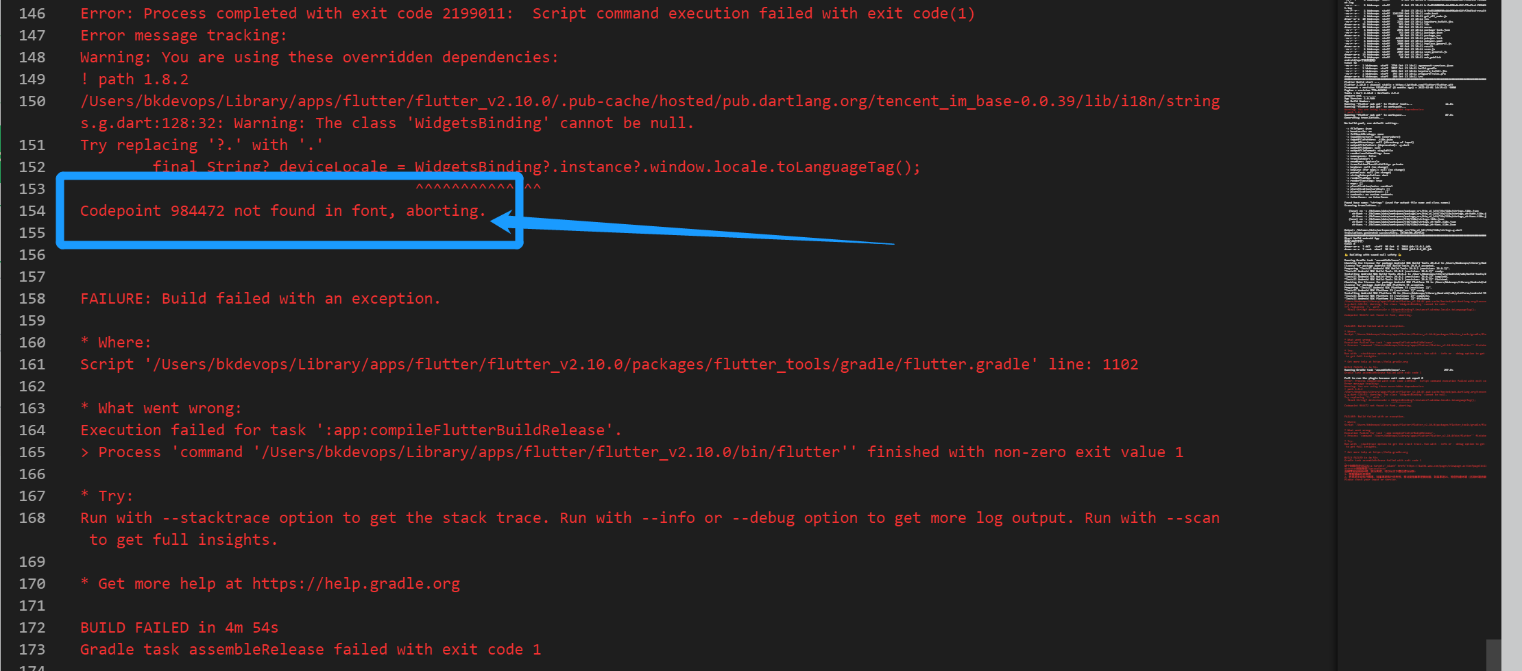
Add
--no-tree-shake-icons to your compilation command, for example:flutter build apk --no-tree-shake-icons --dart-define=SDK_APPID={your `SDKAPPID`}
What should I do if Pods dependencies fail to be installed on iOS?
Solution 1: If an error occurs after the configuration, click Product > Clean Build Folder, clear the product, and run pod install or flutter run again.
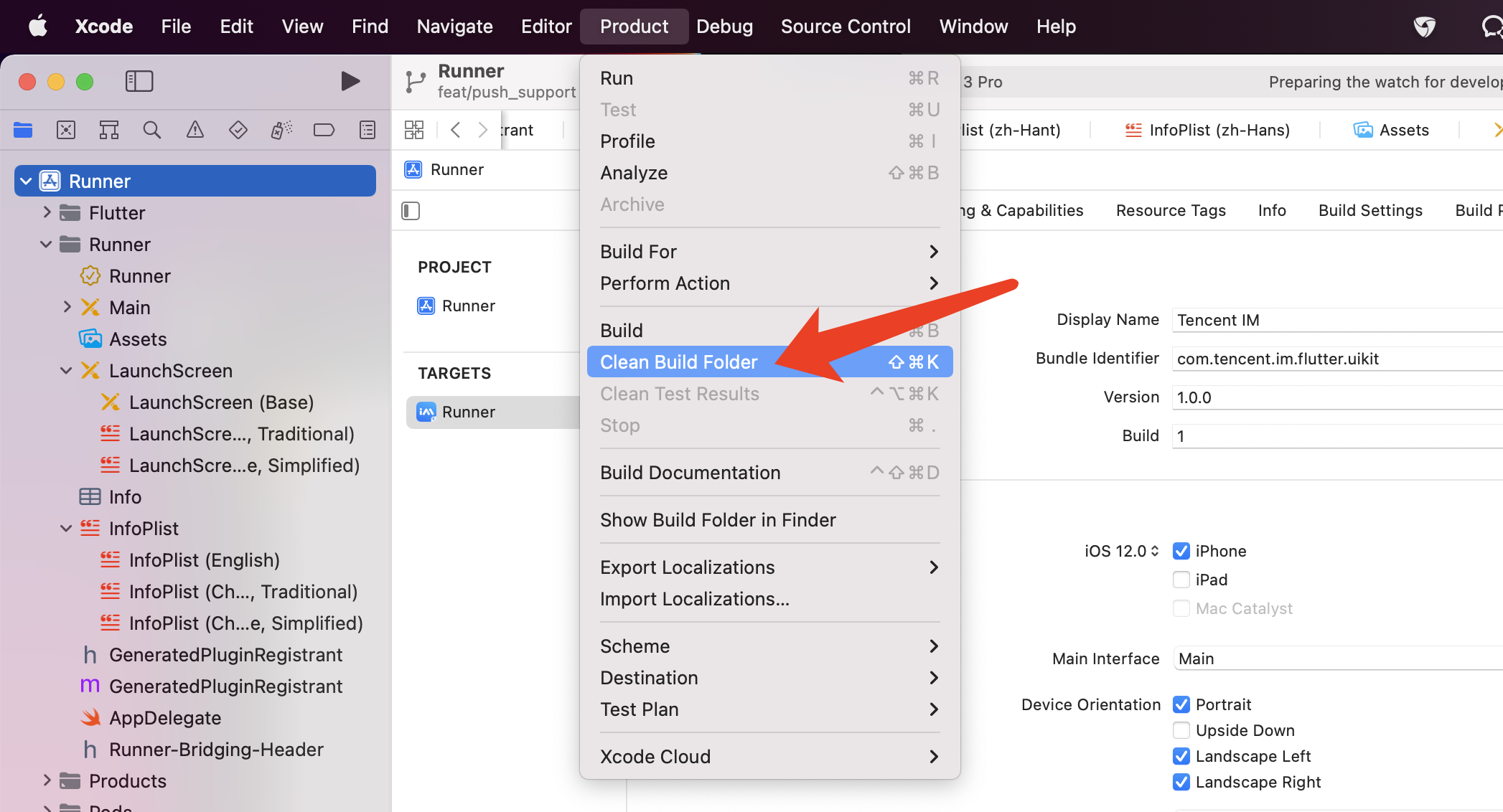
Solution 2: Manually delete the ios/Pods folder and the ios/Podfile.lock file and run the following command to reinstall the dependencies.
cd iossudo gem install ffipod install --repo-update
What do I do if an error occurs during debugging on an iOS device when I am wearing an Apple Watch?

Turn on Airplane Mode on your Apple Watch and go to Settings > Bluetooth on your iPhone to turn off Bluetooth.
Restart Xcode (if opened) and run
flutter run again.How do I check a Flutter environment issue?
If you want to check the Flutter environment, run
Flutter doctor to detect whether the Flutter environment is ready.What do I do if an error occurs on an Android device after TUIKit is imported into an app that is automatically generated by Flutter?

1. Open
android\\app\\src\\main\\AndroidManifest.xml and complete xmlns:tools="http://schemas.android.com/tools" / android:label="@string/android_label" / tools:replace="android:label" as follows:<manifest xmlns:android="http://schemas.android.com/apk/res/android"package="Replace it with your Android package name"xmlns:tools="http://schemas.android.com/tools"><applicationandroid:label="@string/android_label"tools:replace="android:label"android:icon="@mipmap/ic_launcher" // Specify an icon pathandroid:usesCleartextTraffic="true"android:requestLegacyExternalStorage="true">
2. Open
android\\app\\build.gradle and complete minSdkVersion and targetSdkVersion in defaultConfig.defaultConfig {applicationId "" // Replace it with your Android package nameminSdkVersion 21targetSdkVersion 30}
How do I switch the interface language?
For information about how to switch the interface language and add other interface languages, see here.
How do I get an API call error/Flutter layer error/pop-up prompt message?
Mount the
onTUIKitCallbackListener listener when initializing TUIKit.The listener is used to return SDK API errors/Flutter errors/information about scenarios where a pop-up prompt may need to be displayed to the user.
Determine the type through
TIMCallbackType.Below is the sample code. You can modify the following code based on your business needs to customize the logic for prompting the user, including but not limited to the pop-up and banner.
final CoreServicesImpl _coreInstance = TIMUIKitCore.getInstance();final isInitSuccess = await _coreInstance.init(onTUIKitCallbackListener: (TIMCallback callbackValue){switch(callbackValue.type) {case TIMCallbackType.INFO:// Shows the recommend text for info callback directlyUtils.toast(callbackValue.infoRecommendText!);break;case TIMCallbackType.API_ERROR://Prints the API error to console, and shows the error message.print("Error from TUIKit: ${callbackValue.errorMsg}, Code: ${callbackValue.errorCode}");if (callbackValue.errorCode == 10004 && callbackValue.errorMsg!.contains("not support @all")) {Utils.toast(imt("The current group does not support @all members"));}else{Utils.toast(callbackValue.errorMsg ?? callbackValue.errorCode.toString());}break;case TIMCallbackType.FLUTTER_ERROR:default:// prints the stack trace to console or shows the catch errorif(callbackValue.catchError != null){Utils.toast(callbackValue.catchError.toString());}else{print(callbackValue.stackTrace);}}},);
The following describes the three types of callbacks respectively.
SDK API error (TIMCallbackType.API_ERROR)
In this scenario, native SDK API
errorMsg and errorCode are provided.Flutter error (TIMCallbackType.FLUTTER_ERROR)
This error is returned from Flutter. It provides the
stackTrace (from FlutterError.onError) or catchError (from try-catch) when the error occurred.Scenario information (TIMCallbackType.INFO)
We recommend you display the information to the user in the form of a pop-up when appropriate.
You can decide the prompt rule and pop-up style.
The scenario code
infoCode is provided to help you identify the current scenario and the default prompt infoRecommendText.You can directly pop up the default prompt or customize a prompt based on
infoCode. The prompt will be displayed in the system language or the specified language. Do not determine the scenario based on the prompt.infoCode complies with the following rules:infoCode consists of seven digits, the first five of which determine the component where the scenario occurred, and the last two of which determine the specific scenario.Start of infoCode | Component |
66601 | TIMUIKitAddFriend |
66602 | TIMUIKitAddGroup |
66603 | TIMUIKitBlackList |
66604 | TIMUIKitChat |
66605 | TIMUIKitContact |
66606 | TIMUIKitConversation |
66607 | TIMUIKitGroup |
66608 | TIMUIKitGroupProfile |
66609 | TIMUIKitNewContact |
66610 | TIMUIKitGroupProfile |
66611 | TIMUIKitNewContact |
66612 | TIMUIKitProfile |
66613 | TIMUIKitSearch |
66614 | Common components |
The complete list of
infoCode values is as follows:infoCode | infoRecommendText | Scenario Description |
6660101 | A friend request is sent successfully. | The user requests to add another user to the contacts. |
6660102 | The user is already a friend. | The onTapAlreadyFriendsItem callback is triggered when the user requests to add an existing friend. |
6660201 | A group join request is sent. | The user requests to join a group requiring admin approval. |
6660202 | You are already a group member. | The onTapExistGroup callback is triggered when the user sends a group join request and is identified as an existing group member. |
6660401 | The original message cannot be located. | The target message cannot be found in the message list when the user needs to be redirected to the @message or quote the message. |
6660402 | The video is saved successfully. | |The user selects Save after opening a video message in the message list. |
6660403 | The video failed to be saved. | The user selects Save after opening a video message in the message list. |
6660404 | The recording is too short. | The user sends a too short audio message. |
6660405 | Sending failed. The video cannot exceed 100 MB. | The user attempts to send a video greater than 100 MB in size. |
6660406 | The image is saved successfully. | The user selects Save after opening the large image in the message list. |
6660407 | The image failed to be saved. | The user selects Save after opening the large image in the message list. |
6660408 | Copied | The user selects Copy to copy the text message in the pop-up window. |
6660409 | Unavailable | The user selects a non-standard feature in the pop-up window. |
6660410 | Other files are being received. | The previous download tasks have not been completed when the user clicks to download a file message. |
6660411 | Receiving | The user clicks to download a file message. |
6660412 | Video messages must be in MP4 format. | The user sends a video message in non-MP4 format. |
6660414 | Downloading | [Desktop] The image or video is being downloaded and cannot be opened. Open it when it is downloaded. |
6660415 | Video file exception | Unable to send the file because the video file itself is wrong or damaged. |
6661002 | Unable to view group members due to network disconnection | The user attempts to modify the group profile in an environment without a network connection. |
6661003 | The admin role is canceled successfully. | The user cancels the admin role of another user in the group. |
6661201 | Modification failed due to network disconnection | The user attempts to modify their own profile or that of a contact in an environment without a network connection. |
6661202 | The friend is added successfully. | The user adds another user as a friend on the profile page, who is automatically added successfully without approval. |
6661203 | A friend request is sent. | The user adds another user who requires approval as a friend on the profile page. |
6661204 | The user is on the blocklist. | The user adds another user who is on the blocklist as a friend on the profile page. |
6661205 | The friend failed to be added. | The user failed to add a friend, possibly because the latter forbids being added. |
6661206 | The friend is deleted successfully. | The user successfully deleted a friend on the profile page. |
6661207 | The friend failed to be deleted. | The user failed to delete a friend on the profile page. |
6661401 | The input cannot be empty. | The user enters an empty string. |
6661402 | Pass in a lifecycle function for leaving a group to provide the navigation method to return to the homepage or another page. | A method to return to the homepage is provided when the user leaves or disbands the group. |
6661403 | The device's available storage space is insufficient. We recommend you free up some space to gain a better user experience. | After the user is logged in successfully, the system will automatically check the device's available storage space. If the available space is less than 1 GB, a prompt will be displayed indicating that the available space is insufficient. |
Was this page helpful?
You can also Contact Sales or Submit a Ticket for help.
Yes
No
Feedback
