Card is used to organize and display other components in Widget. It supports status information display and theme mode switchover, suitable for multi-component combined display, information grouping, and interactive operation scenarios.
Basic Usage
Configure child components inside through the children property, commonly used for composite heading, text, form control etc.
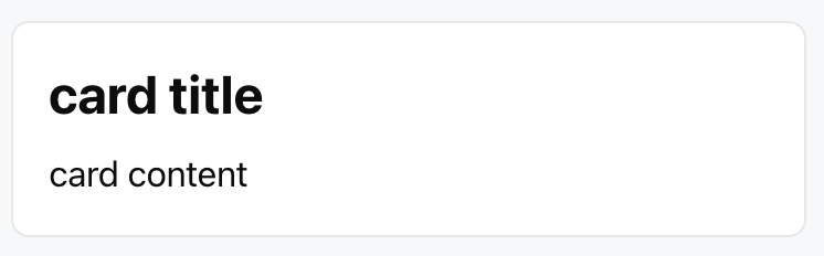
Template example:
<Card>
<Title value="card title" size="lg" />
<Text value="card content" size="md" />
</Card>
Effect display as follows:
Attribute Description
Attribute Name
Type
Description
Default Value
children ★
ChatKitComponent[]
Child component list for defining card content
-
size
"sm" | "md" | "lg" | "full"
card size
"md"
padding
number | string | Spacing
card padding settings
-
background
string | ThemeColor
Background Color
-
status
WidgetStatus
Status Configuration
-
collapsed
boolean
fold or not
false
confirm
CardAction
Confirmation Button Configuration
-
cancel
CardAction
Cancel Button Configuration
-
theme
"light" | "dark"
theme mode
"light"
asForm
boolean
whether as form container
false
Note:
★ Marked with required attribute.
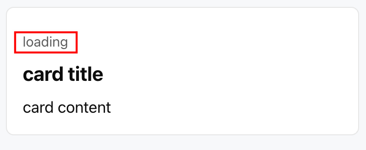
WidgetStatus Type
Define the state display area at the top of the card, supporting the following two formats:
1. String: Direct display status text
Template example:
<Card status="loading">
<Title value="card title" />
<Text value="card content" />
</Card>
Effect display as follows:
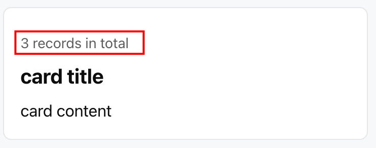
2. Object: An object containing a text field.
Template example:
<Card status={{ text:"3 records in total"}}>
<Title value="card title" />
<Text value="card content" />
</Card>
Effect display as follows:
Note:
Although the type definition includes icon and favicon fields, the current implementation only displays text content and does not support icon display.
CardAction Object
For configuration of Card action buttons (such as confirm, cancel).
Attribute Name
Type
Description
label ★
string
button text
action ★
ActionConfig
Action Configuration
ThemeColor Object
For configuration of color settings under different themes.