The list item component (ListViewItem) is used to show each entry in a ListView and is the basic unit to build list interfaces.
The component supports flexible child component composition, alignment, and spacing control, and is configurable with entire row click action, suitable for scenarios where information display and operation entry coexist.
Basic Usage
Define the display content inside the list item through the children property, and combine components such as icons and text to form a basic list structure.
Template example:
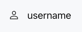
<ListViewItem gap="16px" align="center">
<Icon name="user" size="lg" />
<Text value="username" />
</ListViewItem>
Effect display as follows:
Attribute Description
Attribute Name
Type
Description
Default Value
children ★
ChatKitComponent[]
Component List
-
onClickAction
ActionConfig
Action triggered when clicking the entire list item
-
gap
number | string
child element spacing
-
align
Alignment
vertical alignment
"start"
Note:
Marked with required attribute.
Alignment Type Description
Control the vertical alignment of child components in a list item. Support the following values:
"start" - top alignment
"center" - center alignment
"end" - bottom alignment
"baseline" - baseline alignment
"stretch" - stretch alignment
Interactive Effect Description
When onClickAction is configured:
Hover to change the background to gray.
Display pointer hand cursor.
The entire list item is clickable.
Suitable for scenarios where operations like redirection or selection need to be triggered.
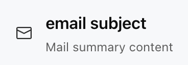
Usage Examples
The following example shows a clickable list item. Click to redirect to the user profile webpage.