The list view container component (ListView) is a basic container for hosting and showing multiple list items (ListViewItem) and building vertical information lists.
The component is responsible for managing the list structure, display quantity, and overall status info. Details and interaction are defined by the internal list item component.
Basic Usage
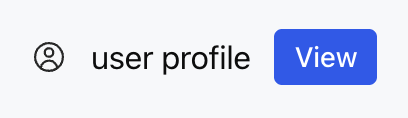
Configure multiple ListViewItems through the children property to quickly build a standard list view.
Template example:
<ListView>
<ListViewItem gap="16px" align="center">
<Icon name="profile" size="lg" />
<Text value="user profile" />
<Button label="view" size="sm" />
</ListViewItem>
</ListView>
Effect display as follows:
Attribute Description
Attribute Name
Type
Description
Default Value
children ★
ListViewItem[]
List Item Array
-
limit
number | "auto"
Display Quantity Limit
-
status
WidgetStatus
Status Configuration
-
Note:
★ Marked with required attribute.
WidgetStatus Type Description
status is used to show auxiliary status info in the list area, currently supported the following two formats:
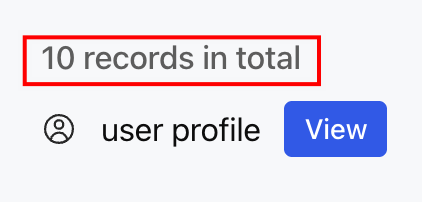
1. string: direct display of status text, suitable for simple prompt.
Template example:
<ListView status="10 records in total">
<ListViewItem gap="16px" align="center">
<Icon name="profile" size="lg" />
<Text value="user profile" />
<Button label="view" size="sm" />
</ListViewItem>
</ListView>
Effect display as follows:
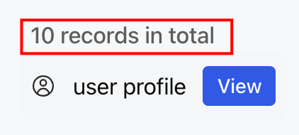
2. Object: Configure the content of the configuration state through an object containing a text field.
Template example:
<ListView status={{ text:"10 records in total"}}>
<ListViewItem gap="16px" align="center">
<Icon name="profile" size="lg" />
<Text value="user profile" />
<Button label="view" size="sm" />
</ListViewItem>
</ListView>
Effect display as follows:
Note:
Although the type definition includes the icon and favicon fields, the current implementation only displays text content and does not support icon display.
ListViewItem Child Component
The ListView must contain one or more ListViewItems as child components for defining the specific content and interaction behavior of each row. For detailed configuration, see ListViewItem List Item.
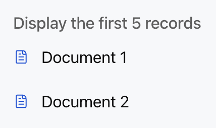
Usage Examples
The following example shows a list view with a maximum number and status prompt.
Template example:
<ListView limit={5} status="Display the first 5 records">