Component Feature
BasicRoot (base root container) is the outermost container component in the Widget structure, for hosting and organizing the entire Widget content structure.
The component is primarily responsible for global theme control and basic layout capacity, without taking on specific business show or interaction logic.
Basic Usage
BasicRoot is usually used as the root node of Widget JSON, for defining overall layout direction and theme mode.
Template example:
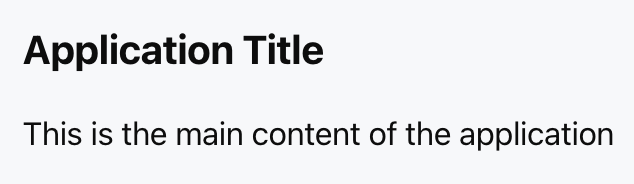
<Basic theme="light" direction="col" gap="16px">
<Title value="Application Title" />
<Text value="This is the main content of the application" />
</Basic>
Effect display as follows:
Attribute Description
|
children ★ | ChatKitComponent[]
| Component List | - |
theme | "light" | "dark"
| theme mode | "light"
|
direction | "row" | "col"
| layout direction | "col"
|
gap | number | string
| child element spacing | - |
padding | number | string | Spacing
| padding | - |
align | Alignment
| Intersect Axis Alignment Mode | - |
justify | Justification
| Main Axis Alignment Mode | - |
Note:
★ Marked with required attribute.
Type Definition
Alignment
Used to control the alignment rule of child components in the intersect axis direction, which is determined by direction:
When direction = "row", the cross axis is vertical.
When direction = "col", the cross axis is horizontal.
Valid values include:
"start" | "center" | "end" | "baseline" | "stretch"
The available values are as follows:
"start": The child component aligns at the starting position of the cross axis.
"center": The child component aligns with center alignment on the cross axis.
"end": The child component aligns at the end position of the cross axis.
"baseline": The child component aligns to the text baseline, commonly used for horizontal layouts containing text.
"stretch": The child component stretches along the cross axis to fill the available space.
Justification
Used to control the geographic distribution and alignment mode of child components in the main axis direction, which is determined by direction:
When direction = "row", the main axis is horizontal.
When direction = "col", the main axis is vertical.
Valid values include:
"start" | "end" | "center" | "between" | "around" | "evenly"
The available values are as follows:
"start": The child components are arranged sequentially from the starting position of the main axis.
"end": The child components align to the end of the main axis.
"center": The child component is centered along the main axis.
"between": The first and last components are aligned to the edges, and the rest are evenly spaced.
"around": The child component has equal space on the left and right.
"evenly": The child component and gaps on the left and right are divided into equal groups.
Spacing
Used for description of padding or spacing attribute's setting method.
The following three formats are supported:
number | string | { x?: number; y?: number; top?: number; right?: number; bottom?: number; left?: number }
Use Cases
BasicRoot is usually used for the following scenarios:
1. Top-level container: As the outermost node configured for the Widget, it hosts all child components.
2. Theme control: Assign a light or dark theme to the entire Widget to ensure a consistent visual style.
3. Basic layout: Offers the most basic vertical or horizontal layout power as the layout basis for other container components.
Difference From Card
BasicRoot focuses more on structure and layout, while Card tends to be content handling and visual presentation.
|
Background | transparent | Background Color |
border | Not supported | Supported |
shadow | Not supported | Supported |
status display | Not supported | Supported |
form mode | Not supported | Supported |
Usage Examples
The following example shows a typical scenario of using BasicRoot as the root container and combining multiple Card components inside it.
Template example:
<Basic
theme="light"
direction="col"
gap="24px"
padding="20px"
>
<Card>
<Title value="Card 1" />
</Card>
<Card>
<Title value="Card 2" />
</Card>
</Basic>
Effect display as follows: