Box
Download
Focus Mode
Font Size
Component Feature
Common layout container component (Box), used for flexible arrangement and style organization of content.
The component supports common style capabilities such as elastic layout direction control, alignment mode, spacing, size, border, and background. It is suitable as a basic container for page structure and partial layout.
Basic Usage
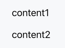
Define the arrangement mode of child components with direction and children, and use gap to control the spacing between child elements.
Template example:
<Box direction="col" gap="12px"><Text value="content1" /><Text value="content2" /></Box>
Effect display as follows:
Attribute Description
Layout Property
Property Name | Type | Description | Default value |
direction | "row" | "col" | Layout orientation | "row" |
children | ChatKitComponent[] | Subcomponent List | - |
align | Alignment | Intersect Alignment Mode | - |
justify | Justification | Main Axis Alignment Mode | - |
wrap | "nowrap" | "wrap" | "wrap-reverse" | Line Break Method | "nowrap" |
flex | number | string | Auto Scaling ratio | - |
gap | number | string | child element spacing | - |
padding | number | string | Spacing | padding | - |
border | number | Border | Borders | Border Configuration | - |
background | string | ThemeColor | Background Color | - |
Dimension Property
Property Name | Type | Description | Default value |
height | number | string | height | - |
width | number | string | width | - |
size | number | string | Set both width and height at the same time | - |
minHeight | number | string | minimum height | - |
minWidth | number | string | minimum width | - |
minSize | number | string | minimum size | - |
maxHeight | number | string | max height | - |
maxWidth | number | string | maximum width | - |
maxSize | number | string | Maximum Size | - |
aspectRatio | number | string | Aspect Ratio | - |
radius | RadiusValue | rounded corner | - |
margin | number | string | Spacing | margin | - |
Type Definition
Alignment
Used to control the alignment rule of child components in the cross-axis direction, which is determined by direction:
When direction = "row", the cross axis is vertical.
When direction = "col", the cross axis is horizontal.
Valid values include:
"start" | "center" | "end" | "baseline" | "stretch"The available values are as follows:
"start": Align child components at the starting position of the cross axis.
"center": Align child components at the center of the cross axis.
"end": Align child components at the end of the cross axis.
"baseline": Align child components by text baseline, commonly used for horizontal layout with text.
"stretch": Stretch child components along the cross axis to fill the available space.
Justification
Used to control the distribution and alignment mode of child components in the main-axis direction, which is determined by direction:
When direction = "row", the main axis is horizontal.
When direction = "col", the main axis is vertical.
Valid values include:
"start" | "end" | "center" | "between" | "around" | "evenly"The available values are as follows:
"start": Arrange child components sequentially from the starting position of the main axis.
"end": Align child components to the end of the main axis as a whole.
"center": Center child components along the main axis.
"between": The first and last components are aligned to the edges, and the rest are evenly spaced.
"around": Reserve equivalent space on both sides of the child component.
"evenly": Divide the child component and gaps on both sides into equal groups.
RadiusValue
Used to define the rounded corners size of a component, supporting semanticization with default value and custom value.
Valid values include:
"2xs" | "xs" | "sm" | "md" | "lg" | "xl" | "2xl" | "3xl" | "full" | stringThe available values are as follows:
"2xs" – "3xl": Rounded corner preset values from smallest to largest.
"full": Fully rounded corners, commonly used for circular or capsule elements.
string: Custom rounded corner values, such as "4px", "50%".
Spacing
Used for description of the setting method for padding or spacing class attributes.
The following three formats are supported:
number | string | { x?: number; y?: number; top?: number; right?: number; bottom?: number; left?: number }as described below:
number | string: Use the same spacing for all four directions.
x / y: Control the horizontal spacing and vertical spacing respectively.
top / right / bottom / left: Control the spacing in one direction respectively.
Border
Used for configuration of component border style.
support the following fields:
{ size?: number; color?: string; style?: "solid" | "dashed" | "dotted" }Field descriptions are as follows:
size: border width.
color: border color.
style: border style.
Borders
Used to configure the border style for four directions of a component.
support the following fields:
{ top?: Border; right?: Border; bottom?: Border; left?: Border }Field descriptions are as follows:
top: top border configuration.
right: right border configuration.
bottom: bottom border configuration.
left: left border configuration.
Help and Support
Was this page helpful?
You can also Contact sales or Submit a Ticket for help.
Help us improve! Rate your documentation experience in 5 mins.
Feedback