Col
Download
Focus Mode
Font Size
Component Feature
Col is a vertical layout container and a shortcut for the Box component, with direction fixed as "col".
It is used to arrange child components vertically and supports style configurations such as elastic layout, spacing, alignment, border, and background.
Basic Usage
Template example:
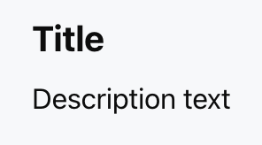
<Col gap="8px"><Title value="Title" size="md" /><Text value="Description text" /></Col>
Effect display as follows:
Attribute Description
The attributes of Col are identical to those of Box, with the only difference being that direction is fixed as col.
Layout Property
Property Name | Type | Description | Default value |
children | ChatKitComponent[] | Child Component List | - |
align | Alignment | Intersect Alignment Mode | - |
justify | Justification | Main Axis Alignment Mode | - |
wrap | "nowrap" | "wrap" | "wrap-reverse" | Line Break Method | "nowrap" |
flex | number | string | Flex value | - |
gap | number | string | child element spacing | - |
padding | number | string | Spacing | padding | - |
border | number | Border | Borders | Border Configuration | - |
background | string | ThemeColor | Background Color | - |
Dimension Property
Property Name | Type | Description | Default value |
height | number | string | height | - |
width | number | string | width | - |
size | number | string | Set both width and height at the same time | - |
minHeight | number | string | minimum height | - |
minWidth | number | string | minimum width | - |
minSize | number | string | minimum size | - |
maxHeight | number | string | max height | - |
maxWidth | number | string | maximum width | - |
maxSize | number | string | maximum size | - |
aspectRatio | number | string | Aspect ratio | - |
radius | RadiusValue | rounded corner | - |
margin | number | string | Spacing | margin | - |
Help and Support
Was this page helpful?
You can also Contact sales or Submit a Ticket for help.
Help us improve! Rate your documentation experience in 5 mins.
Feedback