Divider is a split line component used to create visual separation between content and help make the interface hierarchy clearer.
Basic Usage
By using Divider, you can add horizontal or vertical split lines between content. Spacing is used to set the vertical spacing above and below the split line.
Template example:
<Divider />
Attribute Description
Property Name
Type
Description
Default value
color
string
dividing line color (CSS color value)
-
size
number | string
split line thickness
1
spacing
number | string
vertical spacing
-
flush
boolean
Whether to align edges (read parent container padding from CSS variable, fallback to 16px)
false
Usage Examples
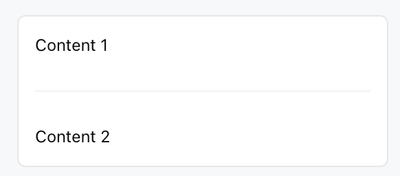
The following example shows how to insert a split line between two text content and set vertical spacing to 16px.
Template example:
<Card>
<Text value="Content 1" />
<Divider spacing="16px" />
<Text value="Content 2" />
</Card>
Effect display as follows:
flush Attribute Description
When flush is true:
The split line extends automatically to the edge of the parent container.
Automatically read the padding value of the parent container.