Spacer is a resilient blank component for creating scalable blank areas in layouts, helping child components align flexibly or adjust spacing in containers.
Basic Usage
By inserting a Spacer in the layout container, it automatically occupies the available space in the parent container, thereby controlling the spacing or alignment mode of control elements.
Template example:
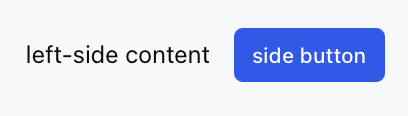
<Row>
<Text value="left-side content" />
<Spacer />
<Button label="side button" />
</Row>
Effect display as follows:
Attribute Description
Property Name
Type
Description
Default value
minSize
number | string
minimum size
-
How It Works
The Spacer component automatically fills the available space in its parent container.
In a Row container, blank space is filled horizontally.
In a Col container, blank space is filled vertically.