Input 输入框
下载
聚焦模式
字号
组件功能
单行文本输入组件,支持多种输入类型、验证规则和样式配置。
基础用法
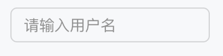
通过 name 与表单字段关联,placeholder 设置占位提示文本。
Template 示例:
<Input name="username" placeholder="请输入用户名" />
效果展示如下:
属性说明
属性名 | 类型 | 描述 | 默认值 |
name ★ | string | 表单字段名称 | - |
inputType | "number" | "email" | "text" | "password" | "tel" | "url" | 输入类型 | "text" |
defaultValue | string | 默认值 | - |
required | boolean | 是否必填 | false |
pattern | string | 验证正则表达式 | - |
placeholder | string | 占位符文本 | - |
allowAutofillExtensions | boolean | 允许自动填充扩展 | false |
autoSelect | boolean | 自动选中文本 | false |
autoFocus | boolean | 自动聚焦 | false |
disabled | boolean | 是否禁用 | false |
variant | "soft" | "outline" | 输入框样式变体 | "outline" |
size | "3xs" | "2xs" | "xs" | "sm" | "md" | "lg" | "xl" | "2xl" | "3xl" | 输入框尺寸 | "md" |
gutterSize | "2xs" | "xs" | "sm" | "md" | "lg" | "xl" | 内边距尺寸 | - |
pill | boolean | 是否为胶囊形状 | false |
注意:
★ 标记为必填属性。
文档反馈