Textarea
Download
Focus Mode
Font Size
Component Feature
The multi-line text input component supports automatic height adjustment, row limit, and multiple input validation options.
Basic Usage
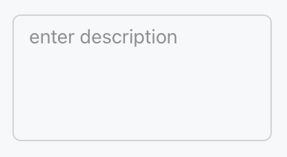
Associate with the form field by name, set placeholder prompt text, specify the initial number of rows, and support automatic height adjustment and input validation.
Template example:
<Textarea name="description" placeholder="enter description" rows={4} />
Effect display as follows:
Attribute Description
Property Name | Type | Description | Default value |
name ★ | string | Form field name | - |
defaultValue | string | Default value | - |
required | boolean | Required | false |
pattern | string | Verify regex | - |
placeholder | string | Placeholder text | - |
autoSelect | boolean | auto-select text | false |
autoFocus | boolean | auto-focus | false |
disabled | boolean | Disabled or not | false |
variant | "soft" | "outline" | Style variant | "outline" |
size | "3xs" | "2xs" | "xs" | "sm" | "md" | "lg" | "xl" | "2xl" | "3xl" | component size | "md" |
gutterSize | "2xs" | "xs" | "sm" | "md" | "lg" | "xl" | padding size | - |
rows | number | initial number of rows | 3 |
autoResize | boolean | Automatically adjust height required or not | false |
maxRows | number | maximum number of rows | - |
allowAutofillExtensions | boolean | Permission for automatic filling expansion | false |
Note:
Marked with required attribute.
Help and Support
Was this page helpful?
You can also Contact sales or Submit a Ticket for help.
Help us improve! Rate your documentation experience in 5 mins.
Feedback