Select 选择器
下载
聚焦模式
字号
组件功能
下拉选择组件,用于在预定义选项中选择值,支持自定义选项样式、图标和徽章。
基础用法
通过 name 与表单字段关联,placeholder 设置占位提示文本,options 定义下拉列表项,可为每个选项添加图标、徽章或描述信息。
Template 示例:
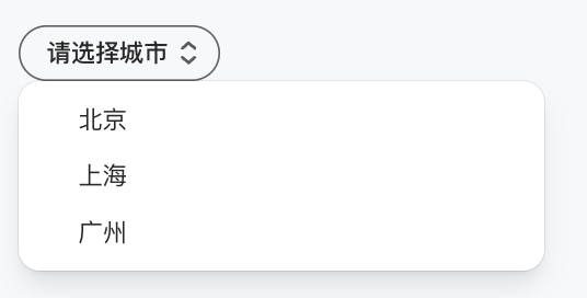
<Selectname="city"placeholder="请选择城市"options={[{ value: "beijing", label: "北京" },{ value: "shanghai", label: "上海" },{ value: "guangzhou", label: "广州" }]}/>
点击查看下拉选项。效果展示如下:
选择北京后,效果展示如下:

属性说明
属性名 | 类型 | 描述 | 默认值 |
name ★ | string | 表单字段名称 | - |
options ★ | SelectOption[] | 选项列表 | - |
onChangeAction | ActionConfig | 值变化时触发的动作 | - |
placeholder | string | 占位符文本 | - |
defaultValue | string | 默认选中值 | - |
variant | "outline" | "solid" | "soft" | "ghost" | 视觉样式 | "outline" |
size | "3xs" | "2xs" | "xs" | "sm" | "md" | "lg" | "xl" | "2xl" | "3xl" | 组件尺寸 | "md" |
pill | boolean | 是否为胶囊形状 | false |
block | boolean | 是否为块级元素 (100% 宽度) | false |
disabled | boolean | 是否禁用 | false |
clearable | boolean | 是否显示清空按钮 | false |
SelectOption 对象
属性名 | 类型 | 描述 | 默认值 |
value ★ | string | 选项值 | - |
label ★ | string | 选项显示文本 | - |
icon | string | 图标名称或 URL | - |
badge | string | 徽章文本 | - |
description | string | 描述文本 | - |
color | string | 选项颜色 | - |
disabled | boolean | 是否禁用 | false |
className | string | 自定义 CSS 类名 | - |
注意:
★ 标记为必填属性。
文档反馈