Checkbox
Download
Focus Mode
Font Size
Component Feature
Checkbox component for multiple selection in a form.
Basic Usage
Associate with the form field by name, set display text with label, and the user can check or uncheck it.
Template example:
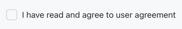
<Checkbox name="agree" label="I have read and agree to user agreement" />
Effect display as follows:
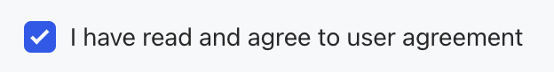
Check this box to display the effects as follows:
Attribute Description
Property Name | Type | Description | Default value |
name ★ | string | Form Field Name | - |
label | string | Checkbox tag text | - |
defaultChecked | string | boolean | Chosen by default (support "true"/"false" or boolean) | false |
onChangeAction | ActionConfig | Action triggered by status change | - |
disabled | boolean | Disable required or not | false |
required | boolean | Required | false |
Note:
★ Marked with required attribute.
Help and Support
Was this page helpful?
You can also Contact sales or Submit a Ticket for help.
Help us improve! Rate your documentation experience in 5 mins.
Feedback