RadioGroup
Download
Focus Mode
Font Size
Component Feature
Date selection component for selecting one date in a form, supports date range limit, clear operation and multiple style configurations.
Basic Usage
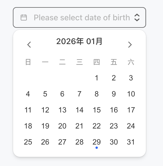
Bind with the form field by name, click the input box to pop up the date panel and select.
Template example:
<DatePicker name="birthday" placeholder="Please select date of birth" />
Effect display as follows:
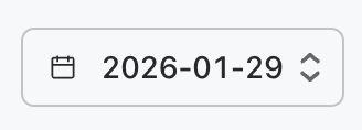
After selecting the date, the effect display as follows:
Attribute Description
Property Name | Type | Description | Default value |
name ★ | string | Form Field Name | - |
onChangeAction | ActionConfig | Action triggered by date change | - |
placeholder | string | Placeholder text when no date is selected | - |
defaultValue | string | Default value (ISO date format) | - |
min | string | Minimum date (ISO date format) | - |
max | string | Maximum date (ISO date format) | - |
variant | "solid" | "soft" | "outline" | "ghost" | visual style | "outline" |
size | "3xs" | "2xs" | "xs" | "sm" | "md" | "lg" | "xl" | "2xl" | "3xl" | component size | "md" |
side | "top" | "bottom" | "left" | "right" | date panel popup direction | "bottom" |
align | "start" | "center" | "end" | Date Panel Alignment Mode | "start" |
pill | boolean | whether it is capsule shape | false |
block | boolean | whether it is a block-level element | false |
clearable | boolean | whether to display the clear button | false |
disabled | boolean | whether to disable | false |
Note:
Marked with required attribute.
Date Format Description
Date-related properties (defaultValue, min, max) use ISO 8601 format.
"2024-12-26".
"2024-12-26T10:30:00Z".
Help and Support
Was this page helpful?
You can also Contact sales or Submit a Ticket for help.
Help us improve! Rate your documentation experience in 5 mins.
Feedback