Política de privacidade
Contrato de segurança e processamento de dados
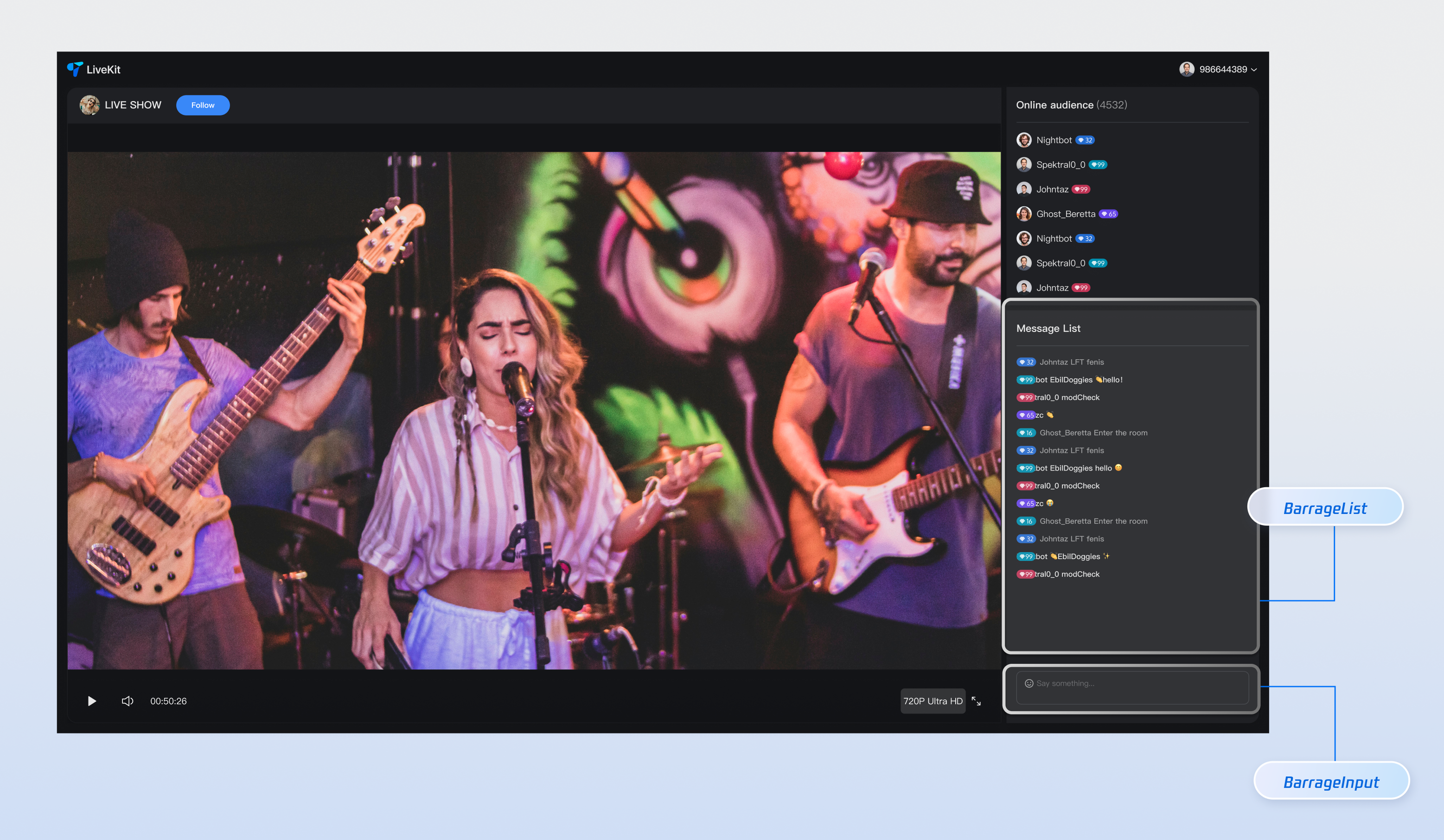
Component Name | Description |
Barrage Message Component (BarrageList) | Handles real-time display and management of chat messages, including message rendering, time-based grouping, user interactions, and responsive layouts. |
Message Input Component (BarrageInput) | Provides rich text editing and message sending capabilities, featuring an emoji picker, character limits, state management, and cross-platform support for a smooth messaging experience. |
npm install tuikit-atomicx-react @tencentcloud/uikit-base-component-react --savenpm install sass --save-dev
pnpm add tuikit-atomicx-react @tencentcloud/uikit-base-component-reactpnpm add sass --dev
yarn add tuikit-atomicx-react @tencentcloud/uikit-base-component-reactyarn add sass --dev
import React from "react";import { useUIKit } from "@tencentcloud/uikit-base-component-react";import { BarrageList, BarrageInput } from "tuikit-atomicx-react";import styles from "./MessageList.module.scss";const MessageList: React.FC = () => {const { t } = useUIKit();return (<div className={styles.livePlayer__messageList}><div className={styles.livePlayer__messageListTitle}><span>{t('live_player_view.message_list_title')}</span></div><div className={styles.livePlayer__messageListContent}><BarrageList /><BarrageInput /></div></div>);};export default MessageList;
.livePlayer__messageList {display: flex;flex-direction: column;flex: 1 0 auto;margin-top: 8px;padding: 8px;background: var(--uikit-bg-color-operate);.livePlayer__messageListTitle {padding: 12px 0;border-bottom: 1px solid var(--uikit-stroke-color-primary);@include text-size-16;}.livePlayer__messageListContent {display: flex;flex: 1;flex-direction: column;}}
Props | Type | Default Value | Description |
Message | Component | IBarrageMessageComponentProps | Custom message component renderer. |
containerStyle | CSSProperties | - | Custom message list container style. |
itemStyle | CSSProperties | - | Custom single message item style. |
height | String | - | Component height, supports CSS units. |
style | CSSProperties | - | Custom style for the root element. |
className | String | - | Custom CSS class name set on the component root DOM node. |
Props Name | Type | Default Value | Description |
containerClass | String | '' | Custom container CSS class name. |
containerStyle | CSSProperties | {} | Custom container inline style. |
width | String | - | Component width, supports CSS units. |
height | String | - | Component height, supports CSS units. |
minHeight | String | '40px' | Component minimum height, supports CSS units. |
maxHeight | String | '140px' | Component maximum height, supports CSS units. |
placeholder | String | - | Input box placeholder text. |
disabled | Boolean | false | Whether to disable the input box. |
autoFocus | Boolean | true | Whether to auto-focus the input box. |
maxLength | Number | 80 | Maximum character limit for input content. |
onFocus | () => void | - | Input box focus event handler. |
onBlur | () => void | - | Input box blur event handler. |
// Message List<BarrageListclassName="custom-barrage-list-name"style={{backgroundColor: "#FFFFFF"}}containerStyle={{backgroundColor: "#999999"}}itemStyle={{backgroundColor: "#000000"}}height="200px" />// Message Input<BarrageInputclassName="custom-barrage-input-name"autoFocusdisabled={false}width="100%"height="100px"placeholder="Enter barrage message"/>
import React from 'react';import { BarrageList } from 'tuikit-atomicx-react';import type { Barrage } from 'tuikit-atomicx-react';interface ICustomMessageComponentProps {message: Barrage;isLastInChunk?: boolean;style?: React.CSSProperties;}const CustomMessage: React.FC<ICustomMessageComponentProps> = ({ message }) => {return (<div className="my-message-item">{message.sender.userName}: {message.textContent}</div>);};// Use custom message component in the message list<BarrageListMessage={CustomMessage}/>
Feature | Description | Integration Guide |
Live Gift Component | Displays a gift catalog, supports sending gifts and gift animations. | |
Audience List Component | Displays current viewers in the live room. |
Esta página foi útil?
Você também pode entrar em contato com a Equipe de vendas ou Enviar um tíquete em caso de ajuda.
comentários