Web(Vue)
下载
聚焦模式
字号
本文介绍如何设置 Web 界面风格。
设置会话列表
TUIConversation 提供会话列表功能。会话列表主要由会话列表区组成,会话列表区提供了 UI 样式可供修改。
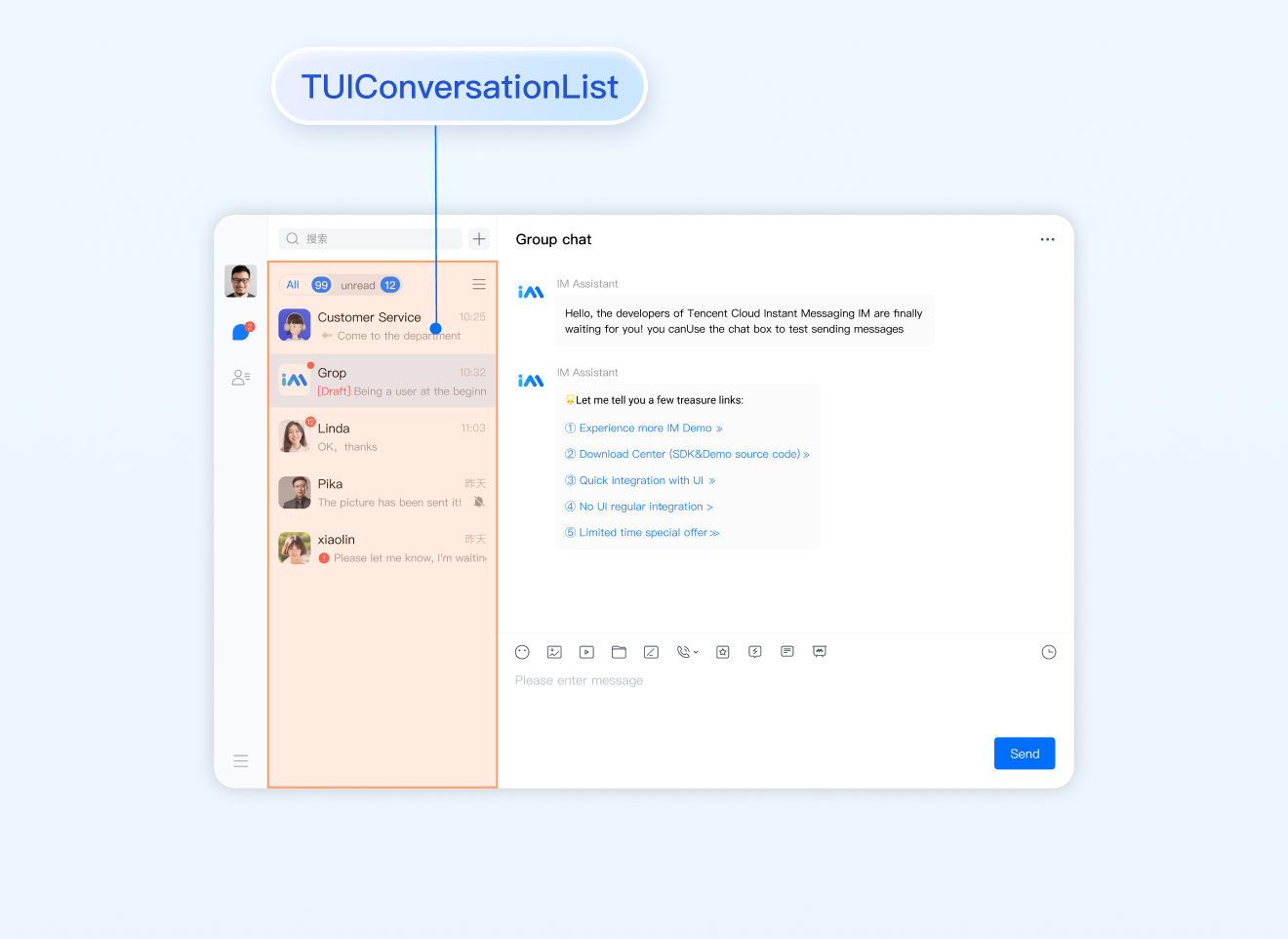
设置会话列表样式
登录后 TUIKit 会根据用户名从 SDK 读取该用户的会话列表。会话列表提供一些常用功能定制,例如头像样式、背景、字体大小、点击与长按事件等。
会话列表中单个列表项展示主要在路径
TUIKit/components/TUIConversation/conversation-list/index.vue 文件中。
示例代码如下:<template><div class="tui-conversation-list"><!-- Conversation List operation panel --><ActionsMenu .../><!-- Conversation List Main --><div v-for="(conversation, index) in conversationList" ...><!-- Conversation List Item --><div :class="['TUI-conversation-item']"><aside class="left"><!-- Avatar --><img class="avatar" :src="conversation.getAvatar()" /><!-- User Online Status --><div ... :class="['online-status']"></div><!-- Conversation Unread Count --><span class="num" ...>...</span><!-- Conversation Unread Red Dot(displayed in Do Not Disturb mode) --><span class="num-notify" ...>...</span></aside><div class="content"><div class="content-header"><!-- Conversation Name --><label class="content-header-label"><p class="name">{{ conversation.getShowName() }}</p></label><!-- Conversation Last Message --><div class="middle-box"><!-- Conversation Last Message When Mentiond --><span class="middle-box-at" ...>{{ conversation.getGroupAtInfo() }}</span><!-- Conversation Last Message Content --><p class="middle-box-content">{{ conversation.getLastMessage("text") }}</p></div></div><div class="content-footer"><!-- Conversation Lastest Message Time --><span class="time">{{ conversation.getLastMessage("time") }}</span><!-- Conversation Muted Flag --><Icon v-if="conversation.isMuted" :file="muteIcon"></Icon></div>...</template>
您可以在路径
TUIKit/components/TUIConversation/conversation-list/style/web.scss 下设置会话列表中列表项的样式。
设置会话列表中头像样式示例代码如下:.TUI-conversation {&-item {.left {.avatar {width: 30px; // avatar widthheight: 30px; // avatar heightborder-radius: 5px; // avatar border radius}}}}
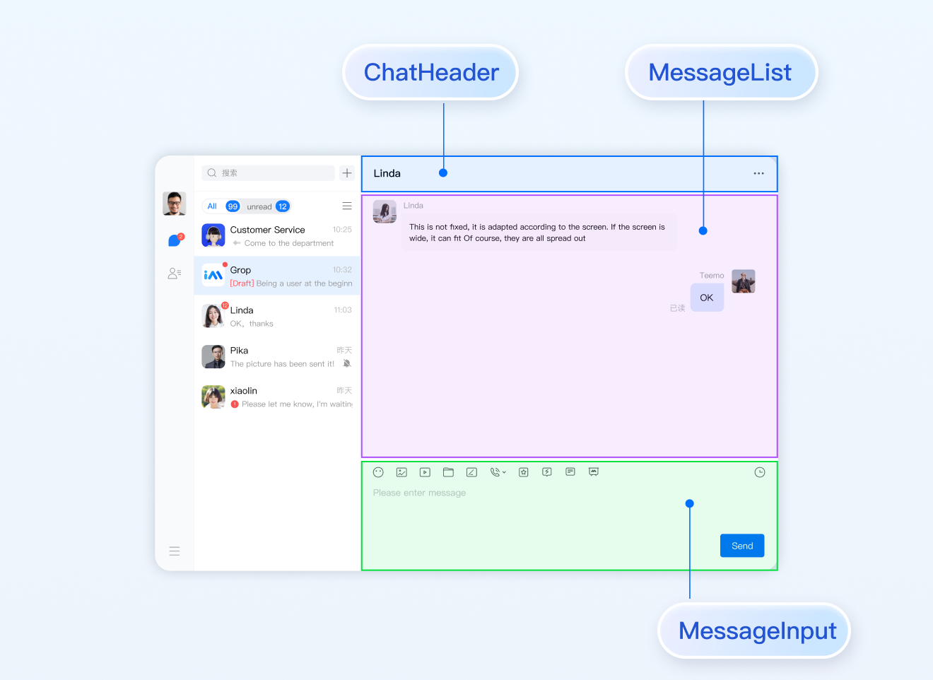
设置聊天窗口的样式
TUIChat 提供聊天窗口。聊天窗口包含三个区域,从上到下为标题栏区、消息区和输入区,如下图所示:
聊天窗口相关配置主要在路径
src/TUIKit/components/TUIChat 文件目录中。设置标题栏区样式
标题栏由左右三个区域组成,如下图所示:
聊天窗口标题栏相关代码主要在路径
src/TUIKit/components/TUIChat/chat-header/index.vue 文件中。聊天窗口标题栏区提供一些常用功能定制,例如背景、字体大小、按钮图标、点击事件、功能开关等。
示例代码如下:<template><div :class="['chat-header', !isPC && 'chat-header-h5']">...<!-- Chat name / [Typing...] status prompt--><div :class="['chat-header-content', ...]">{{ currentConversationName }}</div><!-- Group chat settings extension --><div :class="['chat-header-setting', ...]"><div v-for="(item, index) in extensions" :key="index" @click.stop="handleExtensions(item)"><Icon :file="item.icon"></Icon></div></div></div></template>
您可以在
src/TUIKit/components/TUIChat/chat-header/index.vue文件中设置聊天窗口标题栏区样式。
设置聊天窗口标题栏区的字体大小和背景色示例代码如下:.chat-header {background-color: #147AFF;// chat background color&-content{font-size: 16px;// chat name font size}}
设置消息区样式
设置聊天窗口的背景
您可以在路径
src/TUIKit/components/TUIChat/message-list/style/web.scss 下自定义设置聊天背景色或背景图片。
设置聊天窗口消息区的背景色的示例代码如下:.TUI-chat {...&-message-list {background-color: #006eff;}}
设置聊天窗口消息区的背景图片的示例代码如下:
.TUI-chat {...&-message-list {background-image: url(https://qcloudimg.tencent-cloud.cn/raw/176cddbfb778a4bb26a5d423056efe1d.png);}}
设置发送者的头像样式
消息区中的头像相关代码主要在路径
src/TUIKit/components/TUIChat/message-list/message-elements/message-bubble.vue 文件中, 采用公共组件 Avatar 实现。如果用户没有设置头像会显示默认头像,您可以自定义设置默认头像、头像是否圆角以及头像大小等。<Avatar> 组件:
参数名 | 参数类型 | 是否必须 | 默认值 | 参数描述 | |
url | string | 是 | "https://web.sdk.qcloud.com/component/TUIKit/assets/avatar_21.png" | 头像图片url | |
size | string | 否 | "36px" | 头像尺寸大小 | |
borderRadius | string | 否 | "5px" | 头像外边框圆角 | |
useSkeletonAnimation | boolean | 否 | false | 是否采用骨架屏 | |
设置默认头像配合骨架屏示例代码如下:
<AvataruseSkeletonAnimation:url="message.avatar || ''"/>
设置头像形状、大小示例代码如下:
<AvataruseSkeletonAnimation:url="message.avatar || ''"size="40px"borderRadius="0px"/>
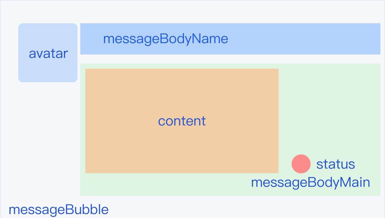
设置气泡的背景色
消息区中单条消息包括 avatar 头像、messageBodyName 昵称区域、content 内容区以及 status 状态区组成。content 区域可以解析展示包括文字、语音、图片、视频、文件、自定义消息等多种类型消息,结构如图所示:
聊天窗口消息区中,左边为对方的气泡,右边为自己的气泡,您可以在路径
src/TUIKit/components/TUIChat/message-list/message-elements/message-bubble.vue 文件中自定义设置双方的气泡背景。
设置消息气泡颜色示例代码如下:.message-bubble {.message-bubble-main-content {.message-body {.message-body-main {.content-in {background: #fbfbfb; // Set the color of the receiving message bubbleborder-radius: 0px 10px 10px 10px;}.content-out {background: #dceafd; // Set the color of the sender message bubbleborder-radius: 10px 0px 10px 10px;}}}}}
设置发送者的昵称样式
您可以在路径
src/TUIKit/components/TUIChat/message-list/message-elements/message-bubble.vue 文件中自定义设置昵称的字体大小与颜色等。
设置发送者昵称样式示例代码如下:.message-bubble {.message-bubble-main-content {.message-body {.message-body-nickName {font-weight: 500; // Set the font weight of the sender's nicknamefont-size: 14px; // Set sender nickname font sizecolor: #999999; // Set the font color of the sender's nickname}}}}
设置聊天内容样式
您可以在路径
src/TUIKit/components/TUIChat/message-list/message-elements/message-text.vue 文件中自定义设置聊天内容的字体大小、双方字体颜色、emoji 表情大小等。
设置聊天内容样式示例代码如下:.emoji {width: 20px;// emoji widthheight: 20px;// emoji height}.text {white-space: pre-wrap;font-size: 14px;// text message font sizecolor: #999999;// text message font color}
设置聊天的提示信息样式
您可以在路径
src/TUIKit/components/TUIChat/message-list/message-elements/message-tip.vue 文件中自定义设置提示信息的背景、字体大小以及字体颜色等。
示例代码如下:.message-tip {margin: 0 auto;color: #999999;// message tip font colorfont-size: 14px;// message tip font sizebackground: red;// message tip background color}
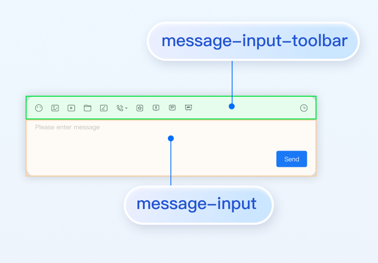
设置输入区域 InputView
输入区域包含文字输入、表情输入、图片发送、视频发送、文件发送、评价发送、常用语发送等功能。
隐藏不需要的功能
您可以自定义隐藏功能模块的发送图片、发送文件以及发送评价等功能。
输入区功能模块在
src/TUIKit/components/TUIChat/message-input-toolbar/index.vue 文件中进行注册,您可以在该文件中注释或删除您不需要的功能。
例如:不需要使用常用语功能,注释常用语 <Words> 组件,示例代码如下:<div><div><!-- Emoji Picker --><EmojiPicker v-if="!isUniFrameWork"></EmojiPicker><!-- Taking photos, only available on uniapp --><ImageUpload v-if="isUniFrameWork" imageSourceType="camera"></ImageUpload><!-- Image Upload --><ImageUpload imageSourceType="album"></ImageUpload><!-- File Upload --><FileUpload v-if="!isUniFrameWork"></FileUpload><!-- Video Upload --><VideoUpload videoSourceType="album"></VideoUpload><!-- Taking videos, only available on uniapp --><VideoUpload v-if="isUniFrameWork" videoSourceType="camera"></VideoUpload><!-- Evaluate --><Evaluate></Evaluate><!-- Commonly Used Phrases --><!-- <Words></Words> --></div></div>
交流与反馈
文档反馈