Mini Program Navigation Bar Icons
Download
Focus Mode
Font Size
Customize the navigation bar buttons
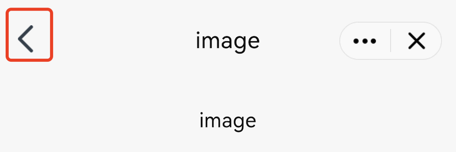
1. Back button
The default style of the Back button is as follows:
The Mini Program SDK allows you to customize the Back button by overriding the navBarBackRes method in AbsMiniUiProxy.
The API is defined as follows:
Method parameter mode: The color of the navigation bar title. 1 for black title, 0 for white title.
Method return value: The icon resource ID of the Back button.
/*** Customizes the Back button icon on the navigation bar. The required size is 24 × 43 pixels.* Calling environment: Subprocess** @param mode - Navigation bar title color. 1 for black title, 0 for white title.* @return*/@DrawableResint navBarBackRes(int mode);
Note:
The size of the Back button icon resource is required to be 24 × 43 pixels.
Example:
@Overridepublic int navBarBackRes(int mode) {if(mode == 0) {//blackreturn R.drawable.back_icon;//your black icon res}else {//whitereturn R.drawable.white_icon;//your white icon res}}
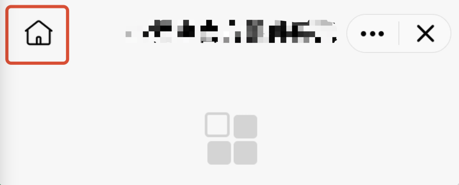
2. Home button
The default style of the Home button is as follows:
The Mini Program SDK allows you to customize the Home button by overriding the homeButtonRes method in AbsMiniUiProxy.
The API is defined as follows:
Method parameter mode: The color of the navigation bar title. 1 for black title, 0 for white title.
Method return value: The icon resource ID of the Home button.
/*** Customizes the Home button icon on the navigation bar. The required size is 48 × 48 pixels.* Calling environment: Subprocess** @param mode - Navigation bar title color. 1 for black title, 0 for white title.* @return*/@DrawableResint homeButtonRes(int mode);
Note:
The size of the Home icon on the navigation bar is required to be 48 × 48 pixels.
Example:
@Overridepublic int homeButtonRes(int mode) {if(mode == 0) {//blackreturn R.drawable.home_black_icon;}else {return R.drawable.home_white_icon;}}
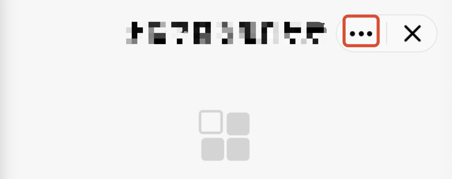
3. More button
The default style of the More button is as follows:
The Mini Program SDK allows you to customize the More button by overriding the moreButtonRes method in AbsMiniUiProxy.
The API is defined as follows:
Method parameter mode: The color of the navigation bar title. 1 for black title, 0 for white title.
Method return value: The icon resource ID of the More button.
/*** Customizes the More button icon on the navigation bar.The required size is 80 × 59 pixels.* Calling environment: Subprocess** @param mode - Navigation bar title color. 1 for black title, 0 for white title.* @return*/@DrawableResint moreButtonRes(int mode);
Note:
The size of the More button icon on the navigation bar is required to be 80 × 59 pixels.
Example:
@Overridepublic int moreButtonRes(int mode) {if(mode == 0) {//blackreturn R.drawable.more_black_icon;}else {return R.drawable.more_white_icon;}}
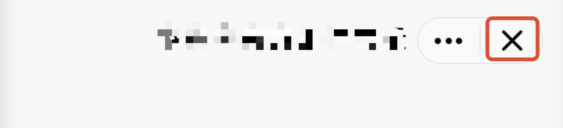
4. Close button
The default style of the Close button is as follows:
The Mini Program SDK allows you to customize the Close button by the following method.
Customize the Close button:
Override the closeButtonRes method in AbsMiniUiProxy.
The API is defined as follows:
API description:
Method parameter mode: The color of the navigation bar title. 1 for black title, 0 for white title.
Method return value: The icon resource ID of the Close button.
/*** Customizes the Close button icon on the navigation bar. The required size is 80 × 59 pixels.* Calling environment: Subprocess** @param mode - Navigation bar title color. 1 for black title, 0 for white title.* @return*/@DrawableResint closeButtonRes(int mode);
Note:
The size of the Close button icon on the navigation bar is required to be 80 × 59 pixels.
Example:
@Overridepublic int closeButtonRes(int mode) {if(mode == 0) {//blackreturn R.drawable.close_black_icon;}else {return R.drawable.close_white_icon;}}
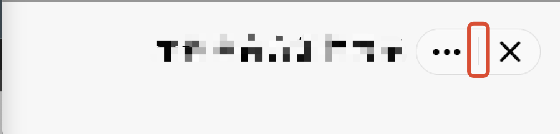
5. Capsule button divider line
The default style of the capsule button divider line is as follows:
The Mini Program SDK allows you to the capsule button divider line by overriding the lineSplitBackgroundColor method in AbsMiniUiProxy.
The API is defined as follows:
Method return value:The background color of the divider line.
/*** The background color of the divider line* Calling environment: Subprocess** @return*/@DrawableResint lineSplitBackgroundColor();
Example:
@Overridepublic int lineSplitBackgroundColor() {return Color.RED;}
Help and Support
Was this page helpful?
You can also Contact sales or Submit a Ticket for help.
Help us improve! Rate your documentation experience in 5 mins.
Feedback