tencent cloud

Tencent Cloud Agent Development Platform

Release Notes and Announcements
Release Notes
Product Announcement
Product Introduction
Product Overview
Advantages
Use Cases
Model Introduction
Purchase Guide
Package Subscription
Previous Version
Getting Started
Agent Application and Its Three Modes
Creating a "Content Summary Assistant" in Standard Mode
Creating a “Webpage Scraping Assistant” in Single Workflow Mode
Creating a “Stand-up Comedy Content Creation Assistant” in Multi-Agent Mode
Operation Guide
Application Development
Workflow
Multi-Agent
Knowledge Base
Widget
Plugin Marketplace
Model List 
Prompt Templates
Application Templates
Platform Management
Business, Workspace and Permissions
API Documentation
History
API Category
Making API Requests
Atomic Capability APIs
Operation Optimization APIs
Document Library APIs
Q&A Database APIs
Knowledge Tag APIs
Application Management APIs
Enterprise Management APIs
Billing APIs
Release Management APIs
Dialogue Endpoint APIs
Data Statistics APIs
Data Types
Error Codes
Application API Documentation
Dialogue API Overview
Dialog API Documentation (WebSocket)
Dialog API Documentation (HTTP SSE)
Image Chat or File Chat (Real-time Document Parsing + Chat)
Offline Document Upload
Tencent Cloud Agent Development Platform Operation COS Guide
ADP Document Parsing Protocol
FAQs
Product FAQs
Technical FAQs
Related Agreements
Tencent Cloud Agent Development Platform Service Level Agreement
Tencent Cloud Agent Development Platform Service Specific Terms
Tencent Cloud Agent Development Platform Privacy Policy
Tencent Cloud Agent Development Platform Data Processing and Security Agreement
Open-Source License Statement
Lighthouse OpenClaw Connector Plugin Service Agreement
Contact Us
Glossary

Badge

PDF
Mode fokus
Ukuran font
Terakhir diperbarui: 2026-02-03 15:50:39

Component Feature

A component for display status, tag or number tag, supporting various colors, sizes and style variants, configured as normal or capsule shape.

Basic Usage

Set the badge text via label, and control the color and style with color and variant.
Template example:
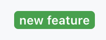
<Badge label="new feature" color="success" variant="solid" />
Effect display as follows:


Attribute Description

Property Name
Type
Description
Default value
label
string
Badge text content
-
color
"secondary" | "success" | "danger" | "warning" | "info" | "discovery"
Badge color
"secondary"
variant
"solid" | "soft" | "outline"
Badge style variant
"solid"
size
"sm" | "md" | "lg"
Badge size
"md"
pill
boolean
whether it is capsule shape
false
Note:
★ Marked with required attribute.

Color Description

secondary: minor/default color
success: success/green
danger: dangerous/red
warning: warning/yellow
info: info/blue
discovery: found/purple

Style Variant Description

solid: solid fill
soft: soft background
outline: border style


Bantuan dan Dukungan

Apakah halaman ini membantu?

masukan