tencent cloud

Tencent Cloud Agent Development Platform

Release Notes and Announcements
Release Notes
Product Announcement
Product Introduction
Product Overview
Advantages
Use Cases
Model Introduction
Purchase Guide
Package Subscription
Previous Version
Getting Started
Agent Application and Its Three Modes
Creating a "Content Summary Assistant" in Standard Mode
Creating a “Webpage Scraping Assistant” in Single Workflow Mode
Creating a “Stand-up Comedy Content Creation Assistant” in Multi-Agent Mode
Operation Guide
Application Development
Workflow
Multi-Agent
Knowledge Base
Widget
Plugin Marketplace
Model List 
Prompt Templates
Application Templates
Platform Management
Business, Workspace and Permissions
API Documentation
History
API Category
Making API Requests
Atomic Capability APIs
Operation Optimization APIs
Document Library APIs
Q&A Database APIs
Knowledge Tag APIs
Application Management APIs
Enterprise Management APIs
Billing APIs
Release Management APIs
Dialogue Endpoint APIs
Data Statistics APIs
Data Types
Error Codes
Application API Documentation
Dialogue API Overview
Dialog API Documentation (WebSocket)
Dialog API Documentation (HTTP SSE)
Image Chat or File Chat (Real-time Document Parsing + Chat)
Offline Document Upload
Tencent Cloud Agent Development Platform Operation COS Guide
ADP Document Parsing Protocol
FAQs
Product FAQs
Technical FAQs
Related Agreements
Tencent Cloud Agent Development Platform Service Level Agreement
Tencent Cloud Agent Development Platform Service Specific Terms
Tencent Cloud Agent Development Platform Privacy Policy
Tencent Cloud Agent Development Platform Data Processing and Security Agreement
Open-Source License Statement
Lighthouse OpenClaw Connector Plugin Service Agreement
Contact Us
Glossary

Textarea

PDF
Mode fokus
Ukuran font
Terakhir diperbarui: 2026-02-03 16:18:51

Component Feature

The multi-line text input component supports automatic height adjustment, row limit, and multiple input validation options.

Basic Usage

Associate with the form field by name, set placeholder prompt text, specify the initial number of rows, and support automatic height adjustment and input validation.
Template example:
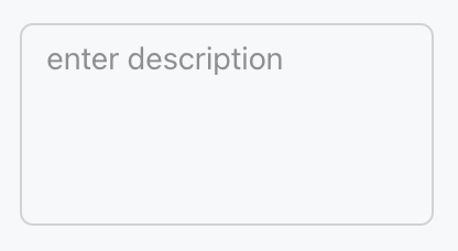
<Textarea name="description" placeholder="enter description" rows={4} />
Effect display as follows:


Attribute Description

Property Name
Type
Description
Default value
name
string
Form field name
-
defaultValue
string
Default value
-
required
boolean
Required
false
pattern
string
Verify regex
-
placeholder
string
Placeholder text
-
autoSelect
boolean
auto-select text
false
autoFocus
boolean
auto-focus
false
disabled
boolean
Disabled or not
false
variant
"soft" | "outline"
Style variant
"outline"
size
"3xs" | "2xs" | "xs" | "sm" | "md" | "lg" | "xl" | "2xl" | "3xl"
component size
"md"
gutterSize
"2xs" | "xs" | "sm" | "md" | "lg" | "xl"
padding size
-
rows
number
initial number of rows
3
autoResize
boolean
Automatically adjust height required or not
false
maxRows
number
maximum number of rows
-
allowAutofillExtensions
boolean
Permission for automatic filling expansion
false
Note:
Marked with required attribute.


Bantuan dan Dukungan

Apakah halaman ini membantu?

masukan