tencent cloud

Tencent Cloud Agent Development Platform

Release Notes and Announcements
Release Notes
Product Announcement
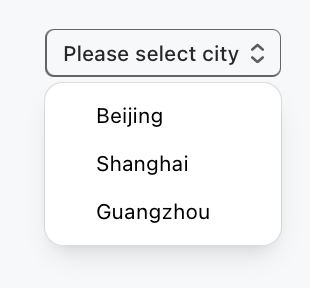
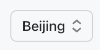
Product Introduction
Product Overview
Advantages
Use Cases
Model Introduction
Purchase Guide
Package Subscription
Previous Version
Getting Started
Agent Application and Its Three Modes
Creating a "Content Summary Assistant" in Standard Mode
Creating a “Webpage Scraping Assistant” in Single Workflow Mode
Creating a “Stand-up Comedy Content Creation Assistant” in Multi-Agent Mode
Operation Guide
Application Development
Workflow
Multi-Agent
Knowledge Base
Widget
Plugin Marketplace
Model List 
Prompt Templates
Application Templates
Platform Management
Business, Workspace and Permissions
API Documentation
History
API Category
Making API Requests
Atomic Capability APIs
Operation Optimization APIs
Document Library APIs
Q&A Database APIs
Knowledge Tag APIs
Application Management APIs
Enterprise Management APIs
Billing APIs
Release Management APIs
Dialogue Endpoint APIs
Data Statistics APIs
Data Types
Error Codes
Application API Documentation
Dialogue API Overview
Dialog API Documentation (WebSocket)
Dialog API Documentation (HTTP SSE)
Image Chat or File Chat (Real-time Document Parsing + Chat)
Offline Document Upload
Tencent Cloud Agent Development Platform Operation COS Guide
ADP Document Parsing Protocol
FAQs
Product FAQs
Technical FAQs
Related Agreements
Tencent Cloud Agent Development Platform Service Level Agreement
Tencent Cloud Agent Development Platform Service Specific Terms
Tencent Cloud Agent Development Platform Privacy Policy
Tencent Cloud Agent Development Platform Data Processing and Security Agreement
Open-Source License Statement
Lighthouse OpenClaw Connector Plugin Service Agreement
Contact Us
Glossary

Select

PDF
Mode fokus
Ukuran font
Terakhir diperbarui: 2026-02-03 16:21:03

Component Feature

Dropdown selection component for selecting values from predefined options, supports custom option styles, icons, and badges.

Basic Usage

Associate with the form field by name, set placeholder text, define drop-down list items in options, and add an icon, badge, or description for each option.
Template example:
<Select
name="city"
placeholder="Please select city"
options={[
{ value: "beijing", label: "Beijing" },
{ value: "shanghai", label: "Shanghai" },
{ value: "guangzhou", label: "Guangzhou" }
]}
/>
Click to view the dropdown option. Effect display as follows:


Select Beijing, and the effect display as follows:


Attribute Description

Property Name
Type
Description
Default value
name
string
Form Field Name
-
options
SelectOption[]
Option List
-
onChangeAction
ActionConfig
Action triggered on value change
-
placeholder
string
Placeholder text
-
defaultValue
string
Default Value
-
variant
"outline" | "solid" | "soft" | "ghost"
visual style
"outline"
size
"3xs" | "2xs" | "xs" | "sm" | "md" | "lg" | "xl" | "2xl" | "3xl"
component size
"md"
pill
boolean
whether the shape is capsule
false
block
boolean
whether the element is block-level (100% width)
false
disabled
boolean
Disabled or not
false
clearable
boolean
whether to display the clear button
false

SelectOption Object

Property Name
Type
Description
Default value
value
string
Option value
-
label
string
Option display text
-
icon
string
icon name or URL
-
badge
string
badge text
-
description
string
Description text
-
color
string
Option color
-
disabled
boolean
Disabled or not
false
className
string
Customize CSS class name
-
Note:
Marked with required attribute.


Bantuan dan Dukungan

Apakah halaman ini membantu?

masukan