Release Notes
Product Announcement
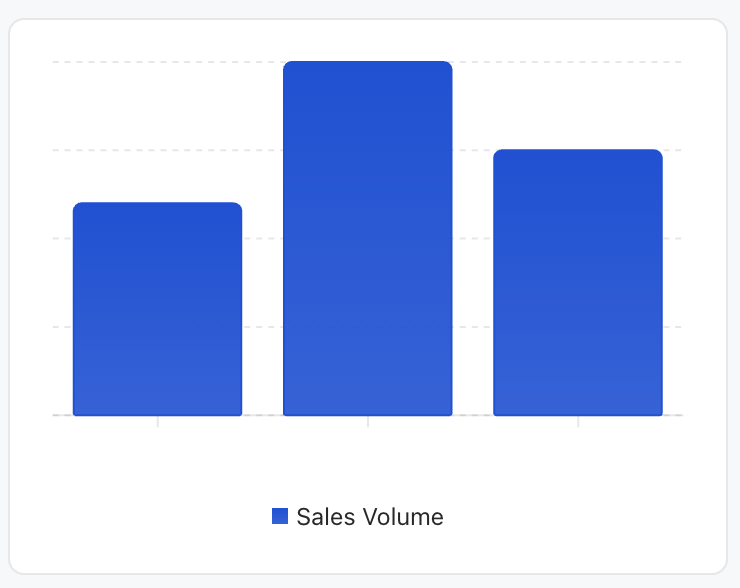
<Card><ChartxAxis="month"data={[{ month: 'January', sales: 120 }{ month: 'February', sales: 200 }{ month: 'March', sales: 150 }]}series={[{ type: 'bar', dataKey: 'sales', label: 'Sales Volume', color: '#0052D9' },]}/></Card>
Property Name | Type | Description | Default value |
data ★ | ChartDataRow[] | Chart data array | - |
series ★ | SeriesConfig[] | Series configuration array | - |
xAxis ★ | string | XAxisConfig | X-axis configuration or data field name | - |
width | number | string | Chart width | - |
size | number | string | Chart size | - |
minWidth | number | string | minimum width | - |
maxWidth | number | string | Maximum width | - |
showTooltip | boolean | display prompt box | true |
showYAxis | boolean | Display the Y axis | false |
showLegend | boolean | Displaying the legend | true |
barGap | number | string | Bar Chart spacing | - |
barCategoryGap | number | string | Histogram category spacing | - |
flex | number | string | Flex value | - |
aspectRatio | number | string | Aspect Ratio (for example 16/9) | 4/3 |
data-w-container attribute): chart width defaults to 100%, self adaptive to the container.width/size: chart width defaults to 260px.aspectRatio (4:3).{[key: string]: any; // for example date, Desktop, Mobile}
type property. If all series types are identical, use the corresponding chart container. If types are different, use the combo chart mode.{type: "bar";dataKey: string; // data field namelabel?: string; // series tagcolor?: string; // bar colorstack?: string; // Stack group ID}
{type: "line";dataKey: string;label?: string;color?: string;curveType?: CurveType; // Curve type}
{type: "area";dataKey: string;label?: string;color?: string;curveType?: CurveType;stack?: string;}
Property Name | Type | Description | Default value |
dataKey ★ | string | data field name | - |
label | string | number | object | coordinate axis tag | - |
type | "number" | "category" | Coordinate axis type | "category" |
hide | boolean | whether to hide | false |
angle | number | Tick rotation angle | - |
tickMargin | number | Tick spacing | - |
allowDuplicatedCategory | boolean | Allow duplicate categories | false |
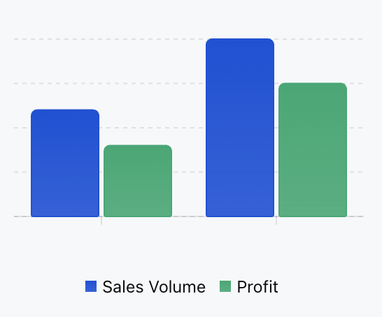
"basis" - basis curve"linear" - straight line"natural" - natural curve"monotoneX" - X-axis monotonic curve"monotoneY" - Y-axis monotonic curve"step" - step curve"stepBefore" - step before"stepAfter" - step after<ChartxAxis="month"data={[{ month: "January", sales: 120, profit: 80 }{ month: "February", sales: 200, profit: 150 }]}series={[{ type: "bar", dataKey: "sales", label: "Sales Volume", color: "#0052D9" },{ type: "bar", dataKey: "profit", label: "Profit", color: "#00A870" }]}/>
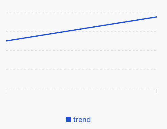
<ChartxAxis="date"data={[{ date: '2024-01', value: 100 },{ date: '2024-02', value: 150 },]}series={[{type: 'line',dataKey: 'value',label: 'trend'color: '#0052D9',},]}/>
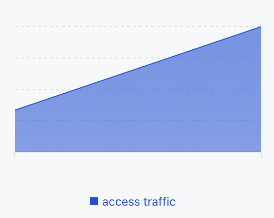
<ChartxAxis="time"data={[{ time: "00:00", visitors: 100 },{ time: "12:00", visitors: 300 }]}series={[{type: "area",dataKey: "visitors",label: "access traffic"color: "#0052D9"}]}/>
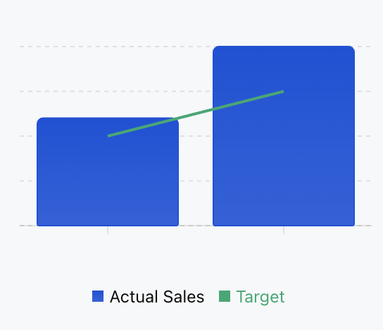
<ChartxAxis="month"data={[{ month: "January", sales: 120, target: 100 }{ month: "February", sales: 200, target: 150 }]}series={[{ type: "bar", dataKey: "sales", label: "Actual Sales", color: "#0052D9" },{ type: "line", dataKey: "target", label: "Target", color: "#00A870" }]}/>
Apakah halaman ini membantu?
Anda juga dapat Menghubungi Penjualan atau Mengirimkan Tiket untuk meminta bantuan.
masukan