Live Stream Video Component(Web Desktop Browser)
Download
포커스 모드
폰트 크기
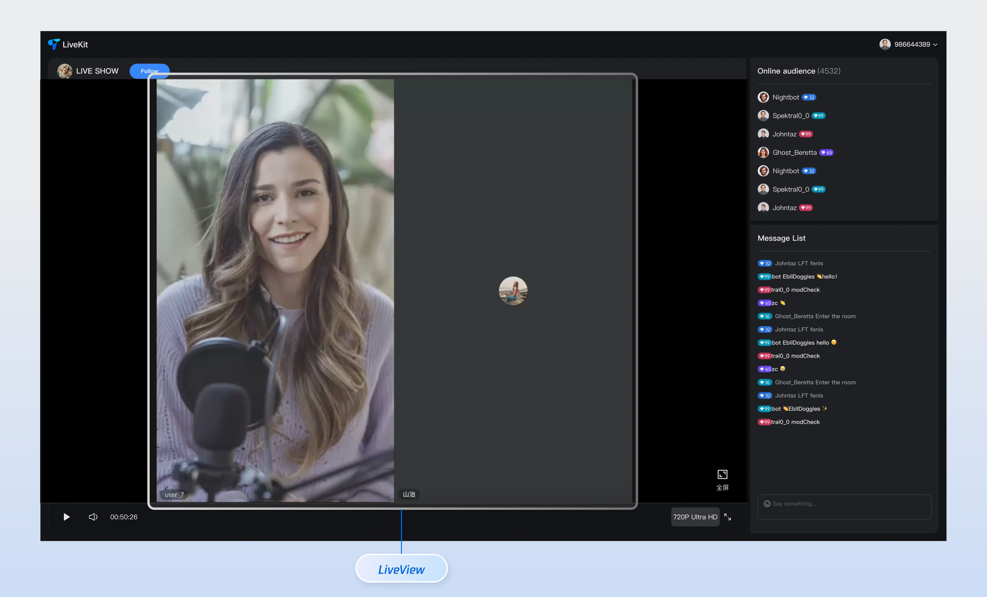
This document provides a detailed introduction to the live stream video component (LiveView). You can refer to the sample code in this document to integrate our pre-developed components into your existing project, or customize the style and layout according to your needs by following the component customization section in the document.
Core Features
Feature Category | Specific Capacity |
Smart stream switchover | LiveView can switch stream types automatically based on the current user's identity (audience or host). Audience mode: The component plays ultra-low-latency video streams to ensure smooth viewing for millions of audience members while drastically reducing traffic costs. Connected mode: The component automatically switches to TRTC streaming, providing millisecond-level ultra-low latency to ensure real-time, clear interaction experience between connected users. |
Customizable UI | To meet diverse business scenarios, LiveView provides custom UI slots, enabling full control over the co-broadcasting user's video stream area. You can rewrite the UI display, flexibly define the user's avatar, nickname, status, and other information, and easily create a unique visual experience that matches your brand style. |
Component Integration
Step 1: Configuring the Environment and Activating the Service
Before quick integration, you need to refer to preparations, meet the related environment configuration and activate the corresponding service.
Step 2: Dependency Installation
npm install tuikit-atomicx-vue3 @tencentcloud/uikit-base-component-vue3 --save
pnpm add tuikit-atomicx-vue3 @tencentcloud/uikit-base-component-vue3
yarn add tuikit-atomicx-vue3 @tencentcloud/uikit-base-component-vue3
Step 3: Joining the Live Room and Performing Voice Chat
Introduce and use LiveView in your project. Copy the following example code directly to your project to join the corresponding live streaming room for co-streaming.
<template><UIKitProvider theme="dark" language="zh-CN"><div class="app"><LiveView /></div></UIKitProvider></template><script setup lang="ts">import { onMounted } from 'vue';import { UIKitProvider } from '@tencentcloud/uikit-base-component-vue3';import { LiveView, useLoginState, useLiveState, useCoGuestState } from 'tuikit-atomicx-vue3';const { login } = useLoginState();const { joinLive } = useLiveState();const { sendCoGuestRequest } = useCoGuestState();async function initLogin() {try {await login({sdkAppId: 0, // SDKAppID, see Step 1 to getuserId: '', // UserID, see Step 1 to getuserSig: '', // userSig, see Step 1 to get});} catch (error) {console.error('login error:', error);}}onMounted(async () => {await initLogin();// After the audience enters the live room// LiveView starts VOD automatically with ultra-low latencyawait joinLive({liveId: 'existing live streaming room Id',})// The client can join the live room by calling the corresponding method and switch mic as needed.// After the audience successfully goes on mic, LiveView autoplays TRTC streaming.await sendCoGuestRequest();});</script><style>.app {width: 100vw; height: 100vh; display: flex; justify-content: center; align-items: center}</style>
Component Customization
LiveView provides flexible component customization slots. These slots support adjusting the style and layout of elements like avatars, nicknames, and status based on your needs, and also allow customizing the video stream area UI for co-streaming. Below are usage examples for the slots.
Component Slot
Name | Parameter | Description |
streamViewUI | userInfo | Display UI for custom seat |
// Example of using the streamViewUI slot<LiveView><CustomSeatViewUI #streamViewUI></CustomSeatViewUI></LiveView>
1.
userInfo defines the basic info and status of each seat in a live streaming room:Parameter | Type | Required | Description |
userInfo | userInfo | optional | User information of the current occupant in this seat. If the seat is empty, it is undefined. |
interface SeatInfo {userInfo?: SeatUserInfo; // User info on the seat (optional)}
2.
userInfo defines the user details of each seat in a live streaming room:Parameter | Type | Required | Description |
roomId | string | Required | The unique identifier of the current live streaming room, used to distinguish different live streaming rooms |
userId | string | Required | User's unique identifier must be unique in the entire system |
userName | string | Required | The name displayed for users in live streams supports Chinese and English characters. |
avatarUrl | string | Required | The complete URL address of the user profile photo, supporting HTTPS protocol |
microphoneStatus | DeviceStatus | Required | Microphone status |
microphoneStatusReason | DeviceStatusReason | Required | The cause for mic status change, to distinguish between user proactive operation and administrator operation |
cameraStatus | DeviceStatus | Required | Camera status |
cameraStatusReason | DeviceStatusReason | Required | The cause for camera status change, to distinguish between user proactive operation and administrator operation |
interface SeatUserInfo {roomId: string; // Live streaming room IDuserId: string; // Unique user IDuserName: string; // User Display NameavatarUrl: string; // User Avatar URLmicrophoneStatus: DeviceStatus; // Microphone StatusallowOpenMicrophone: boolean; // Whether to allow turning on microphonecameraStatus: DeviceStatus; // Camera StatusallowOpenCamera: boolean; // Whether to allow turning on camera}export type SeatUserInfo = {liveId: string; // Live streaming room IDuserId: string; // Unique user IDuserName: string; // User Display NameavatarUrl: string; // User Avatar URLmicrophoneStatus: DeviceStatus; // Microphone StatusmicrophoneStatusReason: DeviceStatusReason; // Reason for the modificationcameraStatus: DeviceStatus; // Camera StatuscameraStatusReason: DeviceStatusReason; // Reason for the modification}
3.
RegionInfo defines the display area and hierarchical information of the seat in the video canvas:Parameter | Type | Required | Description |
x | number | Required | X-coordinate of the region's top-left corner relative to the canvas (pixel value) |
y | number | Required | Y-coordinate of the region's top-left corner relative to the canvas (pixel value) |
w | number | Required | Width of the region (pixel value), must be greater than 0 |
h | number | Required | Height of the region (pixel value), must be greater than 0 |
zOrder | number | Required | Z-order, the larger the value, the more positioned towards the front, for processing display priority of overlap regions |
interface RegionInfo {x: number; // Top-left X-axis coordinate of the regiony: number; // Top-left Y-axis coordinate of the regionw: number; // Region widthh: number; // Region heightzOrder: number; // Z-order}
Custom Slot Example
To help you better experience and understand the customized capability of the LiveView component's streamViewUI slot, we provide a live streaming and mic connection scenario example for your reference. You can refer to the above Step 3 to incrementally copy the following code into your project to achieve a similar scenario effect.
<template><LiveView><template #streamViewUI="{ userInfo }"><divclass="live-stream-view":class="{ 'is-anchor': isAnchor(userInfo), 'is-guest': !isAnchor(userInfo) }"><!-- Video stream area --><div class="video-area"><!-- The video stream will be rendered automatically --></div><!-- User information overlay --><div class="user-overlay"><div class="user-badge" :class="{ 'anchor-badge': isAnchor(userInfo) }">{{ isAnchor(userInfo) ? 'Anchor' : 'Audience' }}</div><div class="user-name">{{ userInfo.userName }}</div><div class="device-status"><span :class="['mic', userInfo.microphoneStatus]"></span><span :class="['camera', userInfo.cameraStatus]"></span></div></div></div></template></LiveView></template><script setup lang="ts">import { LiveView } from 'tuikit-atomicx-vue3';import type { SeatUserInfo } from 'tuikit-atomicx-vue3';// Determine whether it is an anchor (based on business logic)const isAnchor = (userInfo: SeatUserInfo) => {// Here you can judge based on uid and rolereturn userInfo.userId.includes('anchor') || userInfo.userName.includes('Anchor');};</script><style scoped>.live-stream-view{position:relative;width:100%;height:100%;border-radius:8px;overflow:hidden}.live-stream-view.is-anchor{border:3px solid #ff6b35;box-shadow:0 0 20px rgba(255,107,53,.3)}.live-stream-view.is-guest{border:1px solid #ddd}.video-area{width:100%;height:100%;background:#000}.user-overlay{position:absolute;bottom:0;left:0;right:0;background:linear-gradient(transparent,rgba(0,0,0,.8));padding:10px;color:#fff}.user-badge{display:inline-block;padding:2px 8px;border-radius:10px;font-size:12px;margin-bottom:5px;background:#666}.anchor-badge{background:#ff6b35;color:#fff}.user-name{font-weight:700;margin-bottom:5px}.device-status span{margin-right:5px;opacity:.8}.device-status .camera.Off,.device-status .mic.Off{opacity:.3}</style>
피드백