TUILiveKit Release Notes
Live SDK Release Notes
Feature Category | Specific Capability |
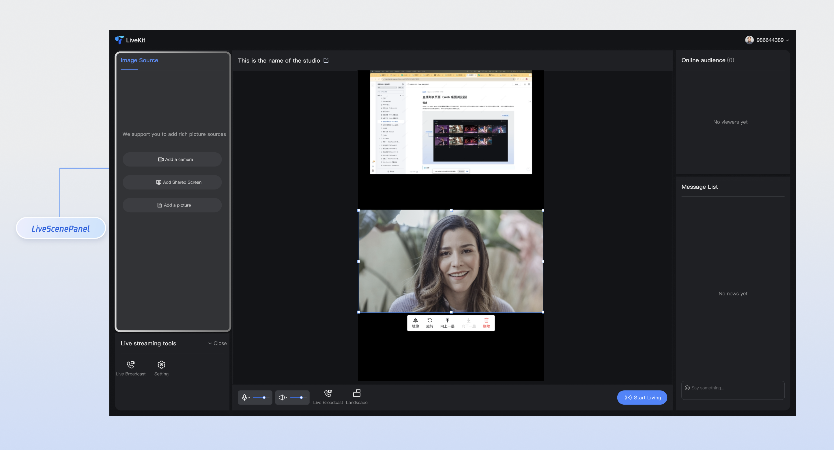
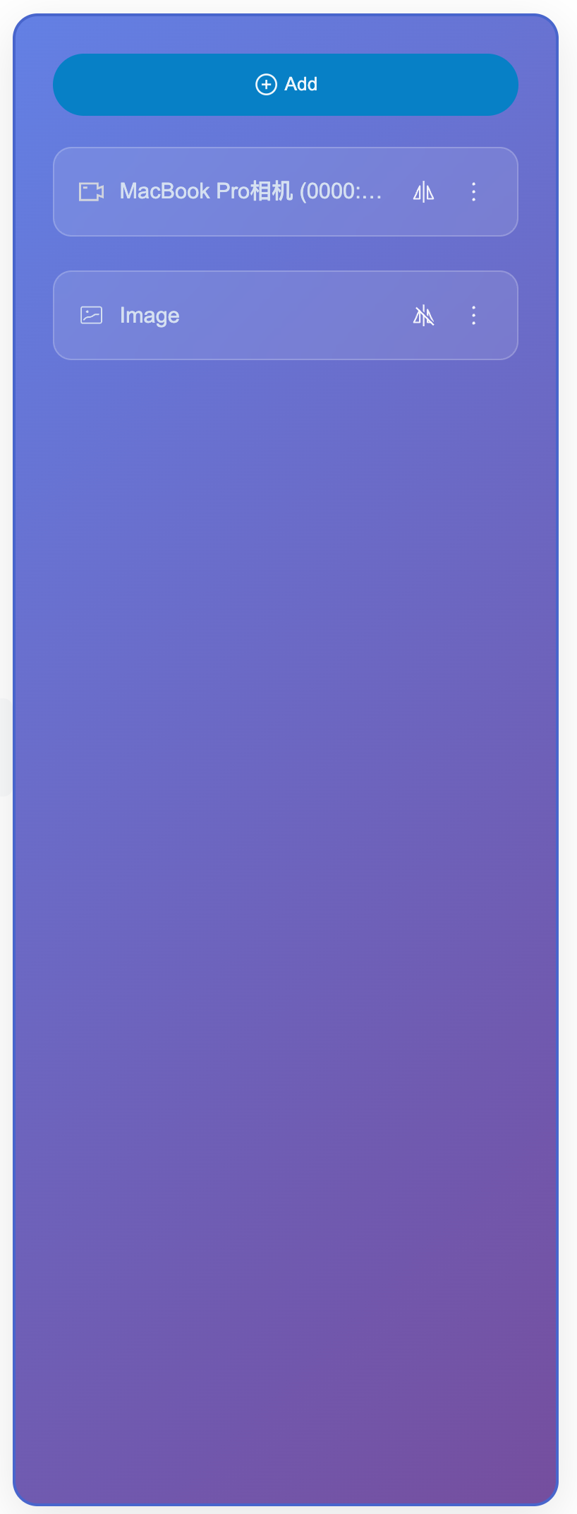
Multi-material type support | Camera, screen sharing, image, video, text and multiple material types, support device selection and parameter configuration. |
Intelligent display mode | Display the full panel when no material is present, and automatically switch to compact button mode when material is available, with responsive layout adaptation. |
Material management operations | Complete material management features including addition, editing, rename, deletion, and sorting, with support for batch operations. |
Real-time preview configuration | Camera configuration pop-up provides real-time preview, supports parameter adjustment and device testing. |
Permission and Error Handling | Automated permission check, Friendly error prompt and retry mechanism to guarantee user experience. |
npm install tuikit-atomicx-vue3 @tencentcloud/uikit-base-component-vue3 --save
pnpm add tuikit-atomicx-vue3 @tencentcloud/uikit-base-component-vue3
yarn add tuikit-atomicx-vue3 @tencentcloud/uikit-base-component-vue3
<template><UIKitProvider theme="dark" language="en-US"><div class="app-container"><LiveScenePanel class="live-scene-panel" /></div></UIKitProvider></template><script setup lang="ts">import { onMounted } from 'vue';import { UIKitProvider } from '@tencentcloud/uikit-base-component-vue3';import { LiveScenePanel, useLoginState } from 'tuikit-atomicx-vue3';const { login } = useLoginState();async function initLogin() {try {await login({sdkAppId: 0, // SDKAppID, see Step 1 to get ituserId: '', // UserID, see Step 1 to get ituserSig: '', // userSig, see Step 1 to get it});} catch (error) {console.error('login error:', error);}}onMounted(async () => {await initLogin();});</script><style scoped>.app-container{width:100vw;height:100vh;display:flex;justify-content:center;align-items:center;padding:20px;box-sizing:border-box}.live-scene-panel{width:20%;height:80vh;background:rgba(0,0,0,0.8);border-radius:16px}</style>
<template><LiveScenePanel class="custom-live-scene-panel" /></template><style>.app-container{width:100vw;height:100vh;display:flex;justify-content:center;align-items:center;padding:20px;box-sizing:border-box}.custom-live-scene-panel{width:100%;max-width:300px;height:80vh;background:linear-gradient(135deg,#667eea 0%,#764ba2 100%);border:2px solid #4c63d2;border-radius:16px;padding:24px;box-shadow:0 8px 32px rgba(0,0,0,0.1);color:white}.custom-live-scene-panel .add-material-item{background-color:#147fcb!important;color:white;border:none;border-radius:0!important;padding:12px 24px;font-weight:600;transition:all 0.3s ease}.custom-live-scene-panel .materials-list{margin-top:20px;gap:16px;display:grid;grid-template-columns:repeat(auto-fill,minmax(200px,1fr))}.custom-live-scene-panel .material-item{background:rgba(255,255,255,0.1);border:1px solid rgba(255,255,255,0.2);border-radius:12px;padding:16px;backdrop-filter:blur(10px);transition:all 0.3s ease}.custom-live-scene-panel .material-item:hover{background:rgba(255,255,255,0.2);transform:scale(1.02)}</style>
Before modification | | After modification | |
Add Media Source Interface | Media Source Setting Interface | Add Media Source Interface | Media Source Setting Interface |
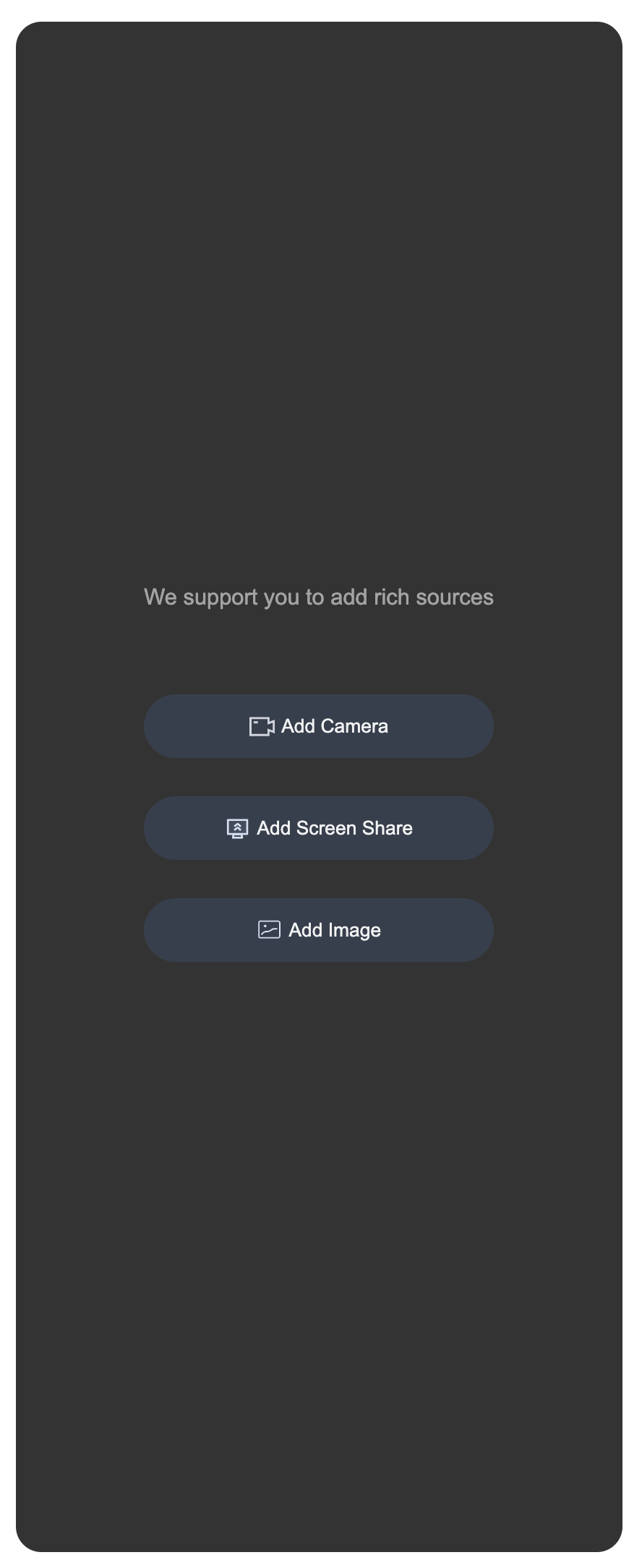 | 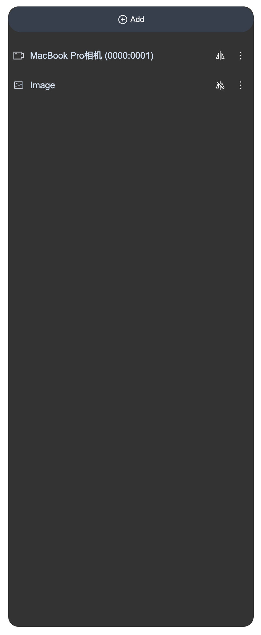 | 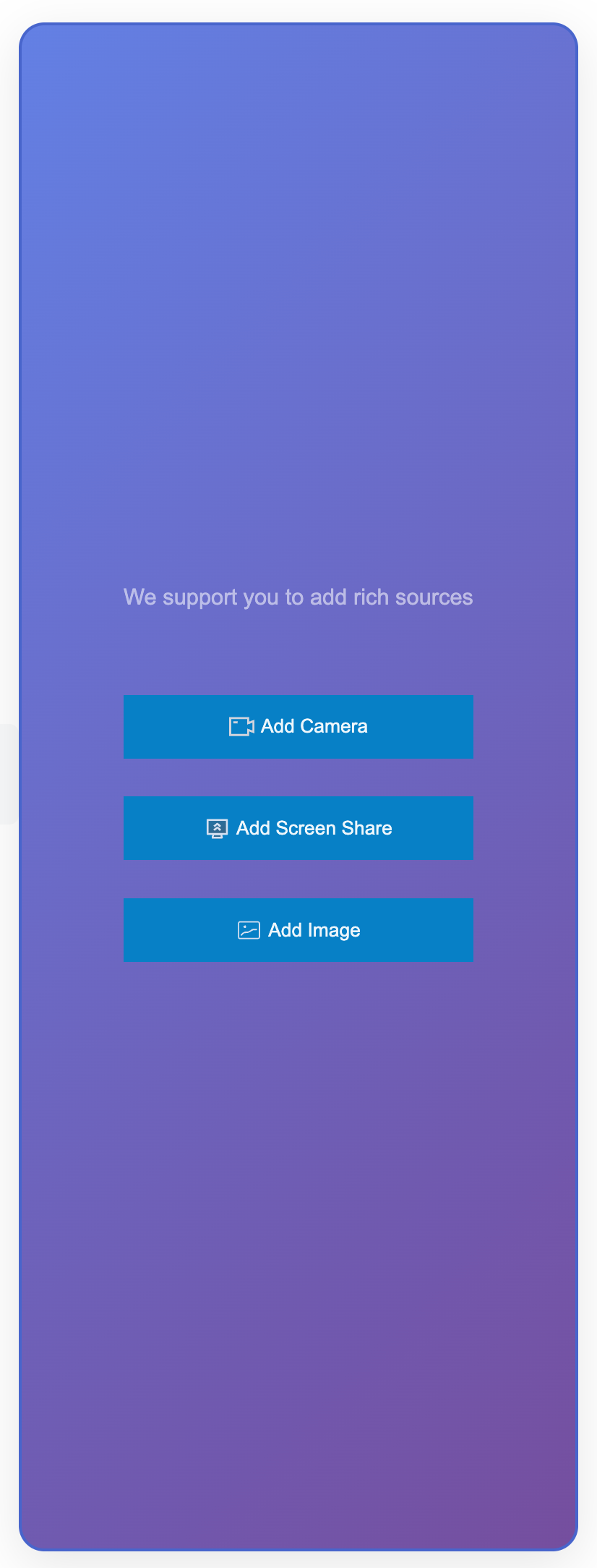 |  |
<template><!-- status display --><div class="status-info"><span>Number of materials: {{ materialCount }}</span><span>Last operation: {{ lastOperation }}</span></div><LiveScenePanel /><LiveScenePanel /><StreamMixer /></template><script setup lang="ts">import { ref, computed, watch } from 'vue';import { LiveScenePanel, useVideoMixerState, StreamMixer } from 'tuikit-atomicx-vue3';
피드백