TUILiveKit Release Notes
Live SDK Release Notes
Feature Name | Detailed Description |
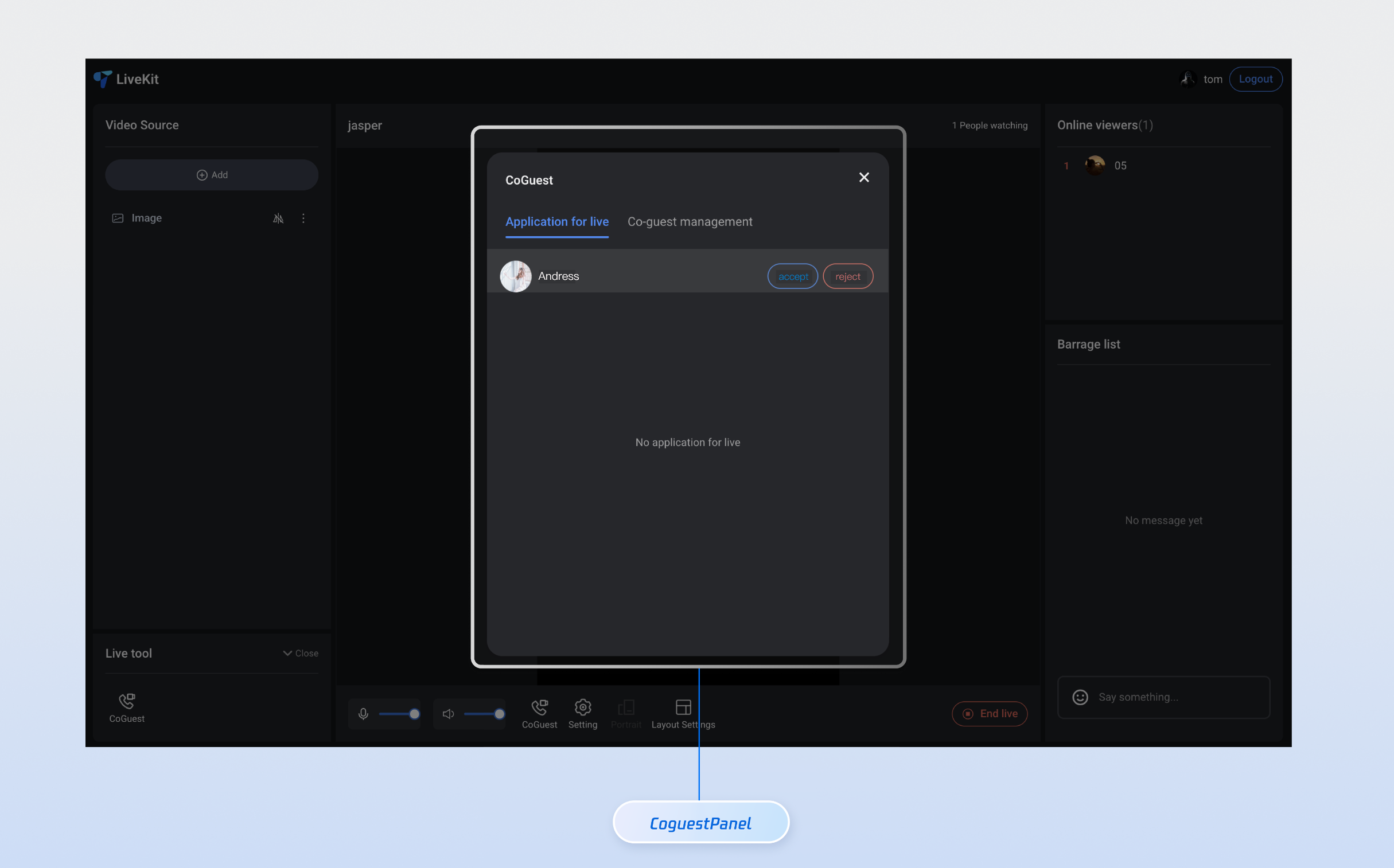
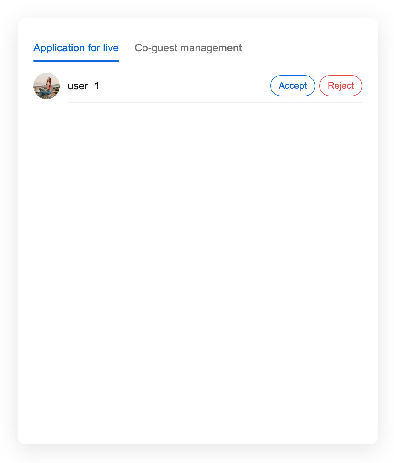
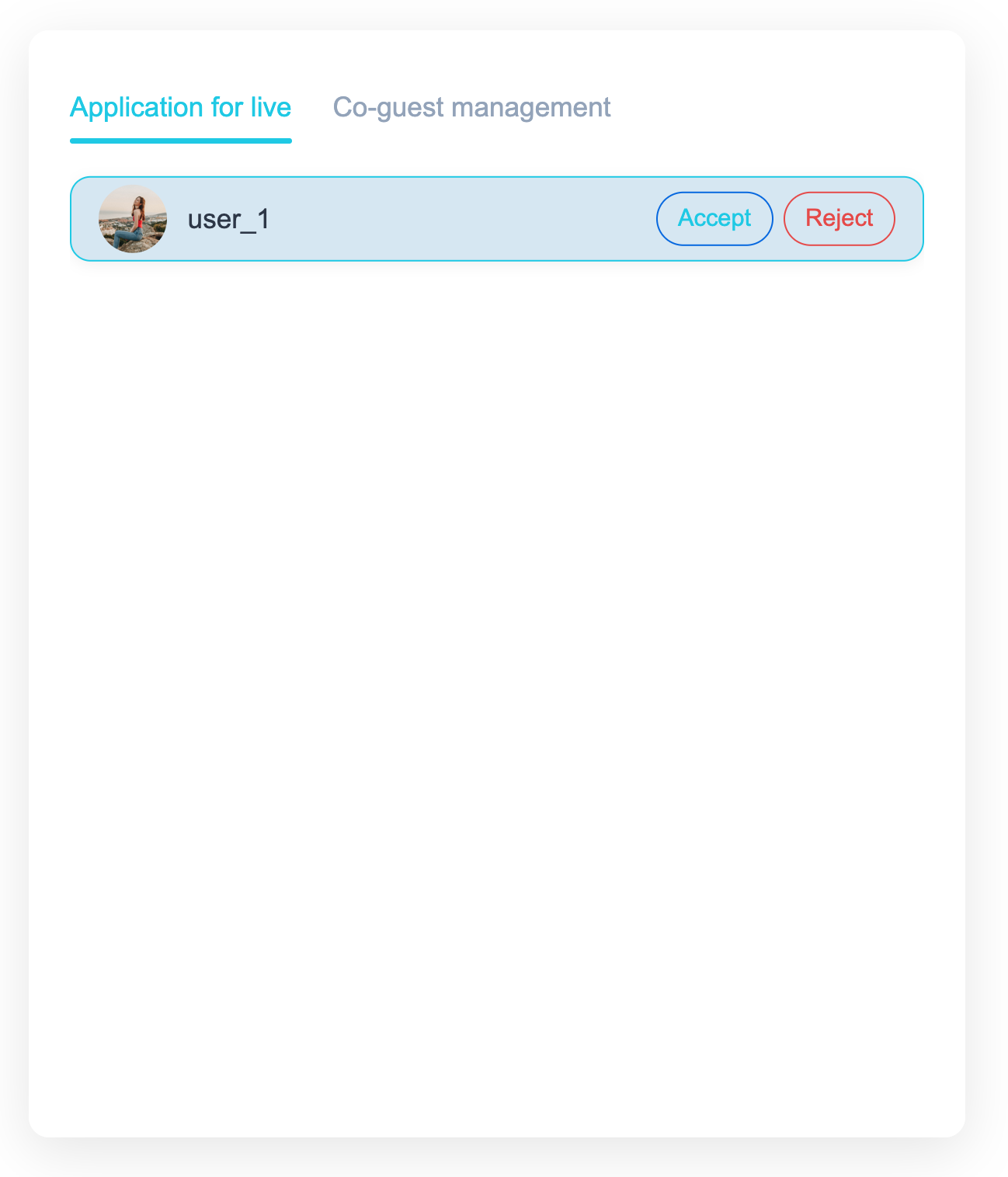
Tab switchover | The UI offers dual tabs, allowing users to quickly switch between the Mic Connection Request and Mic Connection Management feature modules. It supports status memory and message prompts. |
Application List | Display all pending Mic Connection Requests in real time, showing user avatars, Nicknames, and status. Supports sorting by time and the filter function. |
Anchor Operations | Provide abundant one-click operation buttons, support accept application, reject application, disconnect and other features, with real-time feedback on operation results. |
npm install tuikit-atomicx-vue3 @tencentcloud/uikit-base-component-vue3 --save
pnpm add tuikit-atomicx-vue3 @tencentcloud/uikit-base-component-vue3
yarn add tuikit-atomicx-vue3 @tencentcloud/uikit-base-component-vue3
<template><UIKitProvider theme="light" language="en-US"><div class="app"><CoGuestPanel class="co-guest-panel" /></div></UIKitProvider></template><script setup lang="ts">import { onMounted, ref } from 'vue';import { UIKitProvider } from '@tencentcloud/uikit-base-component-vue3';import { CoGuestPanel, useLoginState, useLiveState } from 'tuikit-atomicx-vue3';const { login, loginUserInfo } = useLoginState();const { joinLive } = useLiveState();async function initLogin() {try {await login({sdkAppId: 0, // SDKAppID, see Step 1 to getuserId: '', // UserID, see Step 1 to getuserSig: '', // userSig, see Step 1 to get});} catch (error) {console.error('login error:', error);}}onMounted(async () => {await initLogin();// enter live room by inputting corresponding liveIdawait joinLive({liveId: 'input corresponding live streaming room LiveId',});});</script><style scoped>.app{width:100vw;height:100vh;display:flex;justify-content:center;align-items:center;padding:20px;box-sizing:border-box}.co-guest-panel{width:100%;max-width:500px;padding: 24px;height:600px;background:rgba(255,255,255,0.9);border-radius:12px;box-shadow:0 8px 32px rgba(0,0,0,0.1);overflow:hidden}</style>
<template><CoGuestPanel class="co-guest-panel" /></template><style>.co-guest-panel{--text-color-primary:#2d3748;--text-color-secondary:#93a3bb;--text-color-link:#20c9e7;--bg-color-primary:#ffffff;--bg-color-hover:#d6e7f3;--stroke-color-primary:#8bb6ef;--stroke-color-secondary:#90c0f4;--shadow-light:0 2px 8px rgba(69,67,67,0.08);--shadow-medium:0 4px 16px rgba(93,87,87,0.12);--transition:all 0.3s ease;}.co-guest-panel .panel-content{background:var(--bg-color-primary);border-radius:16px;border:1px solid var(--stroke-color-primary);box-shadow:var(--shadow-medium);transition:var(--transition);overflow:hidden;}.co-guest-panel .panel-content:hover{box-shadow:0 8px 24px rgba(0,0,0,0.15);transform:translateY(-2px);border-color:var(--stroke-color-secondary);}.co-guest-panel .user-item{padding:16px;margin:8px 0;background:var(--bg-color-primary);border:1px solid var(--stroke-color-primary);border-radius:12px;transition:var(--transition);cursor:pointer;}.co-guest-panel .user-item:hover{background:var(--bg-color-hover);border-color:var(--text-color-link);box-shadow:var(--shadow-light);transform:translateY(-1px);}.co-guest-panel .user-item:active{transform:translateY(0);transition:all 0.15s ease;}.co-guest-panel .user-item.selected{background:rgba(102,126,234,0.08);border-color:var(--text-color-link);box-shadow:var(--shadow-light);}</style>
Before modification | After modification |
 |  |
피드백