This document describes the use cases and the operations directions of line charts.
Use Cases
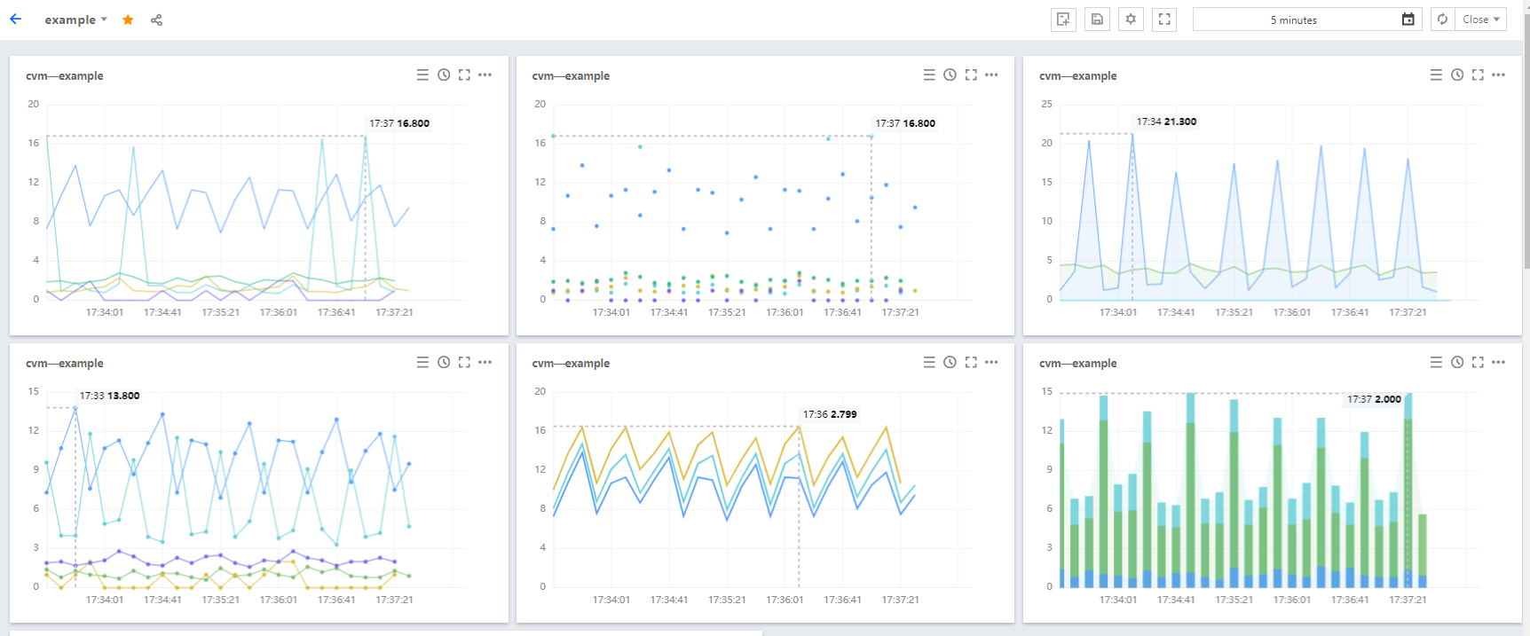
Line chart: is used to display the trends of metrics or the comparisons between the same or different metrics.
Configuration effects of multiple types of line charts:
Directions
1. Log in to the Tencent Cloud Observability Platform console and click Dashboard > Default Dashboard on the left sidebar.
2. Click
> Create a Chart to go to the chart editing page.
3. In the chart configuration module, select “Line Chart” as the chart type.
Chart element configuration
Point: indicates whether to display chart data as points.
Line: is the default display pattern, which can be customized to display the chart data as lines.
Bar: indicates whether to display the chart data as bars.
Line Type: indicates the type of the line displayed, which can be a broken line or a smooth line.
Line Width: you can adjust the line width in the charts.
Fill: you can determine whether to fill the areas formed between a line and the X and Y axes. 0 indicates no filling. 1 to 10 indicate the depth of color for filling the areas, with a greater value indicating a deeper color.
Stack: you can determine whether to stack instance data, that is, whether to calculate the sum of data. To achieve the stack effect, at least two instances are needed.
Null Values: you can determine how null values appear in charts. There are three possible values: not filling, automatic filling with 0, and linking null values.
Coordinate axis configuration
You can determine the displayed content and the display position of the Y axis, which can be left, right, or both. The settings are described as follows:
Show: indicates whether to show the Y axis.
Unit: indicates the display unit of the Y axis. For more information, see List of Units.
Min: indicates the starting value of the Y axis.
Max: indicates the ending value of the Y axis.
Precision: indicates the number of decimal places to be retained for the Y axis. 0: do no retain any decimals. 1: retain one decimal place.
Legend configuration
You can determine the display position of legends by configuring the following settings:
Show: indicates whether to show legends in charts.
Table Type: can be the maximum value, the minimum value, the average value, or the current value. After you select a table type, the data will be sorted by this type.
Put on the Right: indicates whether to place the instances, the maximum value, the minimum value, the average value, and the current value on the right side of charts. By default, they are placed below charts.
Max, Min, Avg, Sum, and Current Value: indicates whether to display the maximum value, the minimum value, the average value, the sum, and the current value below charts.
Precision: indicates the number of decimal places to be retained for the maximum value, the minimum value, the average value, the sum, and the current value. 0: do no retain any decimals. 1: retain one decimal place.
Auxiliary line and notes
You can determine whether to display the auxiliary line and the notes of the maximum value. By default, they are displayed.
4. After completing the configuration, click Save in the upper-right corner.