视图容器
scroll-view
功能说明:可滚动视图区域。使用竖向滚动时,需要给
<scroll-view>一个固定高度,通过 WXSS 设置 height。参数及说明:
属性 | 类型 | 默认值 | 说明 |
scroll-x | boolean | false | 允许横向滚动 |
scroll-y | boolean | false | 允许纵向滚动 |
upper-threshold | number/string | 50 | 距顶部/左边多远时,触发 scrolltoupper |
lower-threshold | number/tring | 50 | 距底部/右边多远时,触发 scrolltolower 事件 |
scroll-top | number/string | - | 设置竖向滚动条位置 |
scroll-left | number/string | - | 设置横向滚动条位置 |
scroll-into-view | string | - | 值应为某子元素 id(id 不能以数字开头)。设置哪个方向可滚动,则在哪个方向滚动到该元素 |
scroll-with-animation | boolean | false | 在设置滚动条位置时使用动画过渡 |
enable-back-to-top | boolean | false | iOS 单击顶部状态栏、Android 双击标题栏时,滚动条返回顶部,只支持竖向 |
refresher-enabled | boolean | false | 开启自定义下拉刷新 |
refresher-threshold | number | 45 | 设置自定义下拉刷新阈值 |
refresher-default-style | string | "black" | 设置自定义下拉刷新默认样式,支持设置 black | white | none, none表示不使用默认样式 |
refresher-background | string | - | 设置自定义下拉刷新区域背景颜色,默认为透明 |
refresher-triggered | boolean | false | 设置当前下拉刷新状态,true 表示下拉刷新已经被触发,false 表示下拉刷新未被触发 |
bounces | boolean | true | iOS 下 scroll-view 边界弹性控制 (同时开启 enhanced 属性后生效) |
show-scrollbar | boolean | true | 滚动条显隐控制 (同时开启 enhanced 属性后生效) |
fast-deceleration | boolean | false | 滑动减速速率控制, 仅在 iOS 下生效 (同时开启 enhanced 属性后生效) |
binddragstart | eventhandle | - | 滑动开始事件 (同时开启 enhanced 属性后生效) detail { scrollTop, scrollLeft } |
binddragging | eventhandle | - | 滑动事件 (同时开启 enhanced 属性后生效) detail { scrollTop, scrollLeft } |
binddragend | eventhandle | - | 滑动结束事件 (同时开启 enhanced 属性后生效) detail { scrollTop, scrollLeft, velocity } |
bindscrolltoupper | eventhandle | - | 滚动到顶部/左边时触发 |
bindscrolltolower | eventhandle | - | 滚动到底部/右边时触发 |
bindscroll | eventhandle | - | 滚动时触发,event.detail = {scrollLeft, scrollTop, scrollHeight, scrollWidth, deltaX, deltaY} |
scroll-anchoring | boolean | false | 开启 scroll anchoring 特性,即控制滚动位置不随内容变化而抖动,仅在 iOS 下生效,安卓下可参考CSS overflow-anchor属性 |
enhanced | boolean | false | |
paging-enabled | boolean | false | 分页滑动效果 (同时开启 enhanced 属性后生效) |
注意:
滚动条的长度是预估的,若直接子节点的高度差别较大,则滚动条长度可能会不准确。
请勿在 scroll-view 中使用 textarea、map、canvas、video 组件。
scroll-into-view 的优先级高于 scroll-top。
在滚动 scroll-view 时会阻止页面回弹,所以在 scroll-view 中滚动,是无法触发 onPullDownRefresh。
若要使用下拉刷新,请使用页面的滚动,而不是 scroll-view ,这样也能通过点击顶部状态栏回到页面顶部。
示例代码:
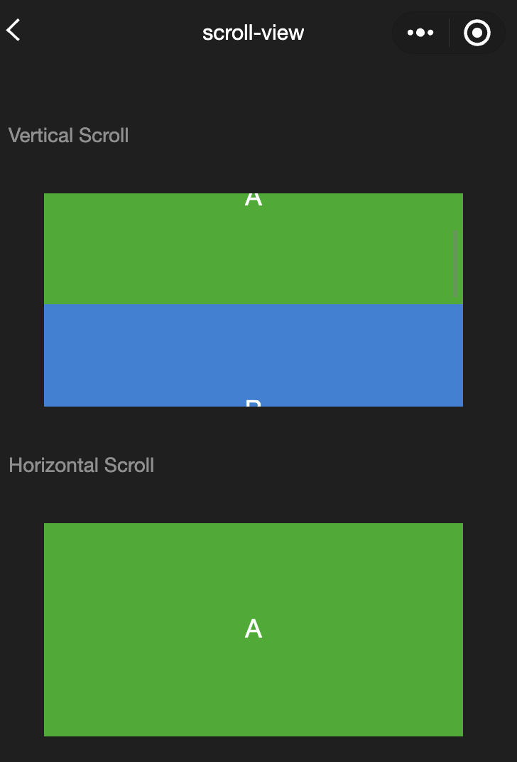
<view class="container"><view class="page-body"><view class="page-section"><view class="page-section-title"><text>Vertical Scroll</text></view><view class="page-section-spacing"><scroll-view scroll-y="true" style="height: 300rpx;" bindscrolltoupper="upper" bindscrolltolower="lower" bindscroll="scroll" scroll-into-view="{{toView}}" scroll-top="{{scrollTop}}"><view id="demo1" class="scroll-view-item demo-text-1"></view><view id="demo2" class="scroll-view-item demo-text-2"></view><view id="demo3" class="scroll-view-item demo-text-3"></view></scroll-view></view></view><view class="page-section"><view class="page-section-title"><text>Horizontal Scroll</text></view><view class="page-section-spacing"><scroll-view class="scroll-view_H" scroll-x="true" bindscroll="scroll" style="width: 100%"><view id="demo1" class="scroll-view-item_H demo-text-1"></view><view id="demo2" class="scroll-view-item_H demo-text-2"></view><view id="demo3" class="scroll-view-item_H demo-text-3"></view></scroll-view></view></view></view></view>
const order = ['demo1', 'demo2', 'demo3']Page({onShareAppMessage() {return {title: 'scroll-view',path: 'page/component/pages/scroll-view/scroll-view'}},data: {toView: 'green'},upper(e) {console.log(e)},lower(e) {console.log(e)},scroll(e) {console.log(e)},scrollToTop() {this.setAction({scrollTop: 0})},tap() {for (let i = 0; i < order.length; ++i) {if (order[i] === this.data.toView) {this.setData({toView: order[i + 1],scrollTop: (i + 1) * 200})break}}},tapMove() {this.setData({scrollTop: this.data.scrollTop + 10})}})
.page-section-spacing{margin-top: 60rpx;}.scroll-view_H{white-space: nowrap;}.scroll-view-item{height: 300rpx;}.scroll-view-item_H{display: inline-block;width: 100%;height: 300rpx;}
swiper
功能说明:滑块视图容器。
change事件返回detail中包含一个source字段,表示导致变更的原因,可能值如下:autoplay自动播放导致 swiper 变化;touch用户滑动引起 swiper 变化;其他原因将用空字符串表示。
参数及说明:
属性 | 类型 | 默认值 | 说明 |
indicator-dots | boolean | false | 是否显示面板指示点 |
indicator-color | color | rgba(0, 0, 0, .3) | 指示点颜色 |
indicator-active-color | color | #000000 | 当前选中的指示点颜色 |
autoplay | boolean | false | 是否自动切换 |
current | number | 0 | 当前所在滑块的 index |
current-item-id | String | "" | 当前所在滑块的 item-id ,不能与 current 被同时指定 |
interval | number | 5000 | 自动切换时间间隔 |
duration | number | 500 | 滑动动画时长 |
circular | boolean | false | 是否采用衔接滑动 |
vertical | boolean | false | 滑动方向是否为纵向 |
display-multiple-items | number | 1 | 同时显示的滑块数量 |
previous-margin | string | "0px" | 前边距,可用于露出前一项的一小部分,接受 px 和 rpx 值 |
easing-function | string | "default" | 指定 swiper 切换缓动动画类型,合法值如下: default:默认缓动函数linear:线性动画easeInCubic:缓入动画easeOutCubic:缓出动画easeInOutCubic:缓入缓出动画 |
next-margin | string | "0px" | 后边距,可用于露出后一项的一小部分,接受 px 和 rpx 值 |
bindchange | eventhandle | - | current 改变时会触发 change 事件,event.detail = {current: current, source: source} |
bindtransition | eventhandle | - | swiper-item 的位置发生改变时会触发 transition 事件,event.detail = {dx: dx, dy: dy} |
bindanimationfinish | eventhandle | - | 动画结束时会触发 animationfinish 事件,event.detail 同上 |
skip-hidden-item-layout | boolean | false | 是否跳过未显示的滑块布局,设为 true 可优化复杂情况下的滑动性能,但会丢失隐藏状态滑块的布局信息 |
注意:
其中只可放置 swiper-item 组件,否则会导致未定义的行为。
如果在 bindchange 的事件回调函数中使用 setData 改变 current 值,则有可能导致 setData 被不停地调用,因而通常情况下请在改变 。current 值前检测 source 字段来判断是否是由于用户触摸引起。
示例代码:
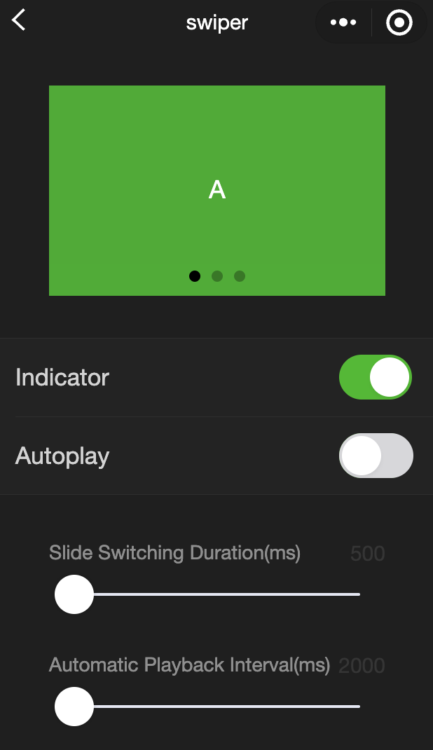
<view class="container"><view class="page-body"><view class="page-section page-section-spacing swiper"><swiper indicator-dots="{{indicatorDots}}"autoplay="{{autoplay}}" interval="{{interval}}" duration="{{duration}}"><block wx:for="{{background}}" wx:key="*this"><swiper-item><view class="swiper-item {{item}}"></view></swiper-item></block></swiper></view><view class="page-section" style="margin-top: 40rpx;margin-bottom: 0;"><view class="weui-cells weui-cells_after-title"><view class="weui-cell weui-cell_switch"><view class="weui-cell__bd">指示点</view><view class="weui-cell__ft"><switch checked="{{indicatorDots}}" bindchange="changeIndicatorDots" /></view></view><view class="weui-cell weui-cell_switch"><view class="weui-cell__bd">自动播放</view><view class="weui-cell__ft"><switch checked="{{autoplay}}" bindchange="changeAutoplay" /></view></view></view></view><view class="page-section page-section-spacing"><view class="page-section-title"><text>幻灯片切换时长(ms)</text><text class="info">{{duration}}</text></view><slider bindchange="durationChange" value="{{duration}}" min="500" max="2000"/><view class="page-section-title"><text>自动播放间隔时长(ms)</text><text class="info">{{interval}}</text></view><slider bindchange="intervalChange" value="{{interval}}" min="2000" max="10000"/></view></view></view>
Page({onShareAppMessage() {return {title: 'swiper',path: 'page/component/pages/swiper/swiper'}},data: {background: ['demo-text-1', 'demo-text-2', 'demo-text-3'],indicatorDots: true,vertical: false,autoplay: false,interval: 2000,duration: 500},changeIndicatorDots() {this.setData({indicatorDots: !this.data.indicatorDots})},changeAutoplay() {this.setData({autoplay: !this.data.autoplay})},intervalChange(e) {this.setData({interval: e.detail.value})},durationChange(e) {this.setData({duration: e.detail.value})}})
swiper-item
功能说明:仅可放置在 swiper 组件中,宽高自动设置为100%。
参数及说明:
属性名 | 类型 | 默认值 | 说明 |
item-id | string | "" | 该 swiper-item 的标识符 |
view
功能描述:视图容器。
参数及说明:
属性名 | 类型 | 默认值 | 说明 |
hover-class | string | - | 指定按下去的样式类。当 hover-class="none"时,没有点击态效果 |
hover-stop-propagation | boolean | false | 指定是否阻止本节点的祖先节点出现点击态 |
hover-start-time | number | 50 | 按住后多久出现点击态,单位毫秒 |
hover-stay-time | number | 400 | 手指松开后点击态保留时间,单位毫秒 |
注意:
示例代码:
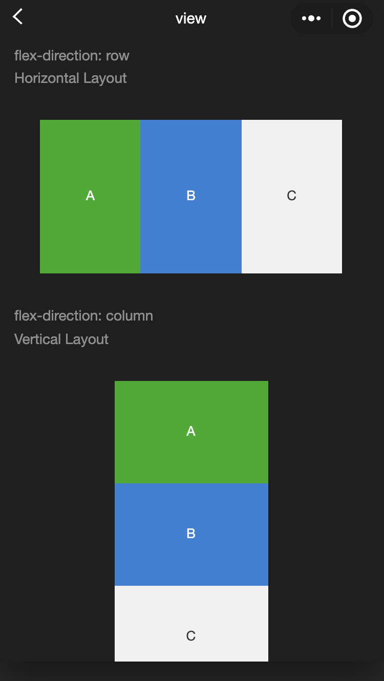
<view class="container"><view class="page-body"><view class="page-section"><view class="page-section-title"><text>flex-direction: row\\n横向布局</text></view><view class="page-section-spacing"><view class="flex-wrp" style="flex-direction:row;"><view class="flex-item demo-text-1"></view><view class="flex-item demo-text-2"></view><view class="flex-item demo-text-3"></view></view></view></view><view class="page-section"><view class="page-section-title"><text>flex-direction: column\\n纵向布局</text></view><view class="flex-wrp" style="flex-direction:column;"><view class="flex-item flex-item-V demo-text-1"></view><view class="flex-item flex-item-V demo-text-2"></view><view class="flex-item flex-item-V demo-text-3"></view></view></view></view></view>
movable-area
功能说明:movable-view 的可移动区域。
参数及说明:
属性名 | 类型 | 默认值 | 说明 |
scale-area | boolean | false | 当里面的 movable-view 设置为支持双指缩放时,设置此值可将缩放手势生效区域修改为整个movable-area。 |
注意:
movable-area 必须设置 width 和 height 属性,不设置默认为10px。
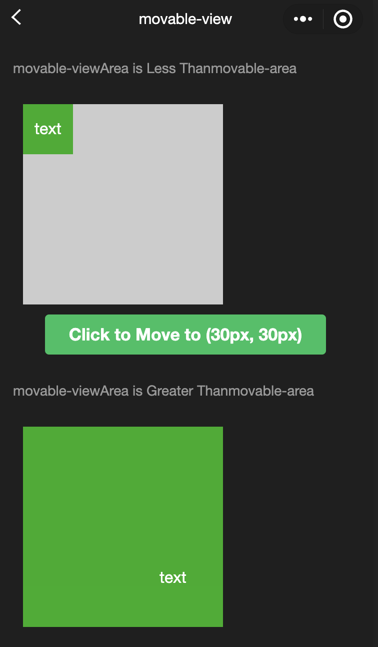
当 movable-view 小于 movable-area 时,movable-view 的移动范围是在 movable-area 内。
当 movable-view 大于 movable-area 时,movable-view 的移动范围必须包含 movable-area(x 轴方向和 y 轴方向分开考虑)。
示例代码:
<view class="container"><view class="page-body"><view class="page-section"><view class="page-section-title first">movable-view区域小于movable-area</view><movable-area><movable-view x="{{x}}" y="{{y}}" direction="all">text</movable-view></movable-area></view><view class="btn-area"><button bindtap="tap" class="page-body-button" type="primary">点击移动到 (30px, 30px)</button></view><view class="page-section"><view class="page-section-title">movable-view区域大于movable-area</view><movable-area><movable-view class="max" direction="all">text</movable-view></movable-area></view><view class="page-section"><view class="page-section-title">只可以横向移动</view><movable-area><movable-view direction="horizontal">text</movable-view></movable-area></view><view class="page-section"><view class="page-section-title">只可以纵向移动</view><movable-area><movable-view direction="vertical">text</movable-view></movable-area></view><view class="page-section"><view class="page-section-title">可超出边界</view><movable-area><movable-view direction="all" out-of-bounds>text</movable-view></movable-area></view><view class="page-section"><view class="page-section-title">带有惯性</view><movable-area><movable-view direction="all" inertia>text</movable-view></movable-area></view><view class="page-section"><view class="page-section-title">可放缩</view><movable-area scale-area><movable-view direction="all" bindchange="onChange" bindscale="onScale" scale scale-min="0.5" scale-max="4" scale-value="{{scale}}">text</movable-view></movable-area></view><view class="btn-area"><button bindtap="tap2" class="page-body-button" type="primary">点击放大3倍</button></view></view></view>
Page({onShareAppMessage() {return {title: 'movable-view',path: 'page/component/pages/movable-view/movable-view'}},data: {x: 0,y: 0,scale: 2,},tap() {this.setData({x: 30,y: 30})},tap2() {this.setData({scale: 3})},onChange(e) {console.log(e.detail)},onScale(e) {console.log(e.detail)}})
movable-view
功能说明:可移动的视图容器,在页面中可以拖拽滑动。movable-view 必须在 movable-area 组件中,并且必须是直接子节点,否则不能移动。
参数及说明:
属性名 | 类型 | 默认值 | 说明 |
direction | string | none | movable-view 的移动方向,属性值有 all、vertical、horizontal、none |
inertia
| boolean | false | movable-view 是否带有惯性 |
out-of-bounds | boolean | false | 超过可移动区域后,movable-view 是否还可以移动 |
x | number / string | 0 | 定义 x 轴方向的偏移,如果 x 的值不在可移动范围内,会自动移动到可移动范围;改变 x 的值会触发动画 |
y | number / string | 0 | 定义 y 轴方向的偏移,如果 y 的值不在可移动范围内,会自动移动到可移动范围;改变 y 的值会触发动画 |
damping | number | 20 | 阻尼系数,用于控制 x 或 y 改变时的动画和过界回弹的动画,值越大移动越快 |
friction | number | 2 | 摩擦系数,用于控制惯性滑动的动画,值越大摩擦力越大,滑动越快停止;必须大于0,否则会被设置成默认值 |
disabled | boolean | false | 是否禁用 |
scale | boolean | false | 是否支持双指缩放,默认缩放手势生效区域是在 movable-view 内 |
scale-min | number | 0.5 | 定义缩放倍数最小值 |
scale-max | number | 10 | 定义缩放倍数最大值 |
scale-value | number | 1 | 定义缩放倍数,取值范围为0.5 - 10 |
animation | boolean | true | 是否使用动画 |
bindchange | eventhandle | - | 拖动过程中触发的事件,event.detail = {x: x, y: y, source: source},其中 source 表示产生移动的原因,值可为: touch:拖动;touch-out-of-bounds:超出移动范围;out-of-bounds:超出移动范围后的回弹;friction:惯性;空字符串:setData; |
bindscale | eventhandle | - | 缩放过程中触发的事件,event.detail = {x: x, y: y, scale: scale} |
除了基本事件外,movable-view 提供了两个特殊事件。
事件名 | 类型 | 触发条件 |
htouchmove | eventhandle | 初次手指触摸后移动为横向的移动,如果 catch 此事件,则意味着 touchmove 事件也被 catch |
vtouchmove | eventhandle | 初次手指触摸后移动为纵向的移动,如果 catch 此事件,则意味着 touchmove 事件也被 catch |
注意:
movable-view 必须设置 width 和 height 属性,不设置默认为10px。
movable-view 默认为绝对定位,top 和 left 属性为0px。
cover-image
功能说明:覆盖在原生组件之上的图片视图,可覆盖的原生组件同 cover-view,支持嵌套在 cover-view 里。
参数及说明:
属性名 | 类型 | 默认值 | 说明 |
src | string | - | 图标路径,支持临时路径、网络地址; 暂不支持 SVG、GIF和BASE64格式; |
bindload | eventhandle | - | 图片加载成功时触发 |
binderror | eventhandle | - | 图片加载失败时触发 |
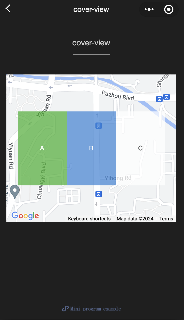
cover-view
功能说明:覆盖在原生组件之上的文本视图,可覆盖的原生组件包括map、video、canvas、camera、live-player、live-pusher,只支持嵌套cover-view、cover-image,可在cover-view中使用button。
参数及说明:
属性名 | 类型 | 默认值 | 说明 |
scroll-top | number / string | - | 设置顶部滚动偏移量,仅在设置了 overflow-y: scroll 成为滚动元素后生效 |
注意:
事件模型遵循冒泡模型,但不会冒泡到原生组件。
文本建议都套上 cover-view 标签,避免排版错误。
只支持基本的定位、布局、文本样式。不支持设置单边的 border、background-image、shadow、overflow: visible 等。
建议子节点不要溢出父节点。
不支持使用 z-index 控制层级。
默认设置的样式有:white-space: nowrap; line-height: 1.2; display: block。
自定义组件嵌套 cover-view 时,自定义组件的 slot 及其父节点暂不支持通过 wx:if 控制显隐,否则会导致 cover-view 不显示。
示例代码:
<view class="container"><view class="page-body"><view class="page-section page-section-gap"><mapstyle="width: 100%; height: 300px;"latitude="{{latitude}}"longitude="{{longitude}}"><cover-view class="cover-view"><cover-view class="container"><cover-view class="flex-wrp" style="flex-direction:row;"><cover-view class="flex-item demo-text-1"></cover-view><cover-view class="flex-item demo-text-2"></cover-view><cover-view class="flex-item demo-text-3"></cover-view></cover-view></cover-view></cover-view></map></view></view></view>
Page({onShareAppMessage() {return {title: 'cover-view',path: 'page/component/pages/cover-view/cover-view'}},data: {latitude: 23.099994,longitude: 113.324520,}})
.cover-view {position: absolute;top: calc(50% - 150rpx);left: calc(50% - 300rpx);/* opacity: .7; */}.flex-wrp{display:flex;}.flex-item{width: 200rpx;height: 300rpx;font-size: 26rpx;}.demo-text-1 {background: rgba(26, 173, 25, 0.7);}.demo-text-2 {background: rgba(39, 130, 215, 0.7);}.demo-text-3 {background: rgba(255, 255, 255, 0.7);}
文档反馈