基础内容
Download
聚焦模式
字号
icon
功能说明:图标组件。
参数及说明:
属性 | 类型 | 默认值 | 说明 |
type | string | - | icon 的类型,有效值:success,success_no_circle,info,warn,waiting,cancel,download,search,clear |
size | umber / string | 23 | icon 的大小,单位默认为 px |
color | string | - | icon 的颜色,同 css 的 color |
示例代码:
<view class="container"><view class="icon-box"><icon class="icon-box-img" type="success" size="93"></icon><view class="icon-box-ctn"><view class="icon-box-title">成功</view><view class="icon-box-desc">用于表示操作顺利完成</view></view></view><view class="icon-box"><icon class="icon-box-img" type="info" size="93"></icon><view class="icon-box-ctn"><view class="icon-box-title">提示</view><view class="icon-box-desc">用于表示信息提示;也常用于缺乏条件的操作拦截,提示用户所需信息</view></view></view><view class="icon-box"><icon class="icon-box-img" type="warn" size="93" color="#C9C9C9"></icon><view class="icon-box-ctn"><view class="icon-box-title">普通警告</view><view class="icon-box-desc">用于表示操作后将引起一定后果的情况;也用于表示由于系统原因而造成的负向结果</view></view></view><view class="icon-box"><icon class="icon-box-img" type="warn" size="93"></icon><view class="icon-box-ctn"><view class="icon-box-title">强烈警告</view><view class="icon-box-desc">用于表示由于用户原因造成的负向结果;也用于表示操作后将引起不可挽回的严重后果的情况</view></view></view><view class="icon-box"><icon class="icon-box-img" type="waiting" size="93"></icon><view class="icon-box-ctn"><view class="icon-box-title">等待</view><view class="icon-box-desc">用于表示等待,告知用户结果需等待</view></view></view><view class="icon-box"><view class="icon-small-wrp"><icon class="icon-small" type="success_no_circle" size="23"></icon></view><view class="icon-box-ctn"><view class="icon-box-title">多选控件图标_已选择</view><view class="icon-box-desc">用于多选控件中,表示已选择该项目</view></view></view><view class="icon-box"><view class="icon-small-wrp"><icon class="icon-small" type="circle" size="23"></icon></view><view class="icon-box-ctn"><view class="icon-box-title">多选控件图标_未选择</view><view class="icon-box-desc">用于多选控件中,表示该项目可被选择,但还未选择</view></view></view><view class="icon-box"><view class="icon-small-wrp"><icon class="icon-small" type="warn" size="23"></icon></view><view class="icon-box-ctn"><view class="icon-box-title">错误提示</view><view class="icon-box-desc">用于在表单中表示出现错误</view></view></view><view class="icon-box"><view class="icon-small-wrp"><icon class="icon-small" type="success" size="23"></icon></view><view class="icon-box-ctn"><view class="icon-box-title">单选控件图标_已选择</view><view class="icon-box-desc">用于单选控件中,表示已选择该项目</view></view></view><view class="icon-box"><view class="icon-small-wrp"><icon class="icon-small" type="download" size="23"></icon></view><view class="icon-box-ctn"><view class="icon-box-title">下载</view><view class="icon-box-desc">用于表示可下载</view></view></view><view class="icon-box"><view class="icon-small-wrp"><icon class="icon-small" type="info_circle" size="23"></icon></view><view class="icon-box-ctn"><view class="icon-box-title">提示</view><view class="icon-box-desc">用于在表单中表示有信息提示</view></view></view><view class="icon-box"><view class="icon-small-wrp"><icon class="icon-small" type="cancel" size="23"></icon></view><view class="icon-box-ctn"><view class="icon-box-title">停止或关闭</view><view class="icon-box-desc">用于在表单中,表示关闭或停止</view></view></view><view class="icon-box"><view class="icon-small-wrp"><icon class="icon-small" type="search" size="14"></icon></view><view class="icon-box-ctn"><view class="icon-box-title">搜索</view><view class="icon-box-desc">用于搜索控件中,表示可搜索</view></view></view></view>
Page({data: {iconSize: [20, 30, 40, 50, 60, 70],iconColor: ['red', 'orange', 'yellow', 'green', 'rgb(0,255,255)', 'blue', 'purple'],iconType: ['success', 'success_no_circle', 'info', 'warn', 'waiting', 'cancel', 'download', 'search', 'clear']}})
progress
功能说明:进度条。
参数及说明:
属性 | 类型 | 默认值 | 说明 |
percent | float | - | 百分比0~100 |
show-info | boolean | false | 在进度条右侧显示百分比 |
border-radius | number / string | 0 | 圆角大小,单位:px |
font-size | number / string | 16 | 右侧百分比字体大小,单位:px |
stroke-width | number / string | 6 | 进度条线的宽度 |
color | color | #09BB07 | 进度条颜色(请使用 activeColor) |
activeColor | color | #09BB07 | 已选择的进度条的颜色 |
backgroundColor | color | #EBEBEB | 未选择的进度条的颜色 |
active | boolean | false | 进度条从左往右的动画 |
active-mode | string | backwards | backwards: 动画从头播; forwards:动画从上次结束点接着播; |
bindactiveend | eventhandle | - | 动画完成事件 |
示例代码:
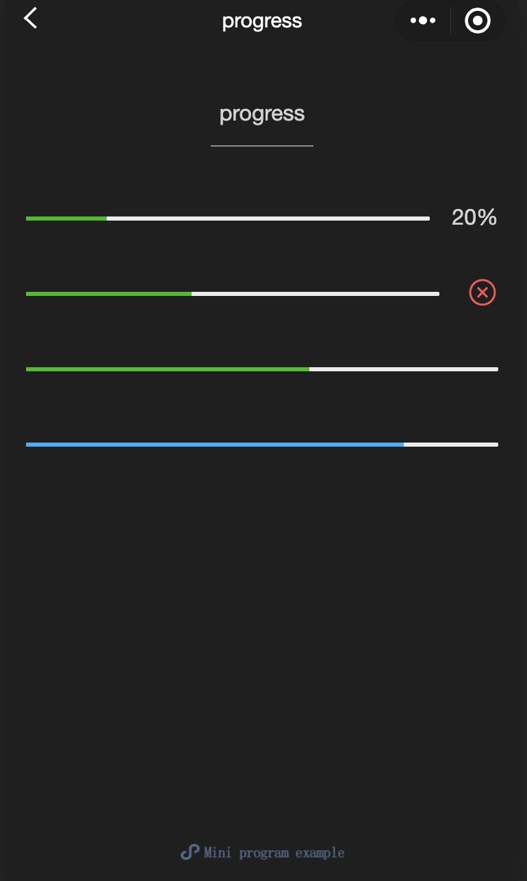
<view class="progress-box"><progress percent="20" show-info stroke-width="3"/></view><view class="progress-box"><progress percent="40" active stroke-width="3" /><icon class="progress-cancel" type="cancel"></icon></view><view class="progress-box"><progress percent="60" active stroke-width="3" /></view><view class="progress-box"><progress percent="80" color="#10AEFF" active stroke-width="3" /></view>
text
功能说明:文本。
参数及说明:
属性 | 类型 | 默认值 | 说明 |
selectable | boolean | false | 文本是否可选 |
space | string | - | 显示连续空格: ensp:中文字符空格一半大小 emsp:中文字符空格大小 nbsp:根据字体设置的空格大小 |
decode | boolean | false | 是否解码 |
注意:
decode可以解析的有
< > & '    。各个操作系统的空格标准并不一致。
除了文本节点以外的其他节点都无法长按选中。
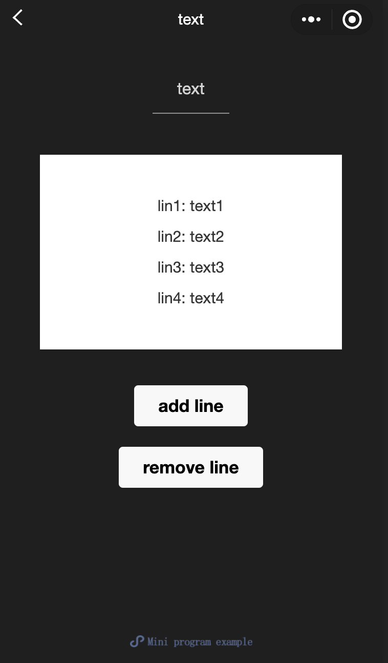
<view class="container"><view class="page-body"><view class="page-section page-section-spacing"><view class="text-box" scroll-y="true" scroll-top="{{scrollTop}}"><text>{{text}}</text></view><button disabled="{{!canAdd}}" bindtap="add">add line</button><button disabled="{{!canRemove}}" bindtap="remove">remove line</button></view></view></view>
const texts = ['lin1: text1','lin2: text2','lin3: text3','lin4: text4','lin5: text5','lin6: text6','lin7: text7','lin8: text8','lin9: text9','lin10: text10','lin11: text11','lin12: text12','......']Page({onShareAppMessage() {return {title: 'text',path: 'page/component/pages/text/text'}},data: {text: '',canAdd: true,canRemove: false},extraLine: [],add() {this.extraLine.push(texts[this.extraLine.length % 12])this.setData({text: this.extraLine.join('\\n'),canAdd: this.extraLine.length < 12,canRemove: this.extraLine.length > 0})setTimeout(() => {this.setData({scrollTop: 99999})}, 0)},remove() {if (this.extraLine.length > 0) {this.extraLine.pop()this.setData({text: this.extraLine.join('\\n'),canAdd: this.extraLine.length < 12,canRemove: this.extraLine.length > 0,})}setTimeout(() => {this.setData({scrollTop: 99999})}, 0)}})
rich-text
功能说明:富文本。
参数及说明:
属性 | 类型 | 默认值 | 说明 |
nodes | array / string | [] | 节点列表 / HTML String |
space | string | - | 显示连续空格: ensp:中文字符空格一半大小 emsp:中文字符空格大小 nbsp:根据字体设置的空格大小 |
支持默认事件,包括:
tap、touchstart、touchmove、touchcancel、touchend和longtap。nodes
nodes 属性推荐使用 Array 类型,由于组件会将 String 类型转换为 Array 类型,因而性能会有所下降。现支持两种节点,通过 type 来区分,分别是元素节点和文本节点,默认是元素节点,在富文本区域里显示的 HTML 节点。
元素节点:type = node
属性 | 说明 | 类型 | 必填 | 备注 |
name | 标签名 | string | 是 | 支持部分受信任的 HTML 节点 |
attrs | 属性 | object | 否 | 支持部分受信任的属性,遵循 Pascal 命名法 |
children | 子节点列表 | array | 否 | 结构和 nodes 一致 |
文本节点:type=text
属性 | 说明 | 类型 | 必填 | 备注 |
text | 文本 | string | 是 | 支持 entities |
受信任的 HTML 节点及属性
全局支持 class 和 style 属性,不支持 id 属性。
节点 | 属性 | 节点 | 属性 |
a | - | img | alt,src,height,width |
abbr | - | ins | - |
b | - | label | - |
br | - | legend | - |
code | - | li | - |
col | span,width | ol | start,type |
colgroup | span,width | p | - |
dd | - | q | - |
del | - | span | - |
div | - | strong | - |
dl | - | sub | - |
dt | - | sup | - |
em | - | table | width |
fieldset | - | tbody | - |
h1 | - | td | colspan,height,rowspan,width |
h2 | - | tfoot | - |
h3 | - | th | colspan,height,rowspan,width |
h4 | - | thead | - |
h5 | - | tr | - |
h6 | - | ul | - |
hr | - | - | - |
注意:
nodes 不推荐使用 String 类型,性能会有所下降。
rich-text 组件内屏蔽所有节点的事件。
attrs 属性不支持 id ,支持 class。
name 属性大小写不敏感。
如果使用了不受信任的 HTML 节点,该节点及其所有子节点将会被移除。
img 标签仅支持网络图片。
如果在自定义组件中使用 rich-text 组件,那么仅自定义组件的 wxss 样式对 rich-text 中的 class 生效。
示例代码
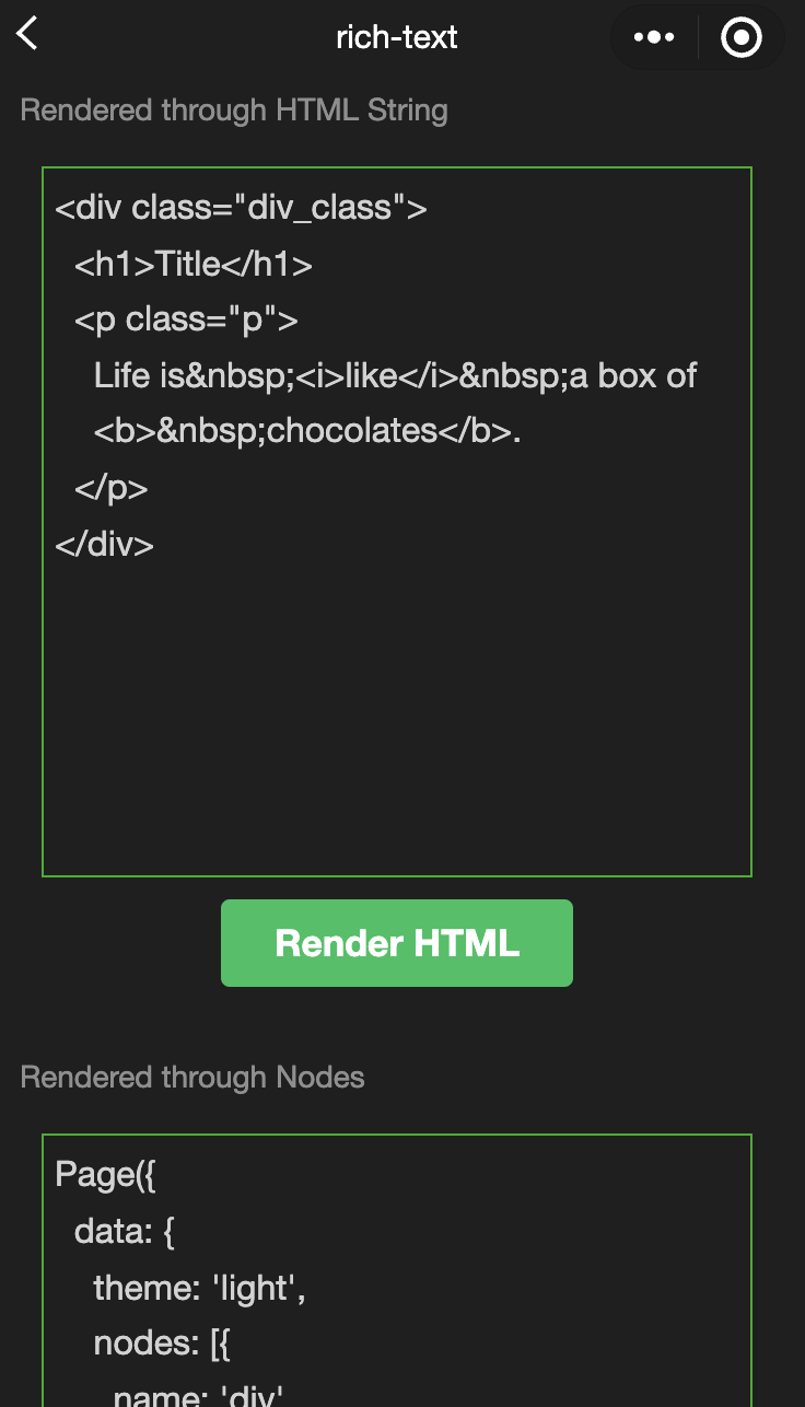
<view class="container"><view class="page-body"><view class="page-section"><view class="page-section-title">通过HTML String渲染</view><view class="page-content"><scroll-view scroll-y>{{htmlSnip}}</scroll-view><button style="margin: 30rpx 0" type="primary" bindtap="renderHtml">渲染HTML</button><block wx:if="{{renderedByHtml}}"><rich-text nodes="{{htmlSnip}}"></rich-text></block></view></view><view class="page-section"><view class="page-section-title">通过节点渲染</view><view class="page-content"><scroll-view scroll-y>{{nodeSnip}}</scroll-view><button style="margin: 30rpx 0" type="primary" bindtap="renderNode">渲染Node</button><block wx:if="{{renderedByNode}}"><rich-text nodes="{{nodes}}"></rich-text></block></view></view></view></view>
const htmlSnip =`<div class="div_class"><h1>Title</h1><p class="p">Life is <i>like</i> a box of<b> chocolates</b>.</p></div>`const nodeSnip =`Page({data: {nodes: [{name: 'div',attrs: {class: 'div_class',style: 'line-height: 60px; color: red;'},children: [{type: 'text',text: 'You never know what you're gonna get.'}]}]}})`Page({onShareAppMessage() {return {title: 'rich-text',path: 'page/component/pages/rich-text/rich-text'}},data: {htmlSnip,nodeSnip,renderedByHtml: false,renderedByNode: false,nodes: [{name: 'div',attrs: {class: 'div_class',style: 'line-height: 60px; color: #1AAD19;'},children: [{type: 'text',text: 'You never know what you\\'re gonna get.'}]}]},renderHtml() {this.setData({renderedByHtml: true})},renderNode() {this.setData({renderedByNode: true})},enterCode(e) {console.log(e.detail.value)this.setData({htmlSnip: e.detail.value})}})
文档反馈