tencent cloud

Last updated:2026-02-03 16:50:51
Chart
Last updated: 2026-02-03 16:50:51

Component Feature

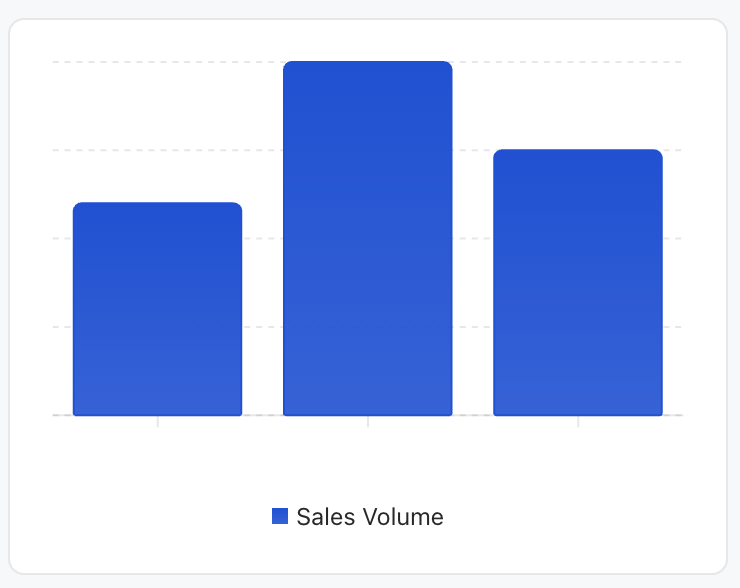
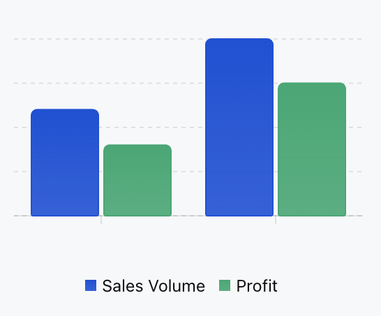
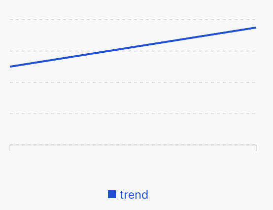
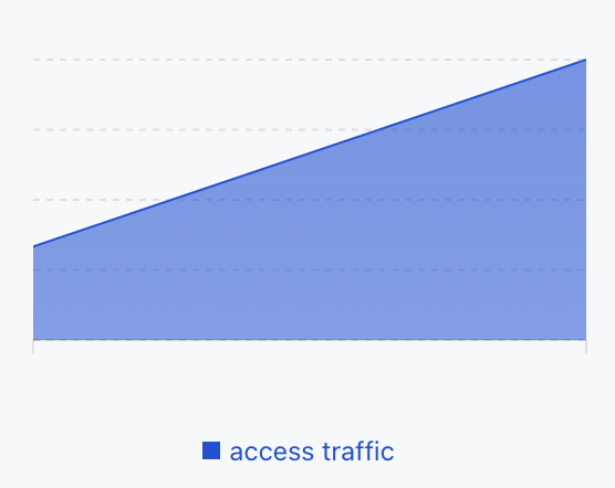
Data visualization components display structured data in graphical method, supporting common chart types such as histogram, line chart and area chart, suitable for trend analysis, comparison display and statistical summary.

Basic Usage

Specify the chart type with type, provide data with data, define the display method of data series with series, and configure the horizontal axis field or display rule with xAxis.
Template example:
<Card>
<Chart
xAxis="month"
data={[
{ month: 'January', sales: 120 }
{ month: 'February', sales: 200 }
{ month: 'March', sales: 150 }
]}
series={[
{ type: 'bar', dataKey: 'sales', label: 'Sales Volume', color: '#0052D9' },
]}
/>
</Card>
Effect display as follows:


Attribute Description

Property Name
Type
Description
Default value
data
ChartDataRow[]
Chart data array
-
series
SeriesConfig[]
Series configuration array
-
xAxis
string | XAxisConfig
X-axis configuration or data field name
-
width
number | string
Chart width
-
size
number | string
Chart size
-
minWidth
number | string
minimum width
-
maxWidth
number | string
Maximum width
-
showTooltip
boolean
display prompt box
true
showYAxis
boolean
Display the Y axis
false
showLegend
boolean
Displaying the legend
true
barGap
number | string
Bar Chart spacing
-
barCategoryGap
number | string
Histogram category spacing
-
flex
number | string
Flex value
-
aspectRatio
number | string
Aspect Ratio (for example 16/9)
4/3
Note:
★ Marked with required attribute.

Size Description

In the container (parent element with the data-w-container attribute): chart width defaults to 100%, self adaptive to the container.
Not in the container and not set width/size: chart width defaults to 260px.
Height control: default is determined by aspectRatio (4:3).

ChartDataRow Type

Data object supports any field:
{
[key: string]: any; // for example date, Desktop, Mobile
}

SeriesConfig Type

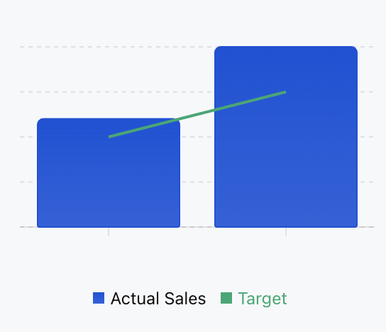
Each series configuration specifies the chart type through the type property. If all series types are identical, use the corresponding chart container. If types are different, use the combo chart mode.
Histogram series:
{
type: "bar";
dataKey: string; // data field name
label?: string; // series tag
color?: string; // bar color
stack?: string; // Stack group ID
}
Line chart series:
{
type: "line";
dataKey: string;
label?: string;
color?: string;
curveType?: CurveType; // Curve type
}
Area chart series:
{
type: "area";
dataKey: string;
label?: string;
color?: string;
curveType?: CurveType;
stack?: string;
}

XAxisConfig Object

Used for granular control of the X-axis.
Property Name
Type
Description
Default value
dataKey
string
data field name
-
label
string | number | object
coordinate axis tag
-
type
"number" | "category"
Coordinate axis type
"category"
hide
boolean
whether to hide
false
angle
number
Tick rotation angle
-
tickMargin
number
Tick spacing
-
allowDuplicatedCategory
boolean
Allow duplicate categories
false

CurveType Data Type

Line chart and area chart support the following curve types:
"basis" - basis curve
"linear" - straight line
"natural" - natural curve
"monotoneX" - X-axis monotonic curve
"monotoneY" - Y-axis monotonic curve
"step" - step curve
"stepBefore" - step before
"stepAfter" - step after

Usage Examples

Bar Chart

Template example:
<Chart
xAxis="month"
data={[
{ month: "January", sales: 120, profit: 80 }
{ month: "February", sales: 200, profit: 150 }
]}
series={[
{ type: "bar", dataKey: "sales", label: "Sales Volume", color: "#0052D9" },
{ type: "bar", dataKey: "profit", label: "Profit", color: "#00A870" }
]}
/>
Effect display as follows:


Line Chart

Template example:
<Chart
xAxis="date"
data={[
{ date: '2024-01', value: 100 },
{ date: '2024-02', value: 150 },
]}
series={[
{
type: 'line',
dataKey: 'value',
label: 'trend'
color: '#0052D9',
},
]}
/>
Effect display as follows:


Area Chart

Template example:
<Chart
xAxis="time"
data={[
{ time: "00:00", visitors: 100 },
{ time: "12:00", visitors: 300 }
]}
series={[
{
type: "area",
dataKey: "visitors",
label: "access traffic"
color: "#0052D9"
}
]}
/>
Effect display as follows:


Combo Chart

You can mix different kinds of charts in the same chart for display.
Template example:
<Chart
xAxis="month"
data={[
{ month: "January", sales: 120, target: 100 }
{ month: "February", sales: 200, target: 150 }
]}
series={[
{ type: "bar", dataKey: "sales", label: "Actual Sales", color: "#0052D9" },
{ type: "line", dataKey: "target", label: "Target", color: "#00A870" }
]}
/>
Effect display as follows:


Was this page helpful?
You can also Contact Sales or Submit a Ticket for help.
Yes
No

Feedback