Clickable Container
Download
Focus Mode
Font Size
Component Feature
Clickable is a clickable layout container component that has ALL Box layout capacities and supports adding a click event.
Basic Usage
Template example:
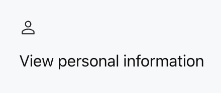
<ClickableonClickAction={{ type: "sys.go_to_url", payload: { url: "/profile" } }}padding="16px"radius="md"><Icon name="user" size="lg" /><Text value="View personal information" /></Clickable>
The component supports click to jump to the target address.
Effect display as follows:
Attribute Description
Clickable has ALL Box layout properties and dimension properties.
Interactive Property
Property Name | Type | Description | Default value |
onClickAction | ActionConfig | Trigger the click action. | - |
disabled | boolean | Whether to disable the component (after it is disabled, it will not respond to click and the cursor displays as not-allowed) | false |
Layout Property
Property Name | Type | Description | Default value |
direction | "row" | "col" | layout direction | "row" |
children | ChatKitComponent[] | Subcomponent List | - |
align | Alignment | Intersect Alignment Mode | - |
justify | Justification | Main Axis Alignment Mode | - |
wrap | "nowrap" | "wrap" | "wrap-reverse" | Line Break Method | "nowrap" |
flex | number | string | Flex value | - |
gap | number | string | child element spacing | - |
padding | number | string | Spacing | padding | - |
border | number | Border | Borders | Border Configuration | - |
background | string | ThemeColor | Background Color | - |
Dimension Property
Property Name | Type | Description | Default value |
height | number | string | height | - |
width | number | string | width | - |
size | number | string | Set both width and height at the same time | - |
minHeight | number | string | minimum height | - |
minWidth | number | string | minimum width | - |
minSize | number | string | minimum size | - |
maxHeight | number | string | max height | - |
maxWidth | number | string | maximum width | - |
maxSize | number | string | Maximum Size | - |
aspectRatio | number | string | Aspect Ratio | - |
radius | RadiusValue | rounded corners | - |
margin | number | string | Spacing | margin | - |
Interaction Effect
Clickable component automatically provides the following interaction effects:
Hover the mouse over the Clickable component to display a pointer cursor.
hover and active (pressing) status styles can be added.
Support keyboard operation. Use the Tab key to focus.
Disable Status
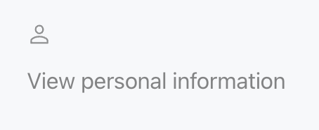
When
disabled is set to true, Clickable component enters non-interactive status.The mouse cursor changes to the
not-allowed disable status.Reduce component transparency (reduce to 50%).
The click action is blocked and will not trigger
onClickAction.All internal child components supporting the
disabled attribute (such as Button, Input, Checkbox) will be automatically disabled.Template example:
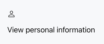
<Clickable disabled={true}onClickAction={{ type: "sys.go_to_url", payload: { url: "/profile" } }}padding="16px"radius="md"><Icon name="user" size="lg" /><Text value="View personal information" /></Clickable>
Effect comparison show as follows:
Default Effect | disabledIs Set totrueEffect |
 |  |
Advanced Function: alwaysEnabled
When the parent component (such as Card) calls the
disable() method to disable the entire Widget, if the Clickable component has alwaysEnabled: true in its onClickAction medium configuration, the Clickable component will not be disabled.Application Scenario
When the form is disabled, users are still allowed to click the "Cancel" or "Close" button.
Loading..., users are still allowed to cancel the operation.
When the interface is disabled, users are still allowed to view Help or description.
Example 1: The cancel button in the form is always available
Scenario: In a form, when the parent container is disabled, users can still click the "cancel" button to close the form.
Template example:
<CardasForm={true}confirm={{ label: "Submit", action: { type: "form.submit" } }}><Input name="username" required={true} /><Input name="email" required={true} /><ClickableonClickAction={{type: "dialog.close",alwaysEnabled: true}}><Button label="Cancel" color="secondary" /></Clickable></Card>
If the parent component calls
disable() to disable the entire form:The input box will be disabled.
The submit button will be disabled.
The "Cancel" button will not be disabled and can still click.
Example 2: The help button is always available
Scenario description: When the webpage is entirely disabled or non-editable, user can still click to view help information.
Template example:
<ClickableonClickAction={{type: "help.show",alwaysEnabled: true}}><Icon name="circle-question" /><Text value="Need help?" /></Clickable>
Important note:
alwaysEnabled is only applicable to the disabled status transmitted through the disable() method of the parent component.If you set
disabled: true directly on Clickable, the component will still be disabled.Set
alwaysEnabled, and Clickable and its child components will not be disabled by the parent component.
Help and Support
Was this page helpful?
You can also Contact sales or Submit a Ticket for help.
Help us improve! Rate your documentation experience in 5 mins.
Feedback