Title
In the component title, you can configure the component title, title position, title text style, title background color, and title background image.
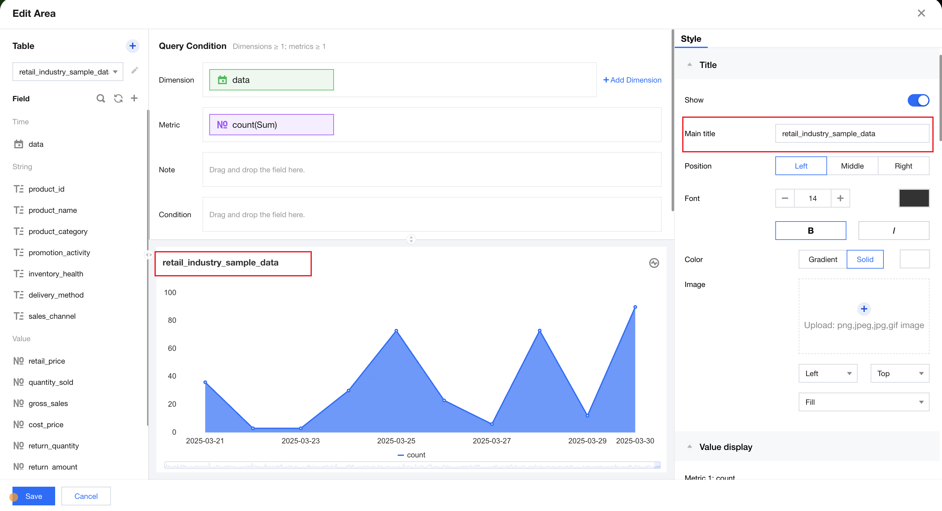
Component Title
You can click the title input box to manually input the title name.
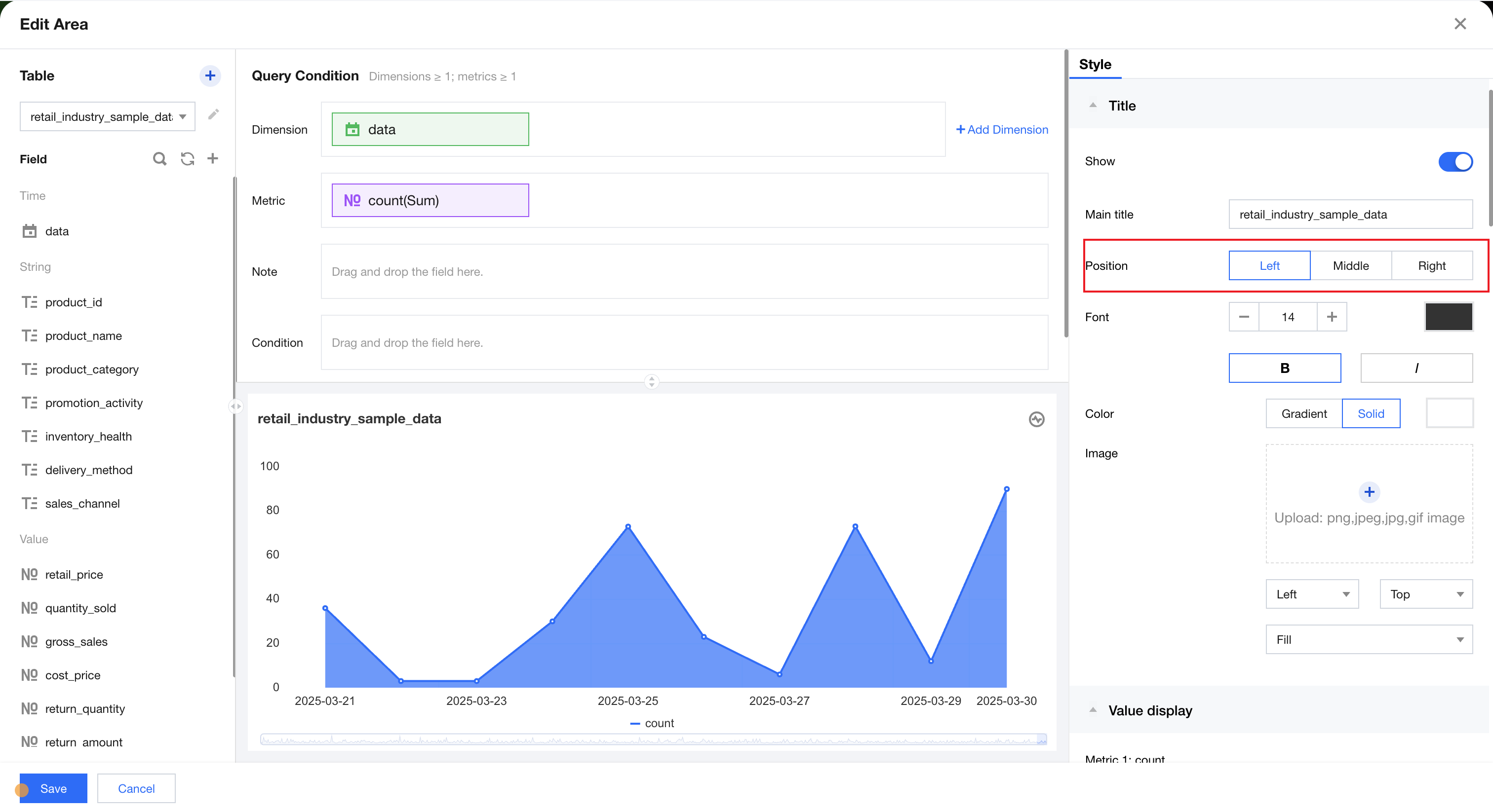
Title Position
Title position supports left-aligned, centered, and right-aligned settings. You can switch the title position to achieve different layouts.
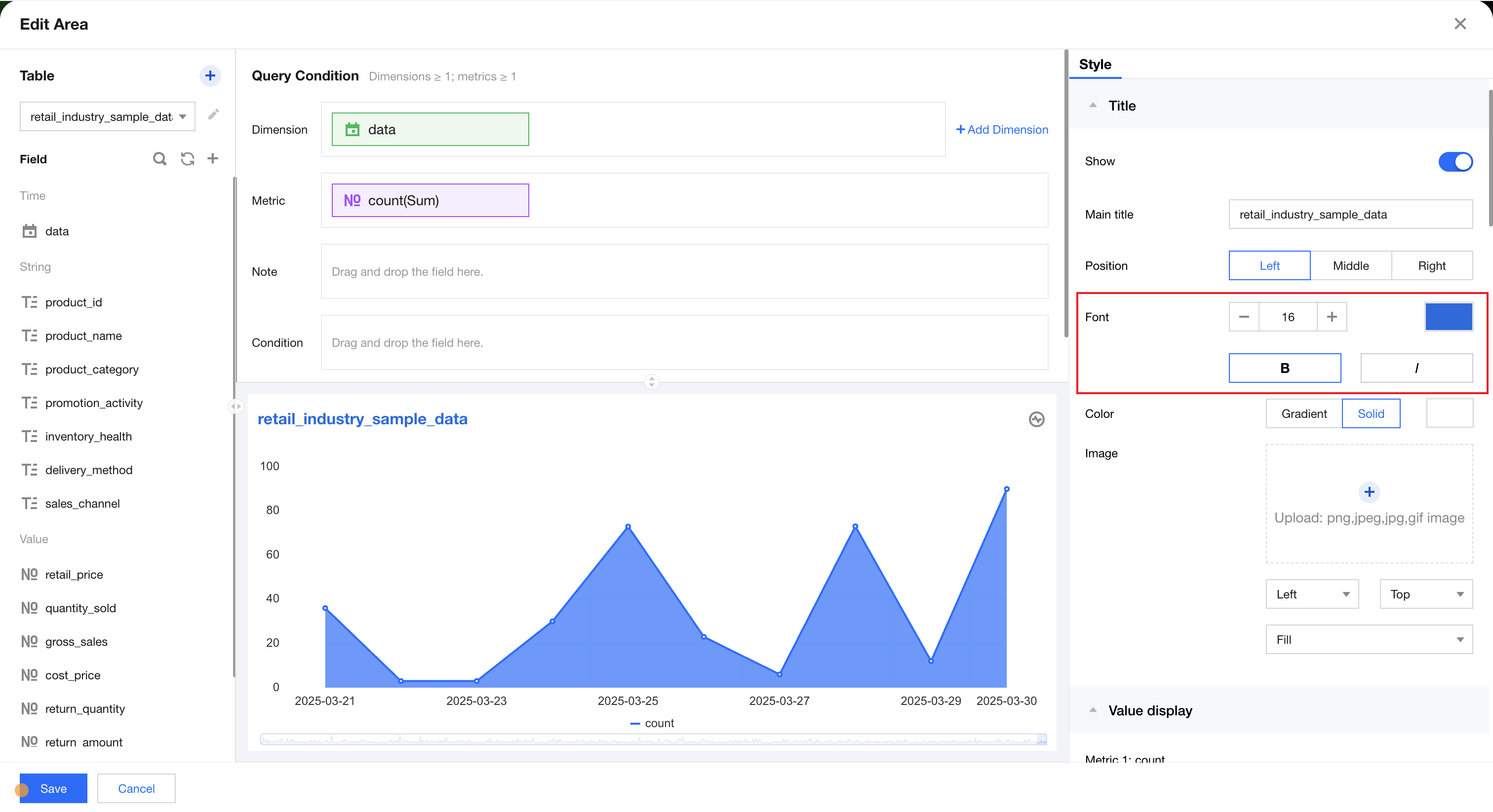
Text style
In text style, you can set the title's font size, color, bold, and italic.
Title Background Color
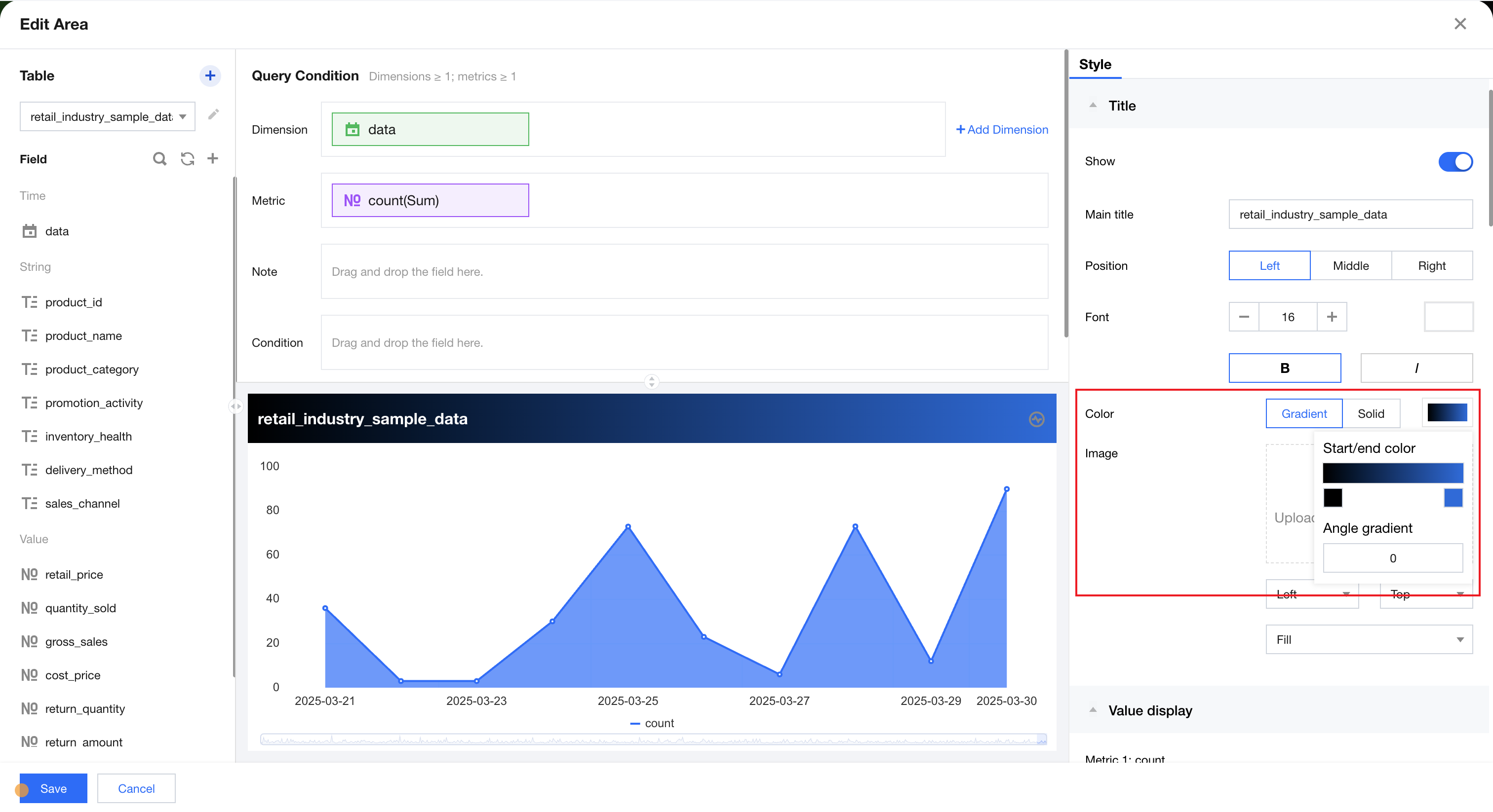
The title background color supports different colors for the title bar, with two styles: mono and gradient.
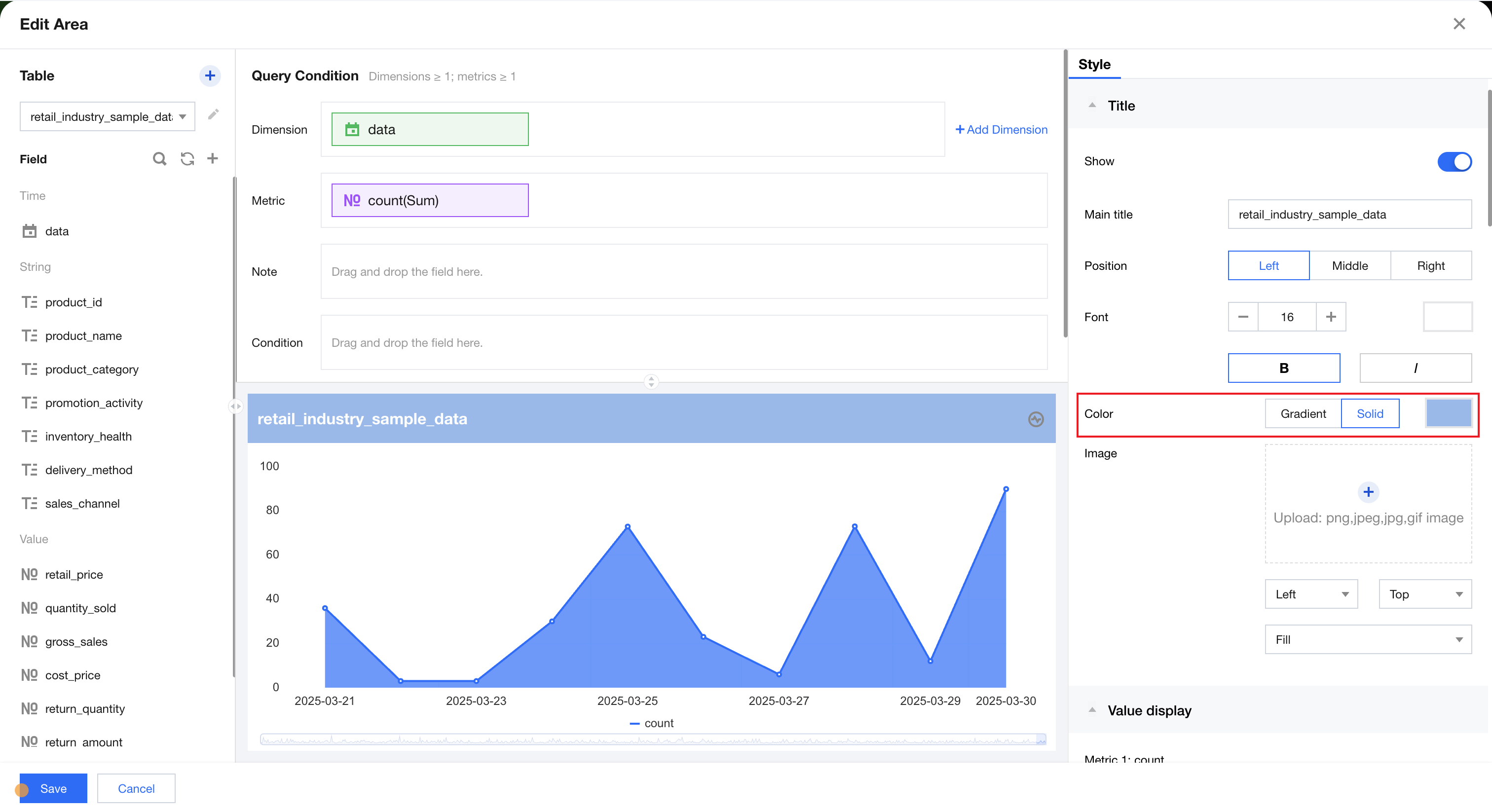
You can click gradient to switch to the gradient color selector, confirm the corresponding color in the start/end color selector, and adjust the final display effect of the background color by entering the gradient angle.
Title Background Image
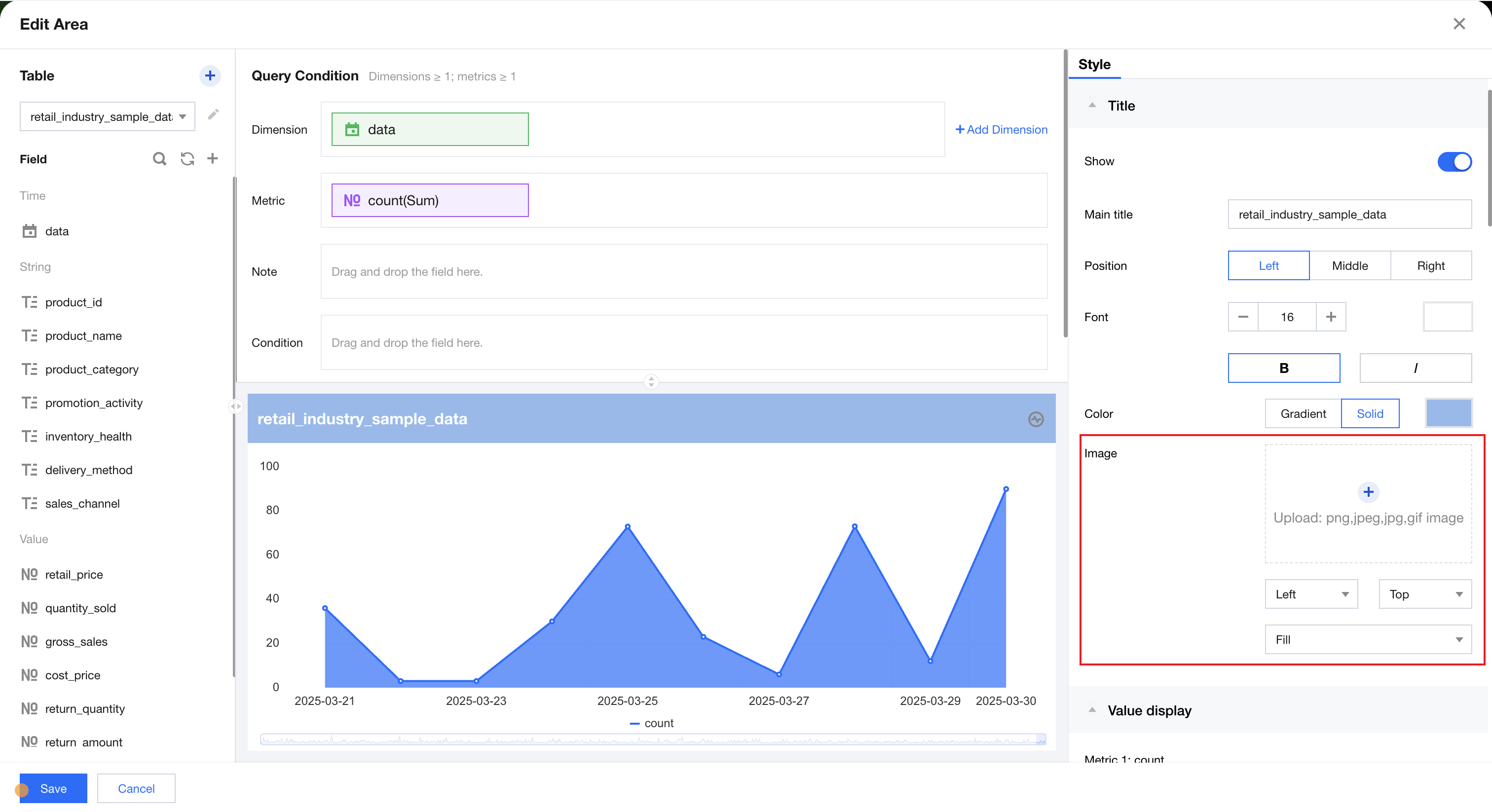
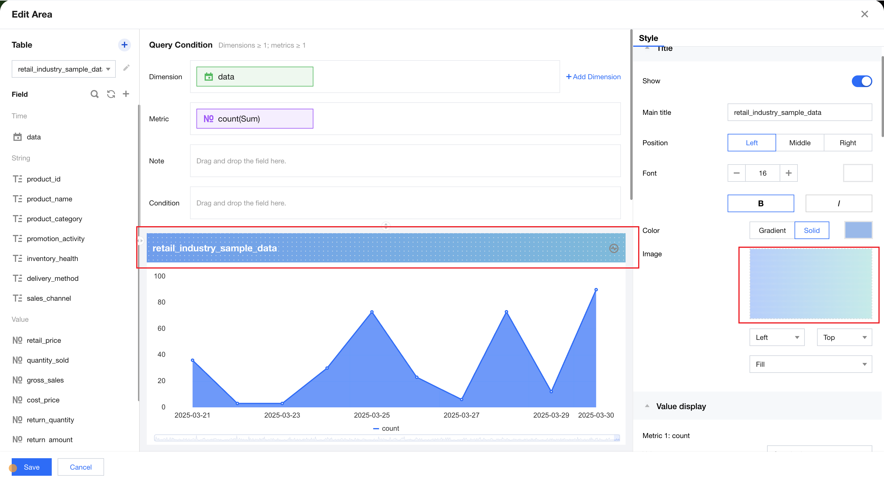
Allows uploading images in png, jpeg, jpg, or gif format as title background images. Adjust the final display effect by switching the background image alignment mode and image fit method.
Help and Support
Was this page helpful?
You can also Contact sales or Submit a Ticket for help.
Help us improve! Rate your documentation experience in 5 mins.
Feedback