Tab Component
The Tab Component is a collection of multiple charts. Switch tabs to view content under different tags.
Examples
View product sales status by department through tag switching.
Legend Effect
Usage
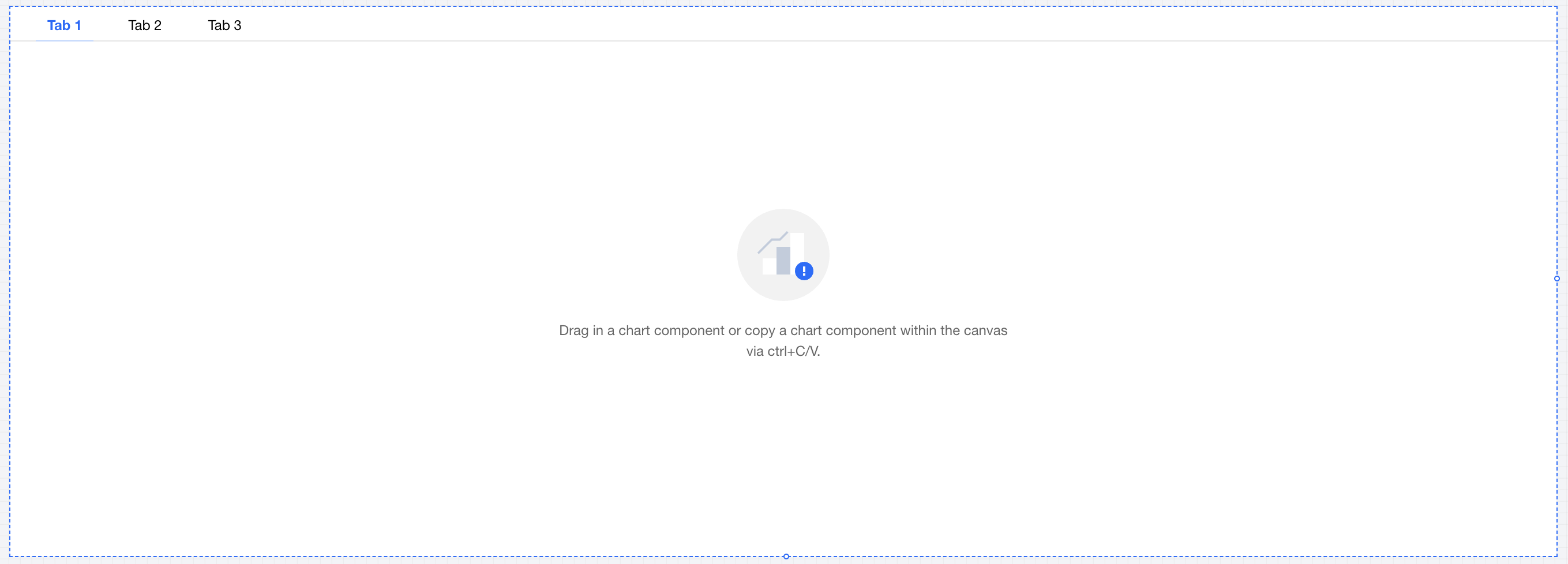
1. Drag the Tab Component from the component list to the canvas.
2. Add a tag and set tag items (see component settings);
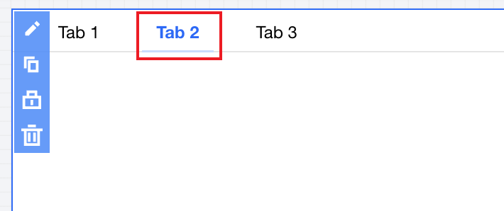
3. Click the tag in the component to switch to the currently active tag item:
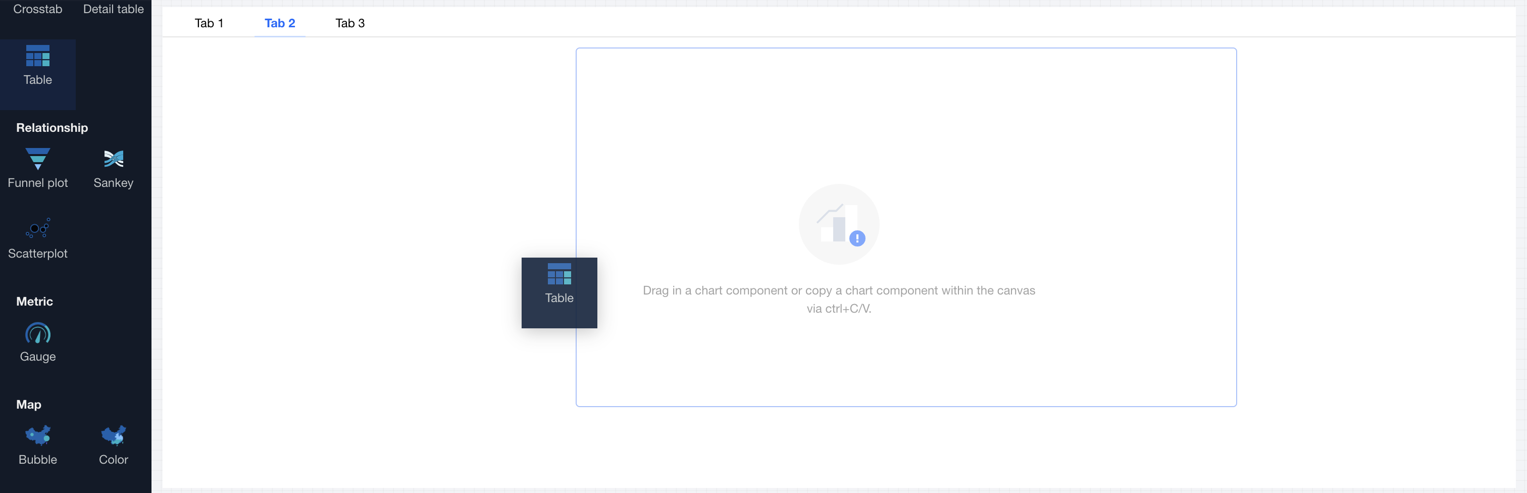
4. Drag the chart component to the corresponding tag item content area.
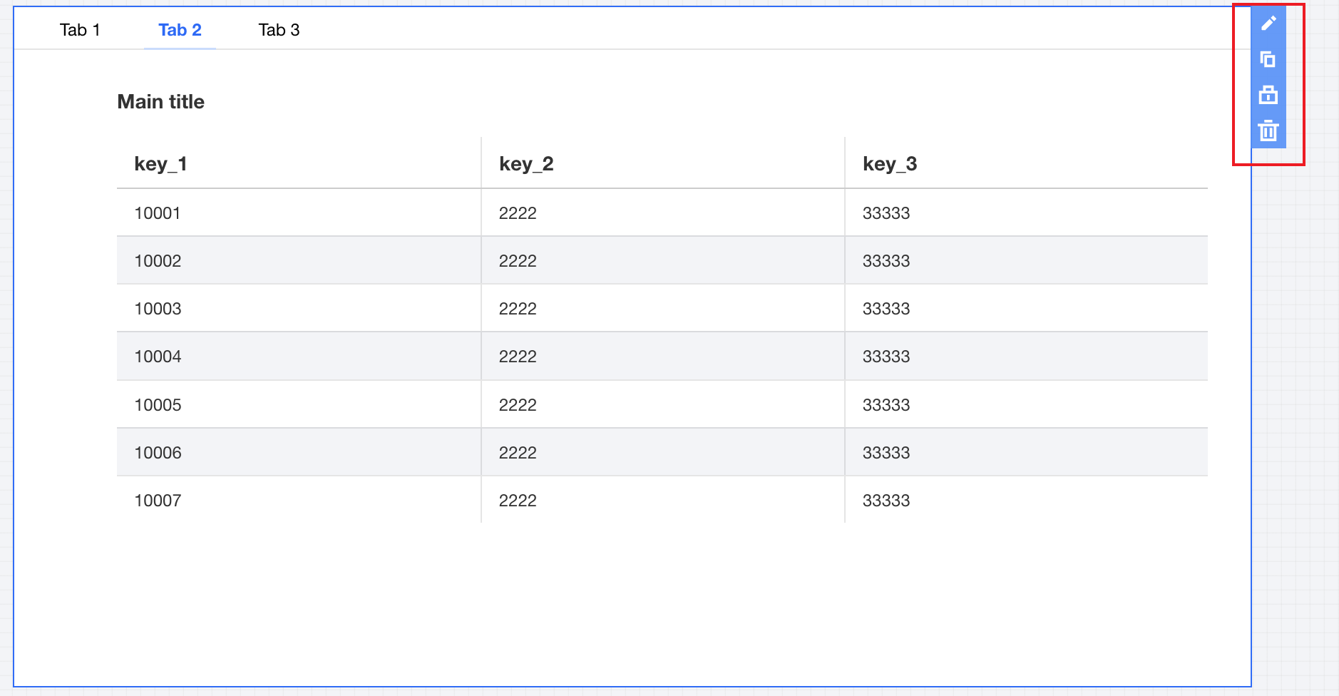
5. Edit chart content (see operation guide for each chart component).
Component Settings
The Tab Component supports the following settings:
Set category | Setting Item | Setup Instructions |
tag item | tag item name | Display name of the tag item |
| tag item sort | Click the up and down arrows on the left side to sort tag items. |
| Adding a Tag | Click to add a tag item, supporting up to 10 tag items |
| Delete tags. | Click the delete icon on the right to remove a tag item, with a minimum of 1 tag item reserved. |
Tag style | tag alignment | Set tag alignment mode, offering three types to select: 1. Left 2. Center 3. Right |
| tag format | Set tag display form, offering two types to select: 1. Text type 2. Button type |
| decimal places retained | Set the number of decimal places for numeric values. For example, "1211.2334" with 2 decimal places retained will show as "1211.23". |
Title | Display | Turn on/off display tab Title |
| Title | Show tab component title name |
Note
1. The Tab Component supports only chart components and cannot place non-chart components, such as text.
2. Each tag page supports only one chart component.
Help and Support
Was this page helpful?
You can also Contact sales or Submit a Ticket for help.
Help us improve! Rate your documentation experience in 5 mins.
Feedback