Search
Download
Focus Mode
Font Size
Component Overview
Search is a complete search solution with a full set of components, including search bar, result display, advanced search, and other features. It is suitable for user, group, and message search in instant messaging, online meeting, and online education scenarios.
Note:
Component Architecture
Search (main component)├── SearchBar # Search bar component├── SearchResults # Search result component├── SearchAdvanced # Advanced search component└── SearchResultsItem # Search result item component├── User # User result item├── Group # Group result item├── Message # Message result item└── Conversation # Session result item
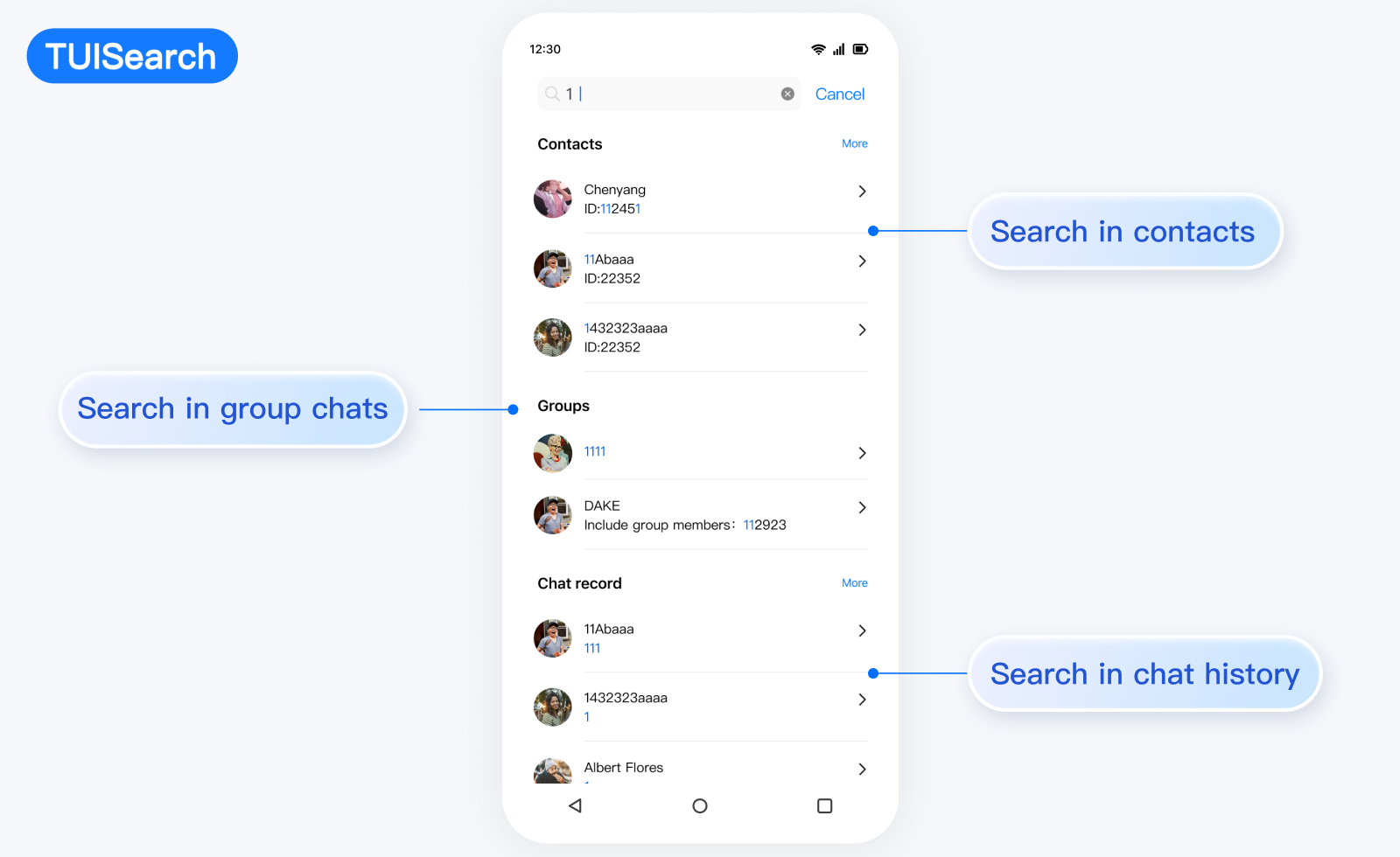
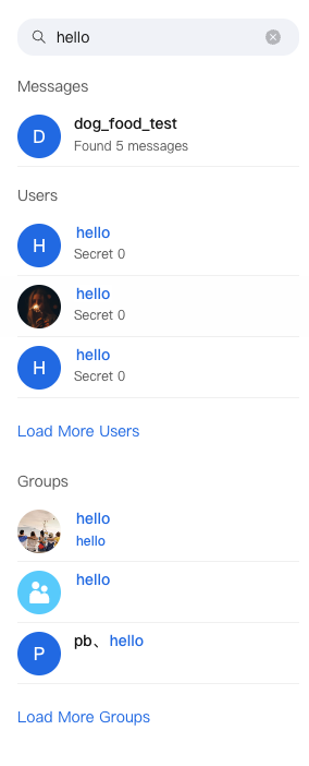
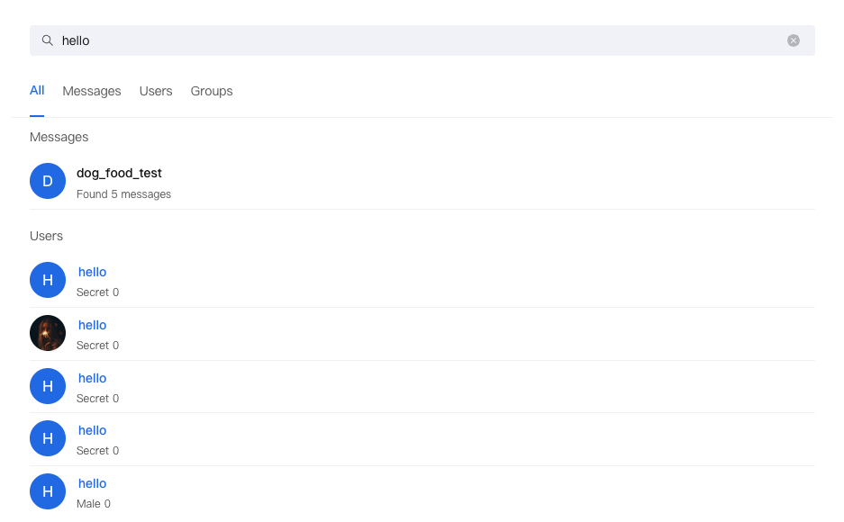
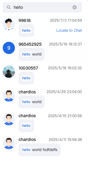
Search Mode
Mini Mode | Standard Mode | Embedded Mode |
Suitable for sidebar or small container Display finite number of results Support expand to view more | Suitable for full-screen search UI Feature demonstration Advanced Search Support | Suitable for chat UI Focus on message search Optimized layout |
 |  |  |
Props
Attribute Name | Type | Default Value | Description |
variant | VariantType | VariantType.MINI | Search mode: mini, standard, embedded |
SearchBar | React.ComponentType<SearchBarProps> | DefaultSearchBar | Custom search box component |
SearchResults | React.ComponentType<SearchResultsProps> | DefaultSearchResults | Custom search result component |
SearchAdvanced | React.ComponentType<SearchAdvancedProps> | DefaultSearchAdvanced | Custom advanced search component |
SearchResultsPresearch | React.ComponentType | - | Search placeholder component |
SearchResultsLoading | React.ComponentType | - | Loading placeholder component |
SearchResultsEmpty | React.ComponentType | - | Empty result placeholder component |
SearchResultItem | React.ComponentType<ResultItemProps> | - | Custom search result item component |
debounceTime | number | 300 | Search debounce time (ms) |
autoFocus | boolean | false | Auto-focus search box |
className | string | - | Custom style class name |
style | React.CSSProperties | - | custom style |
onKeywordChange | (keyword: string) => void | - | search keyword change callback |
onSearchComplete | (results: Map<SearchType, SearchResult>) => void | - | search complete callback |
onResultItemClick | (data: SearchResultItem, type: SearchType) => void | - | search result click callback |
onError | (error: Error) => void | - | search error callback |
Basic Usage
import { Search, VariantType } from '@tencentcloud/chat-uikit-react';function App() {return (<Searchvariant={VariantType.STANDARD}onResultItemClick={(data, type) => {console.log('Search result click:', data, type);}}/>);}
Custom Capabilities
Search provides users with various and dimensional Props APIs, allowing them to customize features, UI, and modules.Search component provides multiple replaceable subcomponents, allowing users to customize SearchBar, SearchResults, SearchAdvanced, SearchResultItem, SearchResultsPresearch, SearchResultsLoading, SearchResultsEmpty. Users can also leverage default subcomponents for secondary development customization.Props
Attribute Name | Type | Default Value | Description |
data | SearchResultItem | - | search result data |
type | SearchType | - | search result type |
keyword | string | - | search keyword |
onClick | (data: SearchResultItem, type: SearchType) => void | - | click callback |
className | string | - | Custom style class name |
Example
const CustomSearchBar = ({ value, onChange, onClear, placeholder }) => (<div className="custom-search-bar"><inputtype="text"value={value}onChange={onChange}placeholder={placeholder}/>{value && <button onClick={onClear}>Clear</button>}</div>);<Search SearchBar={CustomSearchBar} />
Props
Attribute Name | Type | Default Value | Description |
results | Map<SearchType, SearchResult> | - | search result data |
isLoading | boolean | - | whether loading |
error | Error | null | - | Error Message |
keyword | string | - | search keyword |
typeLabels | Record<SearchType, string> | - | search type tag |
onLoadMore | (type: SearchType) => void | - | Load more callback |
onResultItemClick | (data: SearchResultItem, type: SearchType) => void | - | result item click callback |
SearchResultsLoading | React.ComponentType | Loading | Custom load component |
SearchResultsPresearch | React.ComponentType | - | Search placeholder component |
SearchResultsEmpty | React.ComponentType | EmptyResult | Empty result placeholder component |
SearchResultItem | React.ComponentType<ResultItemProps> | DefaultSearchResultsItem | Custom result item component |
variant | VariantType | VariantType.STANDARD | Display Mode |
searchType | SearchType | 'all' | 'all' | Current search type |
Example
const CustomSearchResults = ({ results, keyword, onResultItemClick }) => (<div className="custom-results">{Array.from(results.entries()).map(([type, result]) => (<div key={type}><h3>{type}</h3>{result.resultList.map((item, index) => (<div key={index} onClick={() => onResultItemClick(item, type)}>{/* Custom result item */}</div>))}</div>))}</div>);<Search SearchResults={CustomSearchResults} />
Props
Attribute Name | Type | Default Value | Description |
variant | VariantType | - | Display Mode |
searchType | SearchTabType | - | Current search type |
advancedParams | Map<SearchType, SearchParamsMap[SearchType]> | - | Advanced search parameters |
onAdvancedParamsChange | (type: SearchType, params: SearchParamsMap[SearchType]) => void | - | Parameter change callback |
Example
const CustomSearchAdvanced= ({ variant, searchType, advancedParams, onAdvancedParamsChange }) => (<div className="custom-advanced">{/* Custom advanced search function */}</div>);<SearchSearchAdvanced={CustomSearchAdvanced} />
Props
Attribute Name | Type | Default Value | Description |
data | SearchResultItem | - | search result data |
type | SearchType | - | search result type |
keyword | string | - | search keyword |
onClick | (data: SearchResultItem, type: SearchType) => void | - | click callback |
className | string | - | Custom style class name |
Example
const CustomSearchItem = ({ data, type, keyword, onClick }) => (<div className="custom-item">{type === SearchType.MESSAGE && (<Conversationdata={data}keyword={keyword}onClick={onClick}/>)}{type === SearchType.USER && (<Userdata={data}keyword={keyword}onClick={onClick}/>)}{type === SearchType.GROUP && (<Groupdata={data}keyword={keyword}onClick={onClick}/>)}{type === SearchType.CHAT_MESSAGE && (<Messagedata={data}keyword={keyword}onClick={onClick}/>)}</div>);<SearchSearchResultItem={CustomSearchItem} />
Props
Attribute Name | Type | Default Value | Description |
SearchResultsPresearch | React.ComponentType | - | Search placeholder component |
SearchResultsLoading | React.ComponentType | - | Loading placeholder component |
SearchResultsEmpty | React.ComponentType | - | Empty result placeholder component |
Example
<SearchSearchResultsPresearch={() => <div>Enter keywords to start search</div>}SearchResultsLoading={() => <div>Searching...</div>}SearchResultsEmpty={() => <div>No result found</div>}/>
FAQs
How to Customize the Search Result Display Format
A: Use the
SearchResultItem property to import a customize component.How to Handle Search Performance Issues
A: Adjust
debounceTime, use React.memo, and consider result cache.How to Optimize Mobile Terminal
A: The component automatically adapts to mobile terminals and can be further customized via CSS.
How to Support Multilingual
A: The component has built-in internationalization support. Use
useUIKit to get translations.
Help and Support
Was this page helpful?
You can also Contact sales or Submit a Ticket for help.
Help us improve! Rate your documentation experience in 5 mins.
Feedback