The comparison charts in Tencent Cloud BI products include bar charts, column charts, stacked column charts, stacked bar charts, stacked area charts, percentage bar charts, percentage column charts, percentage area charts, and waterfall charts. They are mainly used to compare data size and differences between items.
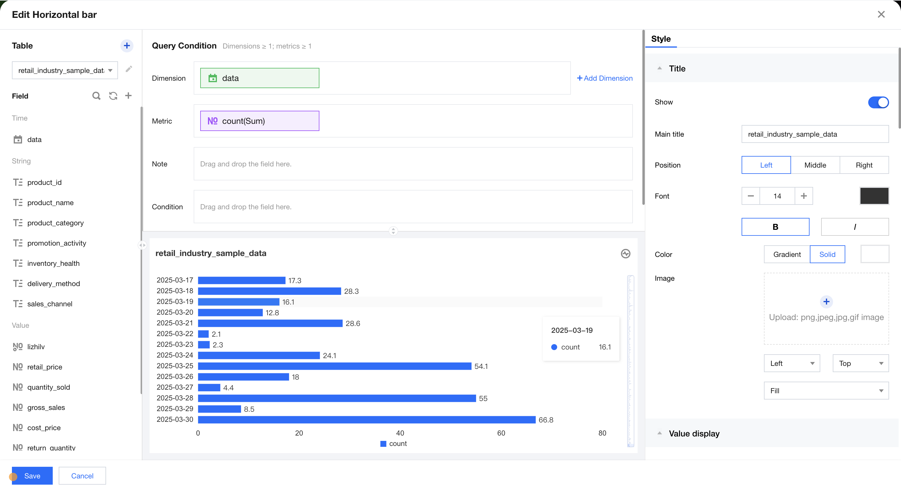
Bar chart
The bar chart is mainly used to compare data size and differences between items through horizontal display. As shown in the figure below, it compares sales data at different times.
Supplementary analysis can be performed on existing dimensions by adding dimension sub-axes.
The condition area allows conditional filtering of data by dragging and dropping time, character, and numeric value fields.
The immediate analysis button can trigger the chart's data update display, while on the right, you can set the maximum display of XX results (0-10000).
Component Style Settings
Bar chart supports the following style settings:
Setting Item
Category Settings
Setup Instructions
Title
Display
Enable/Disable Chart Title Display
Main Title
Set Chart Main Title
horizontal position
Set the horizontal position of the title display, such as left, center, or right.
numeric display
value type
Set the numeric display type, with three types to choose from: 1. Standard numerical value: for example, "1211" shows as "1211" 2. Percentage: for example, "0.11" shows as "11%" 3. Thousands separator: for example, "1211" shows as "1,211"
value unit
Set the unit for numeric display, with the following units to choose from: 1. None 2. Ten thousand: for example, "121112" shows as 12.111, and so on for the following units 3. Million 4. Ten million 5. Hundred million 6. One billion 7. Billions of
decimal places retained
Set the number of decimal places for numeric values. For example, "1211.2334" shows as "1211.23" when set to retain 2 decimal places.
Tags
Display
Enable/Disable Tag Display
data name
To display the data name, enable it.
Data value.
To display the numeric value, enable it. Normally, enable the display of the Tag. The data value must be enabled simultaneously.
Legend
Display
Enable/Disable Legend Display
Position
Set the display position of the legend, supporting four types of position selection: top, bottom, left, right.
alignment
Set the alignment mode of the legend, supporting five alignment options: left, center, right, top, and bottom.
Area zoom
Intelligent Display Do not display
Intelligent: Adapt area zoom based on size and dimension count Display/Do not display: Turn on/off chart title
Coordinate axis settings
Display Y-axis
Whether to display the Y-axis
Display Y-axis Title
Whether to display the Y-axis Title
Y-axis text count
Set Y-axis text count
Y-axis line count
Set Y-axis line count
Display X-axis
Whether to display the X-axis
Display X-axis title
Whether to display the X-axis title
X-axis text count
Set X-axis text count
X-axis line count
Set X-axis line count
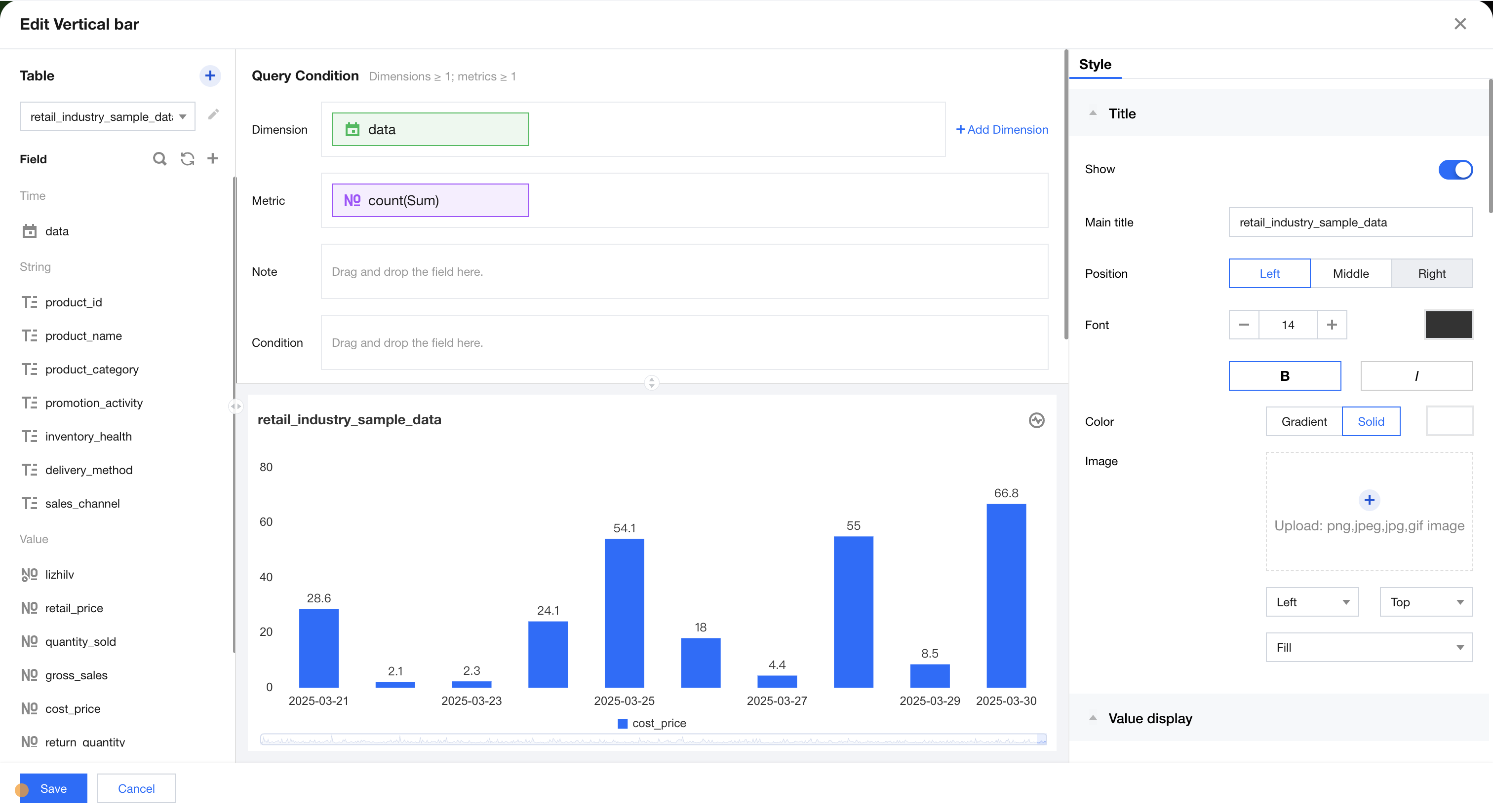
Bar Chart
The histogram is mainly used to compare differences between group data and display changes over a period of time. As shown in the figure below, it represents a comparison of sales data for each month.
Supplementary analysis can be performed on existing dimensions by adding dimension sub-axes.
The condition area allows conditional filtering of data by dragging and dropping time, character, and numeric value fields.
The immediate analysis button can trigger the chart's data update display, while on the right, you can set the maximum display of XX results (0-10000).
Component Style Settings
Histogram supports the following style settings:
Setting Item
Category Settings
Setup Instructions
Title
Display
Enable/Disable Chart Title Display
Main Title
Set Chart Main Title
horizontal position
Set the horizontal position of the title display, such as left, center, or right.
numeric display
value type
Set the numeric display type, with three types to choose from: 1. Standard numerical value: for example, "1211" shows as "1211" 2. Percentage: for example, "0.11" shows as "11%" 3. Thousands separator: for example, "1211" shows as "1,211"
value unit
Set the unit for numeric display, with the following units to choose from: 1. None 2. Ten thousand: for example, "121112" shows as 12.111, and so on for the following units 3. Million 4. Ten million 5. Hundred million 6. One billion 7. Billions of
decimal places retained
Set the number of decimal places for numeric values. For example, "1211.2334" shows as "1211.23" when set to retain 2 decimal places.
Tags
Display
Enable/Disable Tag Display
data name
To display the data name, enable it.
Data value.
To display the numeric value, enable it. Normally, enable the display of the Tag. The data value must be enabled simultaneously.
Legend
Display
Enable/Disable Legend Display
Position
Set the display position of the legend, supporting four types of position selection: top, bottom, left, right.
alignment
Set the alignment mode of the legend, supporting five alignment options: left, center, right, top, and bottom.
Area zoom
Intelligent Display Do not display
Intelligent: Adapt area zoom based on size and dimension count Display/Do not display: Turn on/off chart title
Coordinate axis settings
Display Y-axis
Whether to display the Y-axis
Display Y-axis Title
Whether to display the Y-axis Title
Y-axis text count
Set Y-axis text count
Y-axis line count
Set Y-axis line count
Display X-axis
Whether to display the X-axis
Display X-axis title
Whether to display the X-axis title
Display rule for X-axis label
Set the display direction of the X-axis label, supporting horizontal, vertical, skew, and custom four types.
X-axis text count
Set X-axis text count
X-axis line count
Set X-axis line count
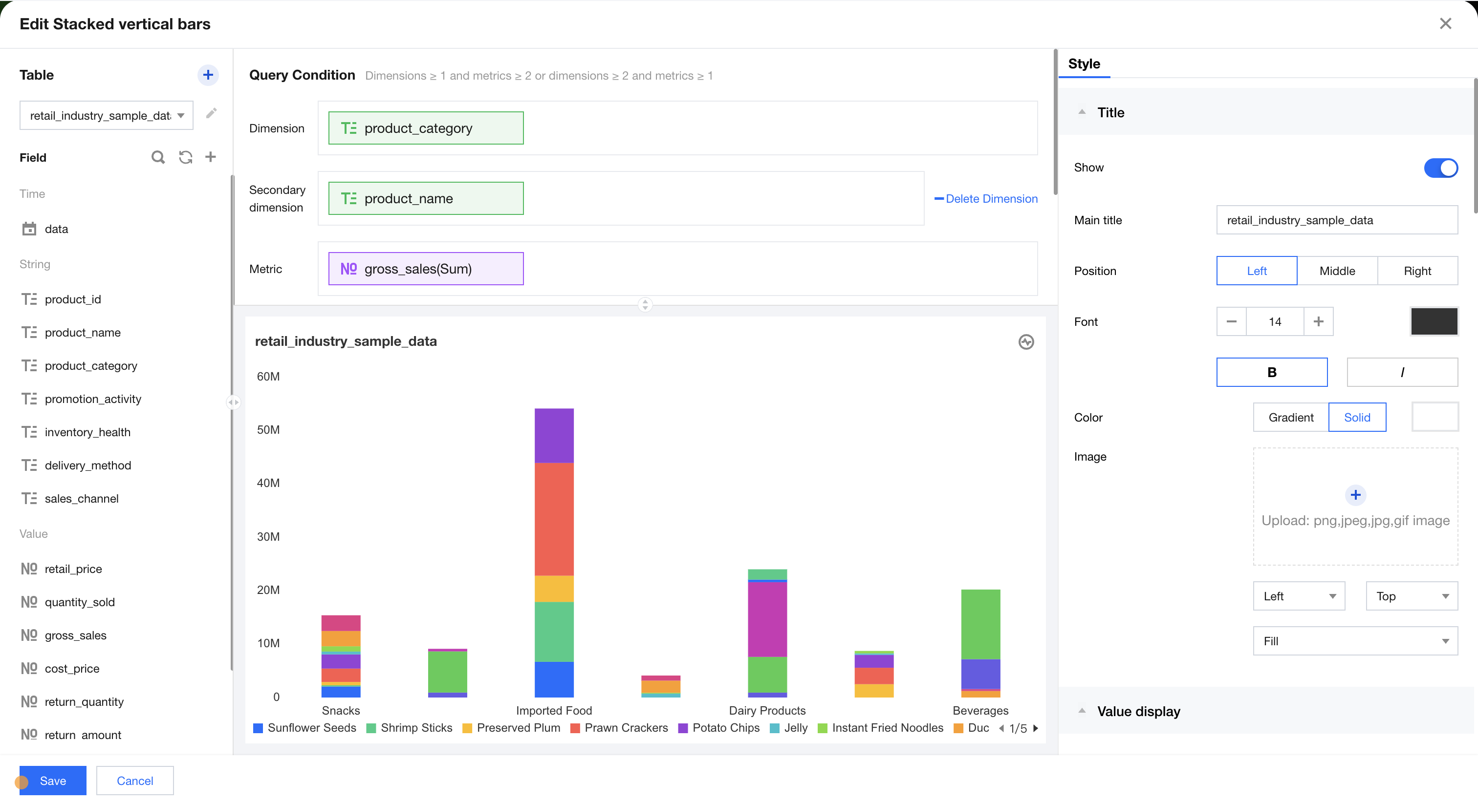
Stacked Column Chart
The stacked column chart is primarily used to graphically display data for each subcategory within a main category, as well as the proportion of each subcategory. It shows the relationship between individual items and the overall data. As shown in the figure below, it presents comparison data of sales for each category by month.
Query Condition Settings
Dimensions & Metrics Requirements: dimensions ≥1, metrics ≥2 or dimensions ≥2, metrics ≥1. You can perform further supplementary analysis by adding a dimension sub-axis to the existing dimensions. As shown in the figure above, the stacked column chart represents sales data comparison across different categories. Each column block indicates sales data for a specific category at a certain time, with each category distinguished by color. Alternatively, you can add multiple metrics to display a stacked column chart for each corresponding metric. The condition area allows filtering data by dragging and dropping time, character, or numeric fields. The immediate analysis button triggers the chart's data update display. Meanwhile, you can set the maximum display count (0-10000) on the right.
Component Style Settings
Stacked column chart supports the following style settings
Setting Item
Category Settings
Setup Instructions
Title
Display
Enable/Disable Chart Title Display
Main Title
Set Chart Main Title
horizontal position
Set the horizontal position of the title display, such as left, center, or right.
numeric display
value type
Set the numeric display type, with three types to choose from: 1. Standard numerical value: for example, "1211" shows as "1211" 2. Percentage: for example, "0.11" shows as "11%" 3. Thousands separator: for example, "1211" shows as "1,211"
value unit
Set the unit for numeric display, with the following units to choose from: 1. None 2. Ten thousand: for example, "121112" shows as 12.111, and so on for the following units 3. Million 4. Ten million 5. Hundred million 6. One billion 7. Billions of
decimal places retained
Set the number of decimal places for numeric values. For example, "1211.2334" shows as "1211.23" when set to retain 2 decimal places.
Tags
Display
Enable/Disable Tag Display
data name
To display the data name, enable it.
Data value.
To display the numeric value, enable it. Normally, enable the display of the Tag. The data value must be enabled simultaneously.
Legend
Display
Enable/Disable Legend Display
Position
Set the display position of the legend, supporting four types of position selection: top, bottom, left, right.
alignment
Set the alignment mode of the legend, supporting five alignment options: left, center, right, top, and bottom.
Area zoom
Intelligent Display Do not display
Intelligent: Adapt area zoom based on size and dimension count Display/Do not display: Turn on/off chart title
Coordinate axis settings
Display Y-axis
Whether to display the Y-axis
Display Y-axis Title
Whether to display the Y-axis Title
Y-axis text count
Set Y-axis text count
Y-axis line count
Set Y-axis line count
Display X-axis
Whether to display the X-axis
Display X-axis title
Whether to display the X-axis title
Display rule for X-axis label
Set the display direction of the X-axis label, supporting horizontal, vertical, skew, and custom four types.
X-axis text count
Set X-axis text count
X-axis line count
Set X-axis line count
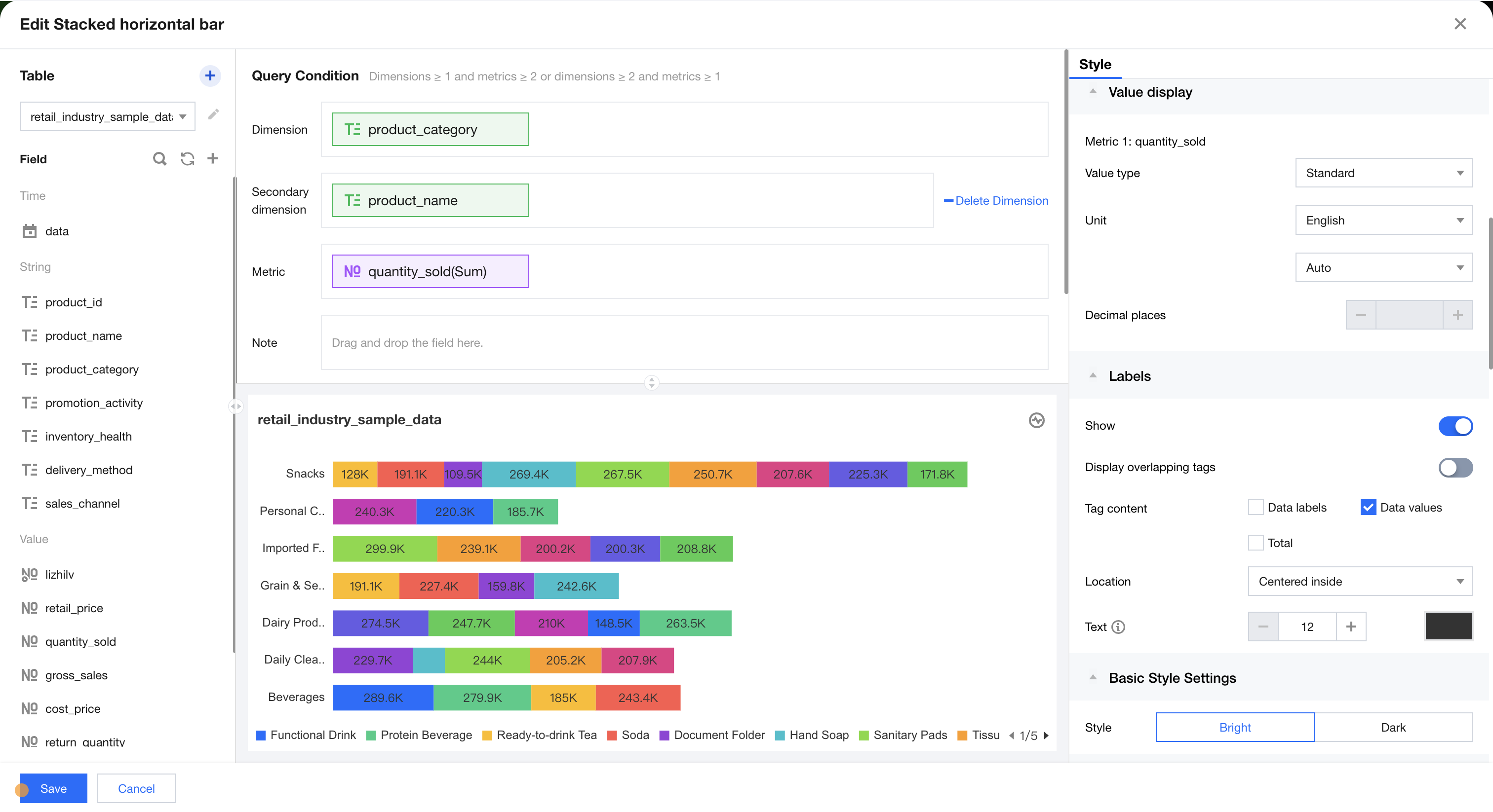
Stacked Bar Chart
The stacked bar chart is mainly used to split each bar to show the data size of similar categories. As shown in the figure below, it compares sales data for each category by month.
Query Condition Settings
Dimension & metric count requirements: dimensions ≥1, metrics ≥2 or dimensions ≥2, metrics ≥1. You can further supplement the analysis of existing dimensions by adding a dimension sub-axis. As shown in the figure above, it represents stacked comparison data of sales across different categories. Each bar indicates sales data for a specific category at a certain time, with each category distinguished by color. Alternatively, you can add multiple metrics to display stacked bar charts for each metric. The condition area allows filtering data by dragging and dropping time, character, or numeric fields. The immediate analysis button triggers chart updates, and you can set the maximum display of XX results (0-10000) on the right.
Component Style Settings
Stacked bar chart supports the following style settings:
Setting Item
Category Settings
Setup Instructions
Title
Display
Enable/Disable Chart Title Display
Main Title
Set Chart Main Title
horizontal position
Set the horizontal position of the title display, such as left, center, or right.
numeric display
value type
Set the numeric display type, with three types to choose from: 1. Standard numerical value: for example, "1211" shows as "1211" 2. Percentage: for example, "0.11" shows as "11%" 3. Thousands separator: for example, "1211" shows as "1,211"
value unit
Set the unit for numeric display, with the following units to choose from: 1. None 2. Ten thousand: for example, "121112" shows as 12.111, and so on for the following units 3. Million 4. Ten million 5. Hundred million 6. One billion 7. Billions of
decimal places retained
Set the number of decimal places for numeric values. For example, "1211.2334" shows as "1211.23" when set to retain 2 decimal places.
Tags
Display
Enable/Disable Tag Display
data name
To display the data name, enable it.
Data value.
To display the numeric value, enable it. Normally, enable the display of the Tag. The data value must be enabled simultaneously.
Legend
Display
Enable/Disable Legend Display
Position
Set the display position of the legend, supporting four types of position selection: top, bottom, left, right.
alignment
Set the alignment mode of the legend, supporting five alignment options: left, center, right, top, and bottom.
Area zoom
Intelligent Display Do not display
Intelligent: Adapt area zoom based on size and dimension count Display/Do not display: Turn on/off chart title
Coordinate axis settings
Display Y-axis
Whether to display the Y-axis
Display Y-axis Title
Whether to display the Y-axis Title
Y-axis text count
Set Y-axis text count
Y-axis line count
Set Y-axis line count
Display X-axis
Whether to display the X-axis
Display X-axis title
Whether to display the X-axis title
X-axis text count
Set X-axis text count
X-axis line count
Set X-axis line count
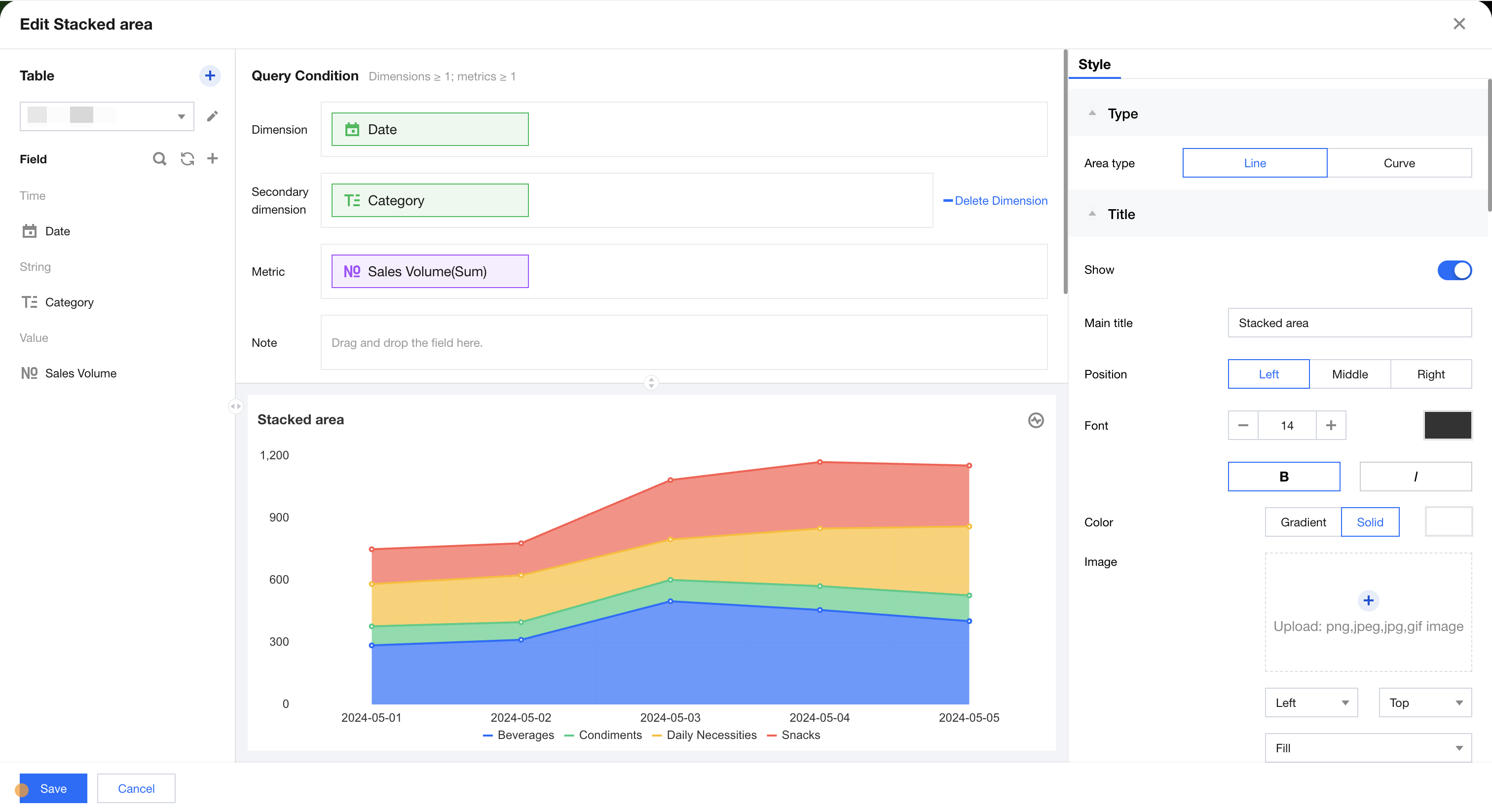
Stacked Area Chart
The stacked area chart is mainly for displaying the trend lines of each numeric value's size over time or by category, showing the relationship between parts and the whole. As shown below, it presents the trend stats of sales for each category by month.
Query Condition Settings
Dimension & metric count requirements: dimension ≥1, metric ≥1. Further supplementary analysis can be performed on the existing dimension by adding a dimension sub-axis. As shown in the figure above, the stacked area chart represents sales data of different categories, where each area chart indicates the sales data of a certain category at a specific time, and each area chart is distinguished by color. Alternatively, multiple metrics can be added to perform stacked display of each corresponding stacked area chart. The condition area allows filtering data by dragging and dropping time, character, or numeric value fields. The immediate analysis button can trigger the chart's data update display, and the maximum display of XX results (0-10000) can be set on the right.
Component Style Settings
Stacked bar chart supports the following style settings:
Setting Item
Category Settings
Setup Instructions
Area chart type
Line Area/Curve Area
Customizable stacked area chart type: line area chart or curve area
Title
Display
Enable/Disable Chart Title Display
Main Title
Set Chart Main Title
horizontal position
Set the horizontal position of the title display, such as left, center, or right.
numeric display
value type
Set the numeric display type, with three types to choose from: 1. Standard numerical value: for example, "1211" shows as "1211" 2. Percentage: for example, "0.11" shows as "11%" 3. Thousands separator: for example, "1211" shows as "1,211"
value unit
Set the unit for numeric display, with the following units to choose from: 1. None 2. Ten thousand: for example, "121112" shows as 12.111, and so on for the following units 3. Million 4. Ten million 5. Hundred million 6. One billion 7. Billions of
decimal places retained
Set the number of decimal places for numeric values. For example, "1211.2334" shows as "1211.23" when set to retain 2 decimal places.
Tags
Display
Enable/Disable Tag Display
data name
To display the data name, enable it.
Data value.
To display the numeric value, enable it. Normally, enable the display of the Tag. The data value must be enabled simultaneously.
Legend
Display
Enable/Disable Legend Display
Position
Set the display position of the legend, supporting four types of position selection: top, bottom, left, right.
alignment
Set the alignment mode of the legend, supporting five alignment options: left, center, right, top, and bottom.
Area zoom
Intelligent Display Do not display
Intelligent: Adapt area zoom based on size and dimension count Display/Do not display: Turn on/off chart title
Coordinate axis settings
Display Y-axis
Whether to display the Y-axis
Display Y-axis Title
Whether to display the Y-axis Title
Y-axis text count
Set Y-axis text count
Y-axis line count
Set Y-axis line count
Display X-axis
Whether to display the X-axis
Display X-axis title
Whether to display the X-axis title
Display rule for X-axis label
Set the display direction of the X-axis label, supporting horizontal, vertical, skew, and custom four types.
X-axis text count
Set X-axis text count
X-axis line count
Set X-axis line count
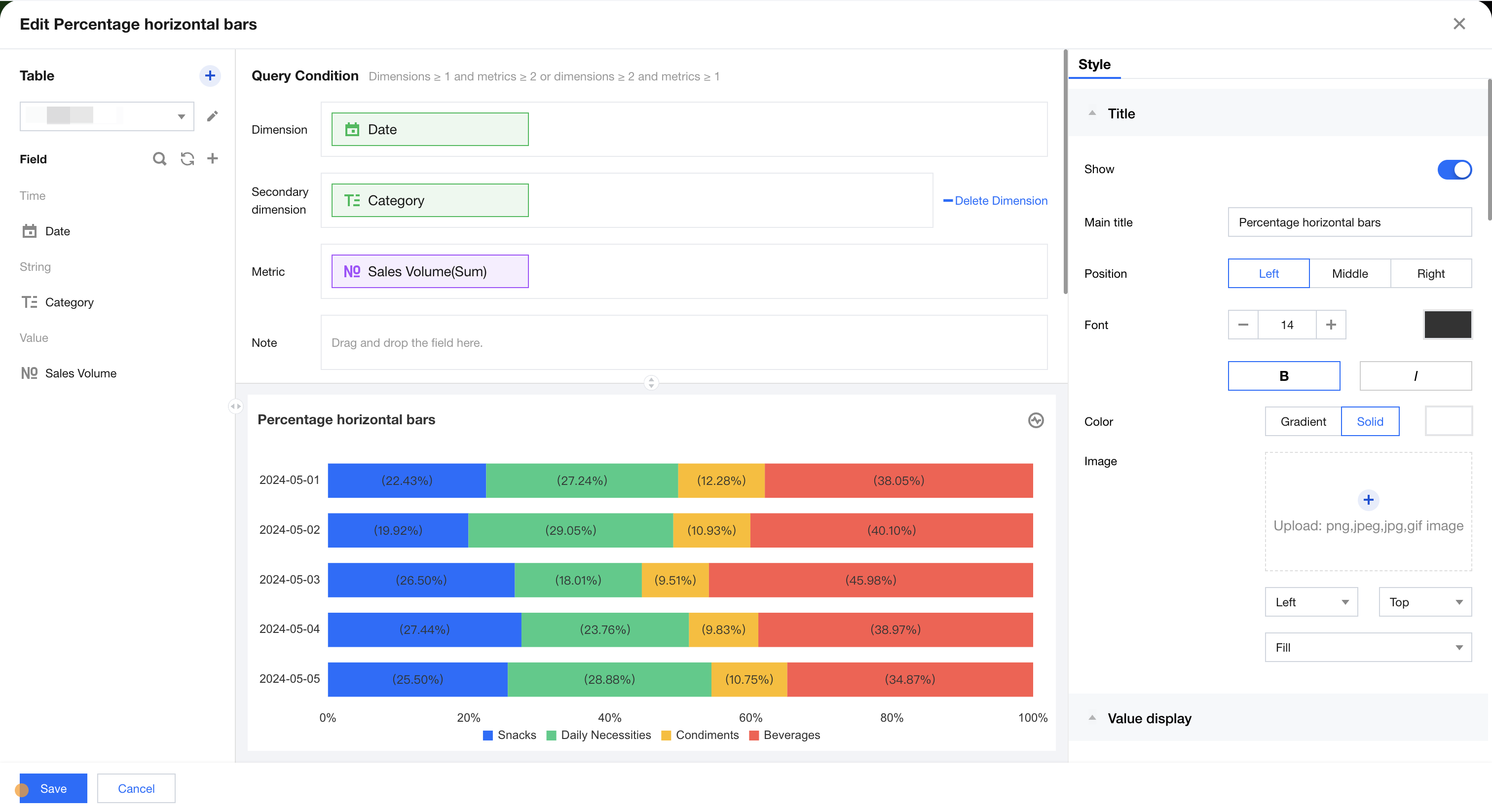
Percentage Bar Chart
The percentage bar chart is mainly used to show data for each subcategory within a main category, as well as the proportion of each subcategory. It displays the relationship between individual items and the overall data. As shown below, it presents the percentage comparison and distribution of sales for different categories by month.
Query Condition Settings
Dimensional & metric count requirements: dimensions ≥1, metrics ≥2 or dimensions ≥2, metrics ≥1. The existing dimensions can be further supplemented by adding a dimension sub-axis. As shown in the figure above, the data represents percentage sales comparisons across different categories, where each bar indicates sales percentage data for a specific category at a certain time, with each category distinguished by color. Alternatively, multiple metrics can be added to display stacked bar charts for each corresponding percentage. The condition area allows conditional filtering of data by dragging and dropping time, character, or numeric fields. The immediate analysis button triggers the chart's data update display, and the maximum display of XX results (0-10000) can be set on the right.
Component Style Settings
Percentage bar chart supports the following style settings:
Setting Item
Category Settings
Setup Instructions
Title
Display
Enable/Disable Chart Title Display
Main Title
Set Chart Main Title
horizontal position
Set the horizontal position of the title display, such as left, center, or right.
numeric display
value type
Set the numeric display type, with three types to choose from: 1. Standard numerical value: for example, "1211" shows as "1211" 2. Percentage: for example, "0.11" shows as "11%" 3. Thousands separator: for example, "1211" shows as "1,211"
value unit
Set the unit for numeric display, with the following units to choose from: 1. None 2. Ten thousand: for example, "121112" shows as 12.111, and so on for the following units 3. Million 4. Ten million 5. Hundred million 6. One billion 7. Billions of
decimal places retained
Set the number of decimal places for numeric values. For example, "1211.2334" shows as "1211.23" when set to retain 2 decimal places.
Tags
Display
Enable/Disable Tag Display
data name
To display the data name, enable it.
Data value.
To display the numeric value, enable it. Normally, enable the display of the Tag. The data value must be enabled simultaneously.
Percentage
To display percentage data, enable it.
Legend
Display
Enable/Disable Legend Display
Position
Set the display position of the legend, supporting four types of position selection: top, bottom, left, right.
alignment
Set the alignment mode of the legend, supporting five alignment options: left, center, right, top, and bottom.
Area zoom
Intelligent Display Do not display
Intelligent: Adapt area zoom based on size and dimension count Display/Do not display: Turn on/off chart title
Coordinate axis settings
Display Y-axis
Whether to display the Y-axis
Display Y-axis Title
Whether to display the Y-axis Title
Y-axis text count
Set Y-axis text count
Y-axis line count
Set Y-axis line count
Display X-axis
Whether to display the X-axis
Display X-axis title
Whether to display the X-axis title
X-axis text count
Set X-axis text count
X-axis line count
Set X-axis line count
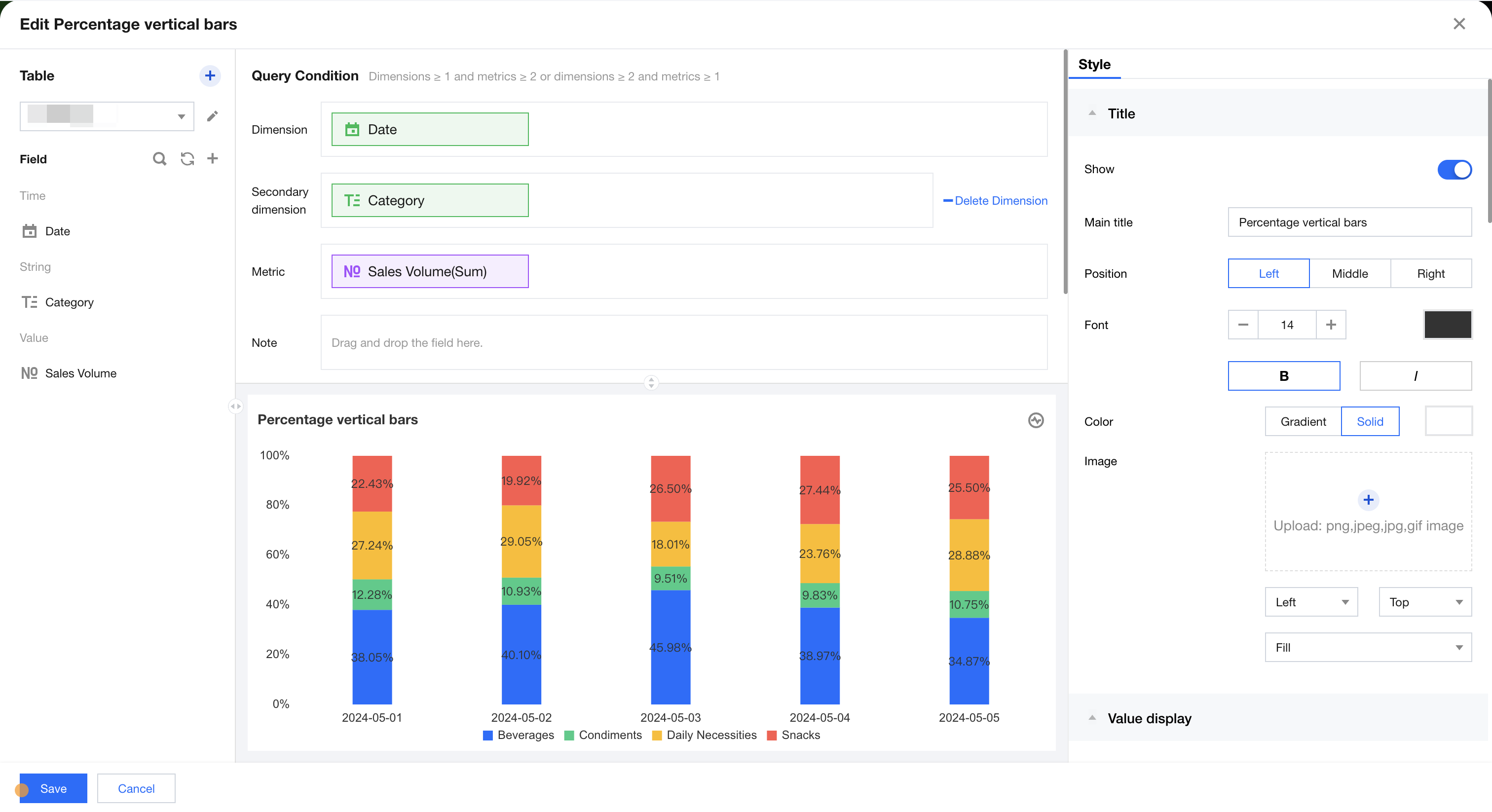
Percentage Column Chart
The stacked bar chart is used to display data for each subcategory within a main category, as well as the proportion of each subcategory. It shows the relationship between individual items and the overall data. As shown below, it presents percentage comparison data of sales for each category by month.
Query Condition Settings
Dimensions & Metrics Requirements: dimensions ≥1, metrics ≥2 or dimensions ≥2, metrics ≥1. You can further analyze existing dimensions by adding a dimension sub-axis. As shown in the figure above, it represents comparison data of sales percentage by different categories. Each column represents sales percentage data of a specific category at a certain time, with each category distinguished by color. Alternatively, you can add multiple metrics to display stacked percentage column charts for each metric. The condition area allows conditional filtering of data by dragging and dropping time, character, or numeric fields. The immediate analysis button can trigger the chart's update display, and you can set a maximum display of XX results (0-10000) on the right.
Component Style Settings
Percentage column chart supports the following style settings:
Setting Item
Category Settings
Setup Instructions
Title
Display
Enable/Disable Chart Title Display
Main Title
Set Chart Main Title
horizontal position
Set the horizontal position of the title display, such as left, center, or right.
numeric display
value type
Set the numeric display type, with three types to choose from: 1. Standard numerical value: for example, "1211" shows as "1211" 2. Percentage: for example, "0.11" shows as "11%" 3. Thousands separator: for example, "1211" shows as "1,211"
value unit
Set the unit for numeric display, with the following units to choose from: 1. None 2. Ten thousand: for example, "121112" shows as 12.111, and so on for the following units 3. Million 4. Ten million 5. Hundred million 6. One billion 7. Billions of
decimal places retained
Set the number of decimal places for numeric values. For example, "1211.2334" shows as "1211.23" when set to retain 2 decimal places.
Tags
Display
Enable/Disable Tag Display
data name
To display the data name, enable it.
Data value.
To display the numeric value, enable it. Normally, enable the display of the Tag. The data value must be enabled simultaneously.
Percentage
To display percentage data, enable it.
Legend
Display
Enable/Disable Legend Display
Position
Set the display position of the legend, supporting four types of position selection: top, bottom, left, right.
alignment
Set the alignment mode of the legend, supporting five alignment options: left, center, right, top, and bottom.
Area zoom
Intelligent Display Do not display
Intelligent: Adapt area zoom based on size and dimension count Display/Do not display: Turn on/off chart title
Coordinate axis settings
Display Y-axis
Whether to display the Y-axis
Display Y-axis Title
Whether to display the Y-axis Title
Y-axis text count
Set Y-axis text count
Y-axis line count
Set Y-axis line count
Display X-axis
Whether to display the X-axis
Display X-axis title
Whether to display the X-axis title
Display rule for X-axis label
Set the display direction of the X-axis label, supporting horizontal, vertical, skew, and custom four types.
X-axis text count
Set X-axis text count
X-axis line count
Set X-axis line count
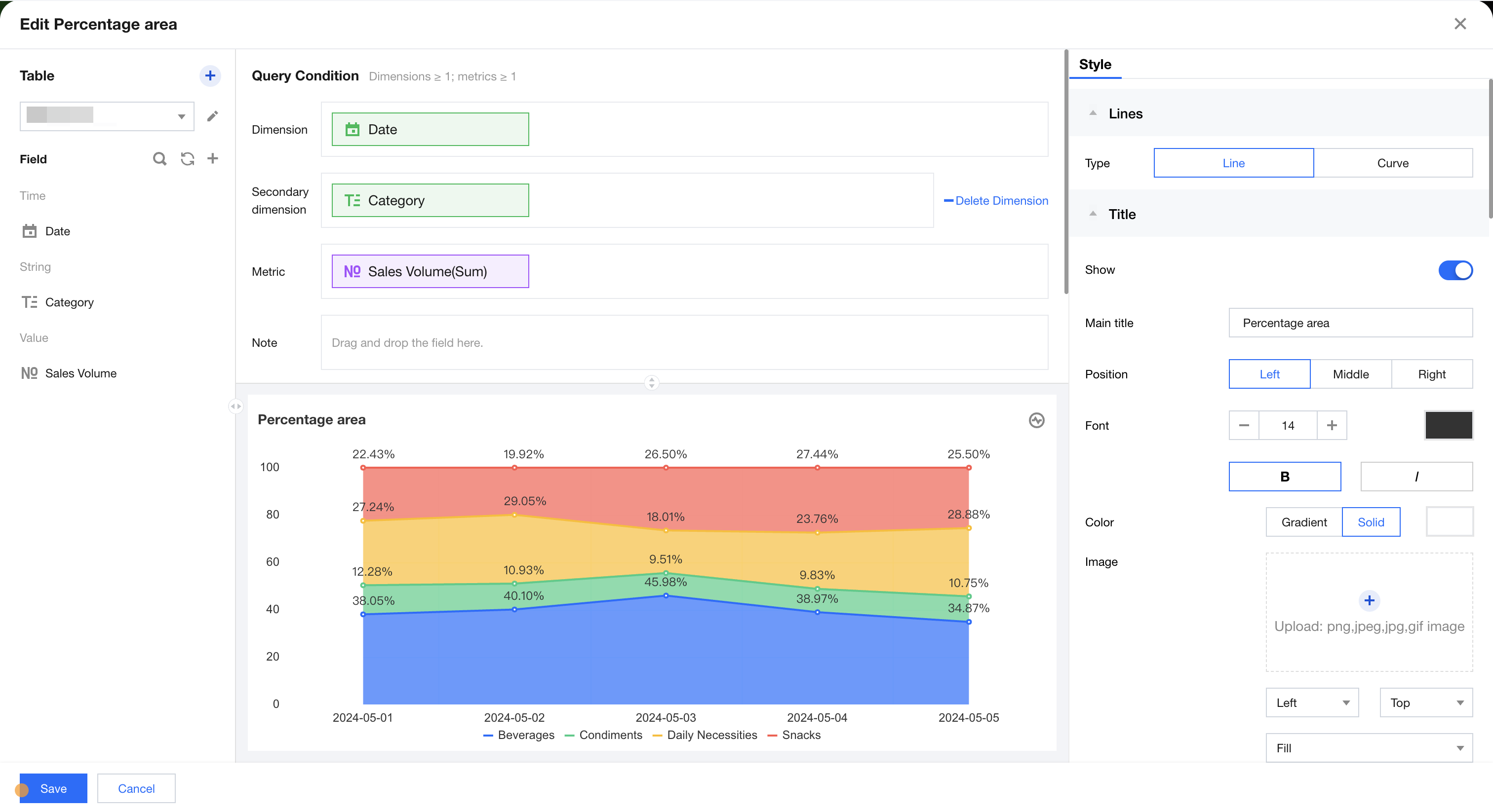
Percentage Area Chart
Percentage Area Chart is mainly used to accumulate the dependent variable data of each area and normalize the total amount, forming a Percentage Area Chart. As shown below, it represents the comparison data of sales percentage for different categories by month.
Supplementary analysis can be performed on existing dimensions by adding dimension sub-axes. As shown in the figure above, it represents the comparison data of sales percentage for different categories. Each area chart indicates the sales percentage data of a certain category at a specific time, and each category is distinguished by color.
or through adding multiple metrics to perform stacked display of percentage area charts corresponding to each metric.
The condition area allows conditional filtering of data by dragging and dropping time, character, or numeric value fields.
The immediate analysis button can trigger the chart's data update display, while on the right, you can set the maximum display of XX results (0-10000).
Component Style Settings
Percentage Area Chart supports the following style settings:
Setting Item
Category Settings
Setup Instructions
Area chart type
Line Area/Curve Area
Customizable percentage area chart type: line chart or curve
Title
Display
Enable/Disable Chart Title Display
Main Title
Set Chart Main Title
horizontal position
Set the horizontal position of the title display, such as left, center, or right.
numeric display
value type
Set the numeric display type, with three types to choose from: 1. Standard numerical value: for example, "1211" shows as "1211" 2. Percentage: for example, "0.11" shows as "11%" 3. Thousands separator: for example, "1211" shows as "1,211"
value unit
Set the unit for numeric display, with the following units to choose from: 1. None 2. Ten thousand: for example, "121112" shows as 12.111, and so on for the following units 3. Million 4. Ten million 5. Hundred million 6. One billion 7. Billions of
decimal places retained
Set the number of decimal places for numeric values. For example, "1211.2334" shows as "1211.23" when set to retain 2 decimal places.
Tags
Display
Enable/Disable Tag Display
data name
To display the data name, enable it.
Data value.
To display the numeric value, enable it. Normally, enable the display of the Tag. The data value must be enabled simultaneously.
Percentage
To display percentage data, enable it.
Legend
Display
Enable/Disable Legend Display
Position
Set the display position of the legend, supporting four types of position selection: top, bottom, left, right.
alignment
Set the alignment mode of the legend, supporting five alignment options: left, center, right, top, and bottom.
Area zoom
Intelligent Display Do not display
Intelligent: Adapt area zoom based on size and dimension count Display/Do not display: Turn on/off chart title
Coordinate axis settings
Display Y-axis
Whether to display the Y-axis
Display Y-axis Title
Whether to display the Y-axis Title
Y-axis text count
Set Y-axis text count
Y-axis line count
Set Y-axis line count
Display X-axis
Whether to display the X-axis
Display X-axis title
Whether to display the X-axis title
Display rule for X-axis label
Set the display direction of the X-axis label, supporting horizontal, vertical, skew, and custom four types.
X-axis text count
Set X-axis text count
X-axis line count
Set X-axis line count
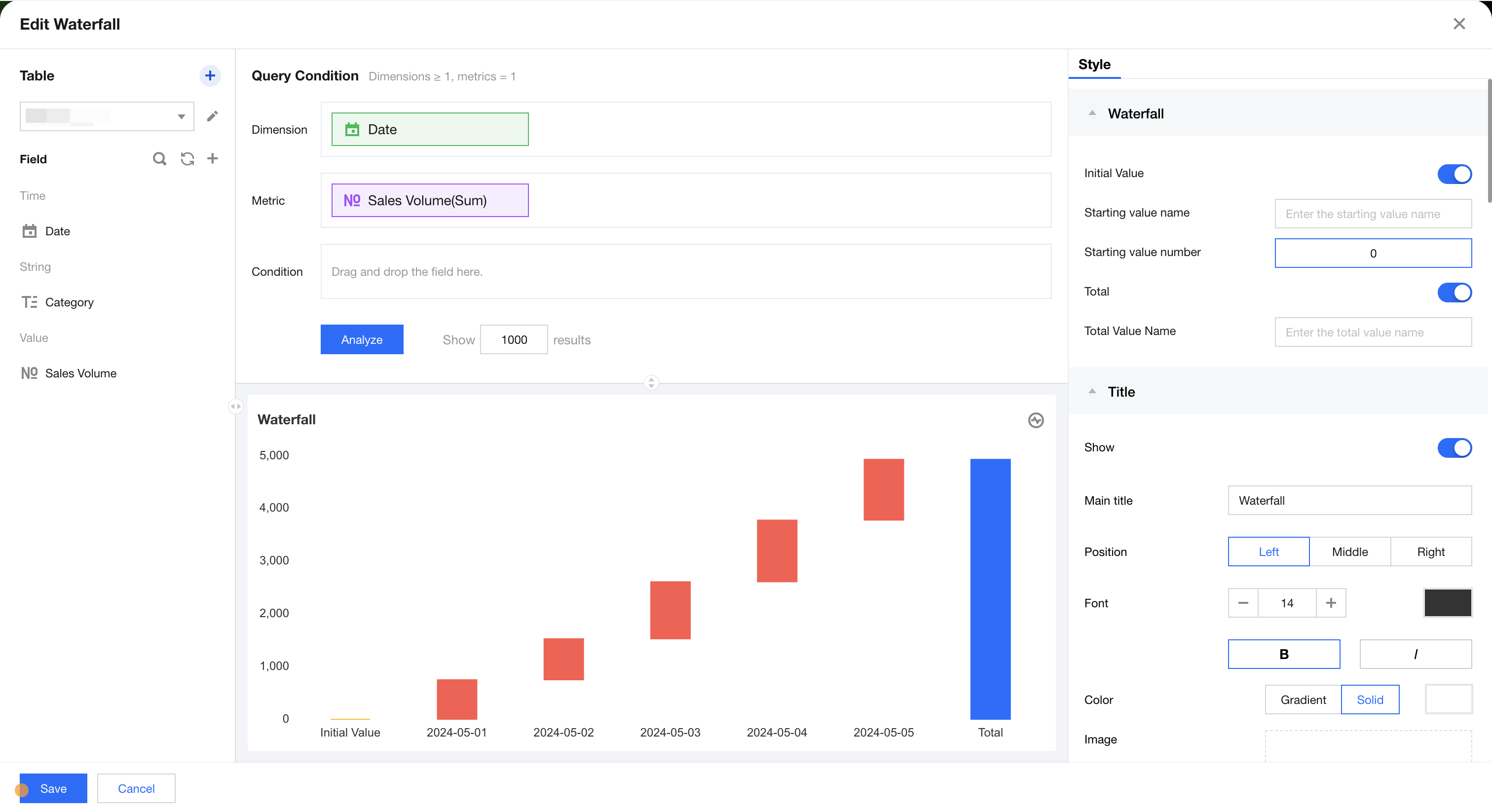
Waterfall Chart
The waterfall chart is mainly used to view the cumulative progressive relationship of data. The following figure represents the cumulative progressive relationship of sales for each month.
The condition area allows conditional filtering of data by dragging and dropping time, character, and numeric value fields.
The immediate analysis button can trigger the chart's data update display, while on the right, you can set the maximum display of XX results (0-10000).
Component Style Settings
Histogram supports the following style settings:
Setting Item
Category Settings
Setup Instructions
Waterfall Chart
starting value
Enable/disable display of starting value
starting value name
Set the display name of the starting value
starting value numeric value
Set the starting value
Total value
Enable/disable display of total value
Total Value Name
Set the display name of the total value
Title
Display
Enable/Disable Chart Title Display
Main Title
Set Chart Main Title
horizontal position
Set the horizontal position of the title display, such as left, center, or right.
numeric display
value type
Set the numeric display type, with three types to choose from: 1. Standard numerical value: for example, "1211" shows as "1211" 2. Percentage: for example, "0.11" shows as "11%" 3. Thousands separator: for example, "1211" shows as "1,211"
value unit
Set the unit for numeric display, with the following units to choose from: 1. None 2. Ten thousand: for example, "121112" shows as 12.111, and so on for the following units 3. Million 4. Ten million 5. Hundred million 6. One billion 7. Billions of
decimal places retained
Set the number of decimal places for numeric values. For example, "1211.2334" shows as "1211.23" when set to retain 2 decimal places.
Tags
Display
Enable/Disable Tag Display
data name
To display the data name, enable it.
Data value.
To display the numeric value, enable it. Normally, enable the display of the Tag. The data value must be enabled simultaneously.
Percentage
Enable/disable displaying the percentage between the current metric value and total value. After enabling percentage:
Display in tooltips and data tags (requires enabling tags and data values);
The calculation method for percentage is: percentage = (absolute value of current value / sum of absolute values of all values)%
When positive and negative values coexist in metric values, the total percentage may be less than 100%.
Area zoom
Intelligent Display Do not display
Intelligent: Adapt area zoom based on size and dimension count Display/Do not display: Turn on/off chart title
Coordinate axis settings
Display Y-axis
Whether to display the Y-axis
Display Y-axis Title
Whether to display the Y-axis Title
Y-axis text count
Set Y-axis text count
Y-axis line count
Set Y-axis line count
Coordinate format
Set coordinate axis ticks numeric display format, options: auto, follow certain metric. When set to follow certain metric, the numeric display of coordinate ticks will remain consistent with the specified metric format (metric numeric format can be set in "Numeric display").
Coordinate value interval
Set the minimum and maximum values of the coordinate scale. Values outside the interval range will not be displayed after configuration to enhance contrast for close values. If not set, the system will use automatic value acquisition.
Number of intervals
Set the number of scale intervals in the coordinate value range. If the coordinate value range is set, proceed to evenly distribute according to the number of intervals. If only the maximum or minimum value is set for the range, the system will automatically select the closest number of intervals (for example, if the number of intervals is set to 4, it may be automatically adjusted to 5).